









Overview:
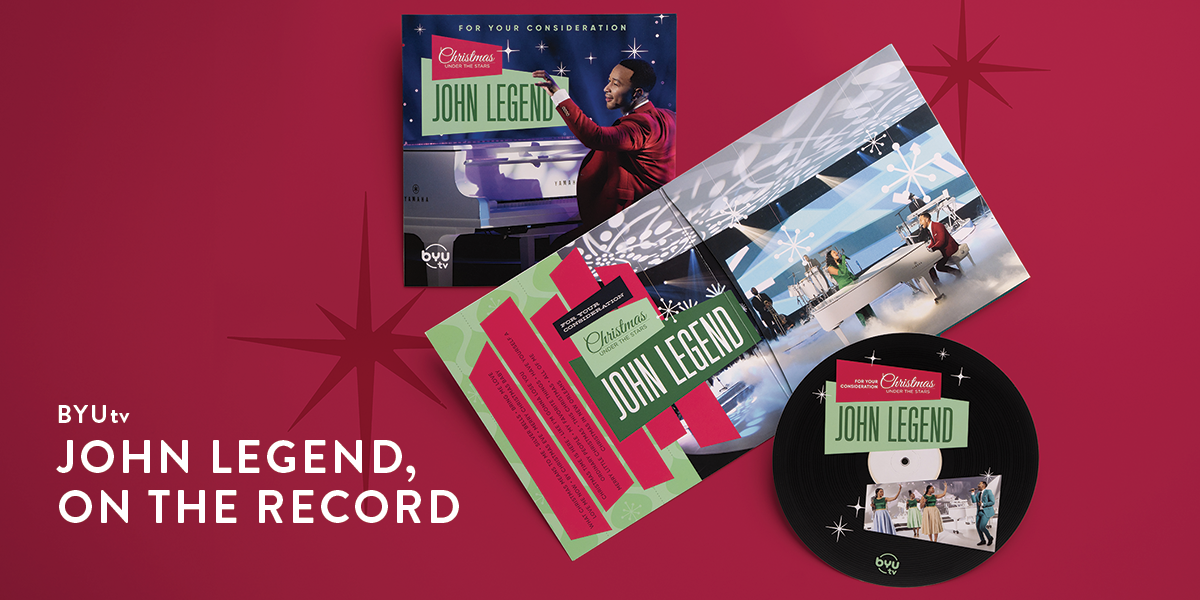
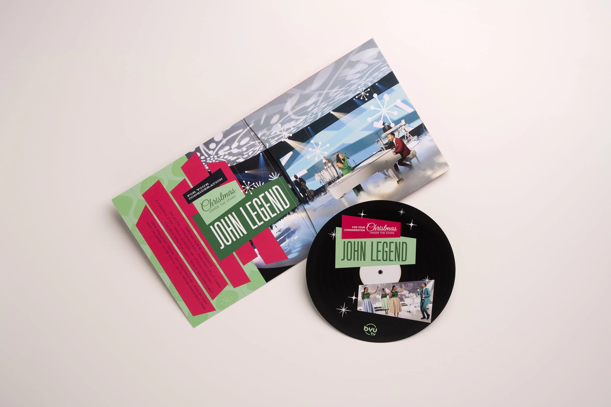
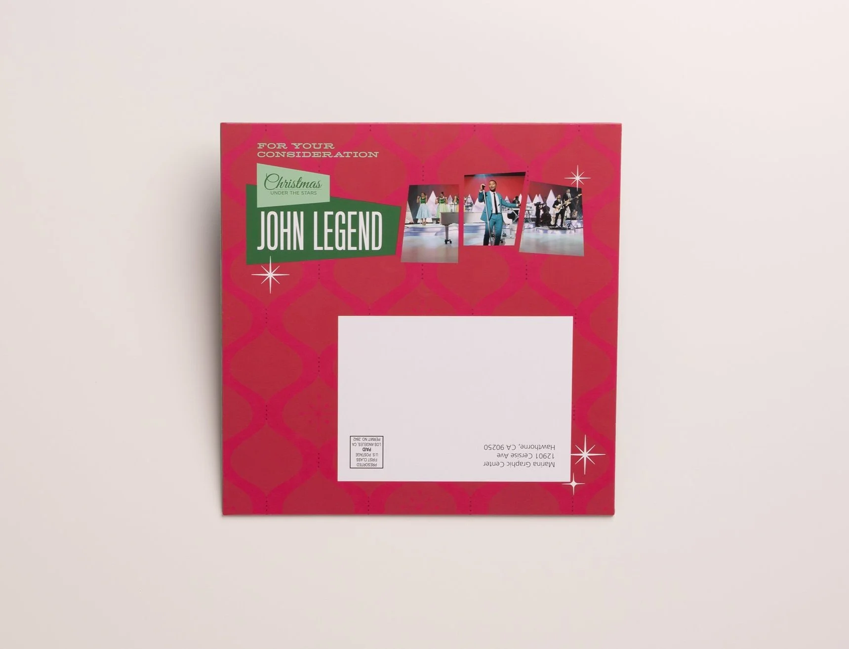
In 2020, BYUtv featured John Legend in its annual holiday special, Christmas Under the Stars. To promote Emmy consideration for this program, I designed a For Your Consideration (FYC) mailer that paid homage to the soulful essence of Legend's music while adhering to new industry constraints.
My Role:
Concept development, art direction, packaging design, production coordination.
The Challenge:
Due to updated guidelines, FYC mailers were required to be cost-effective and exclude physical DVDs, directing recipients to a secure online viewing platform. The task was to create a memorable, tactile experience that resonated with the show's musical theme without relying on traditional media formats.
The Solution:
Drawing inspiration from the jazz and R&B styles synonymous with John Legend, I designed a 45 rpm record sleeve containing a faux vinyl record. This "record" featured concentric circle lines enhanced with spot gloss to mimic the grooves of an actual vinyl. The reverse side included an invitation and access details for the online screening, seamlessly blending nostalgia with modern viewing methods.
The Impact:
The mailer stood out among typical FYC submissions, capturing the attention of Emmy voters through its unique design and thematic relevance. It effectively conveyed the show's ambiance and Legend's musical influence, contributing to BYUtv's promotional efforts during the awards season.
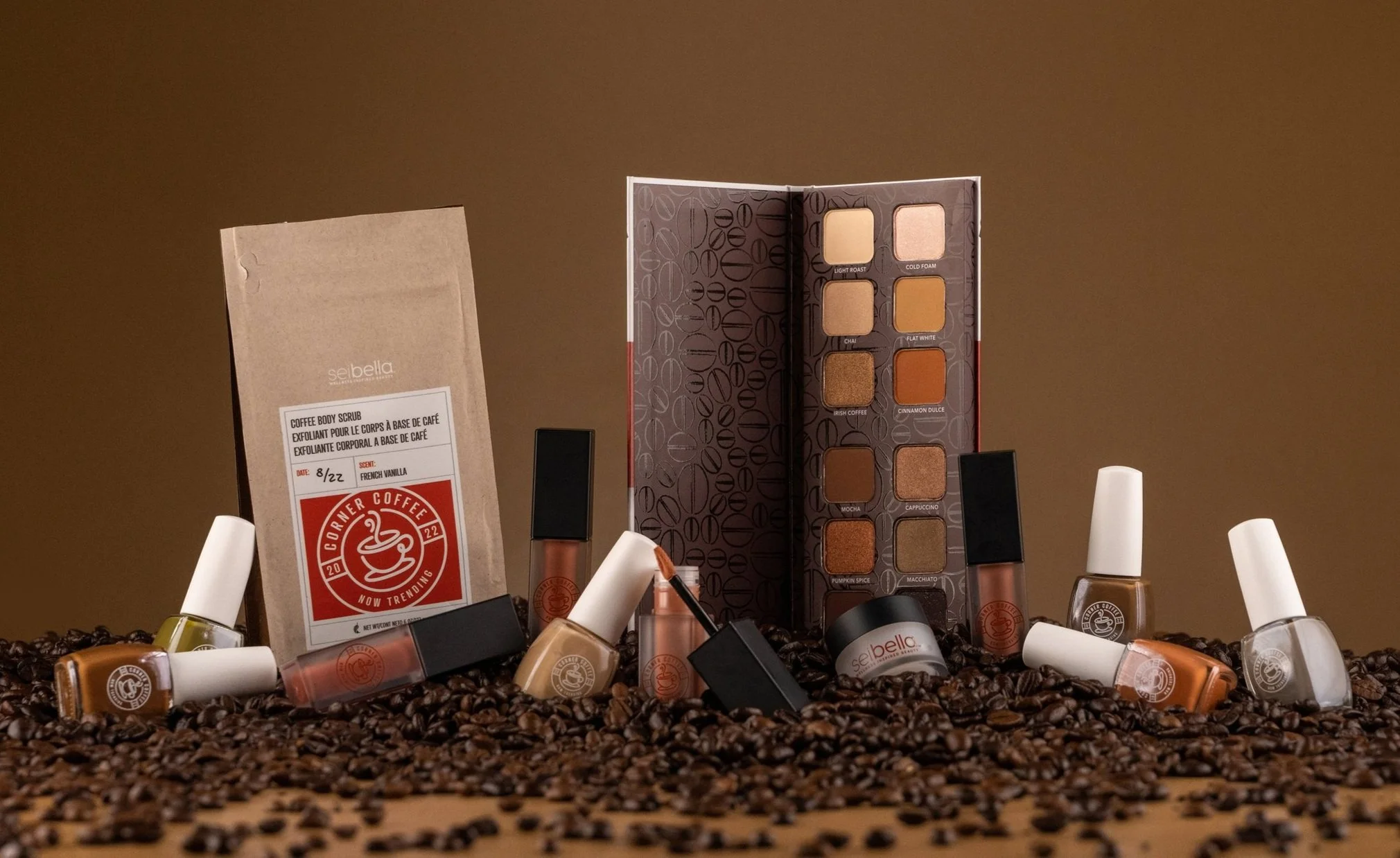
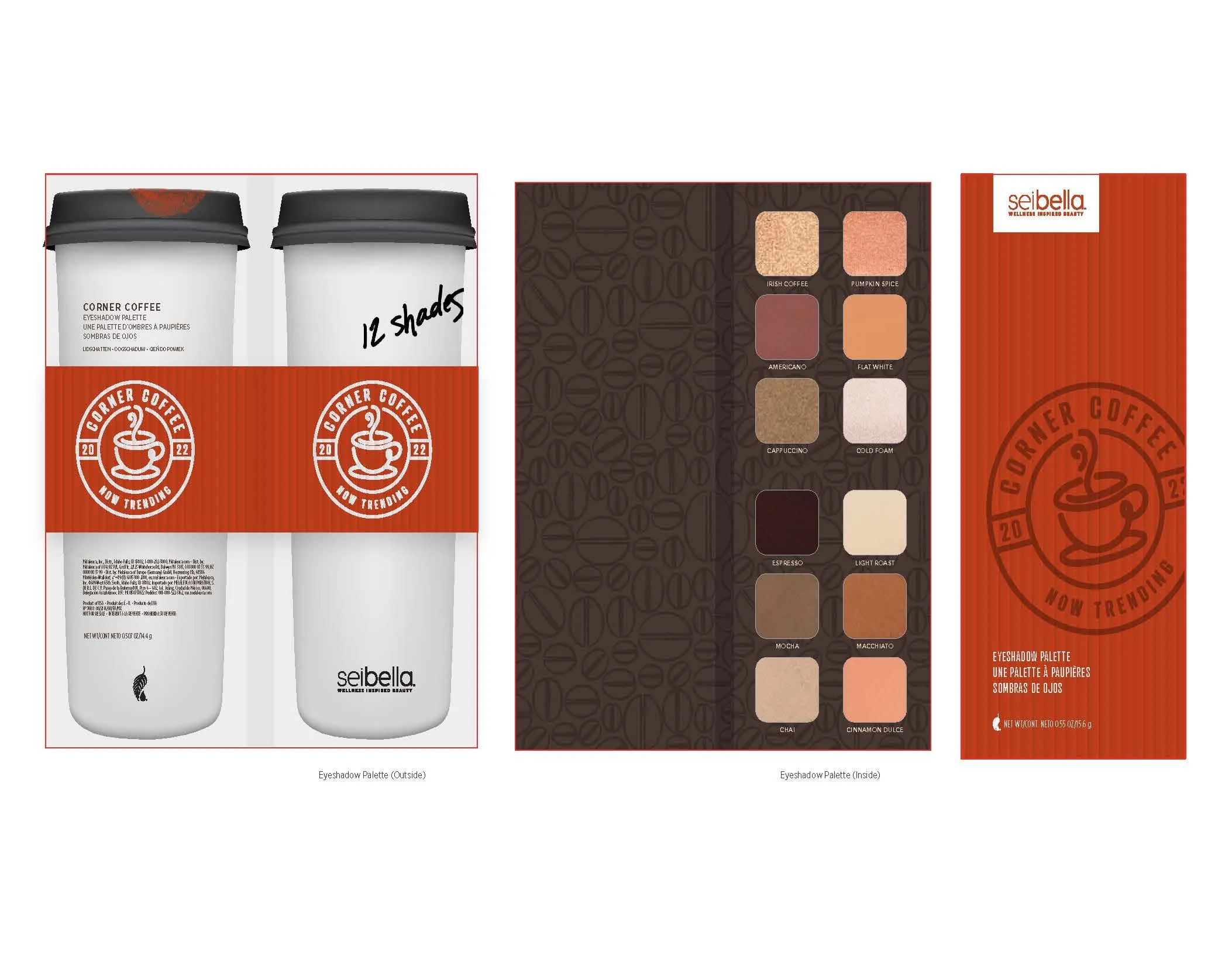
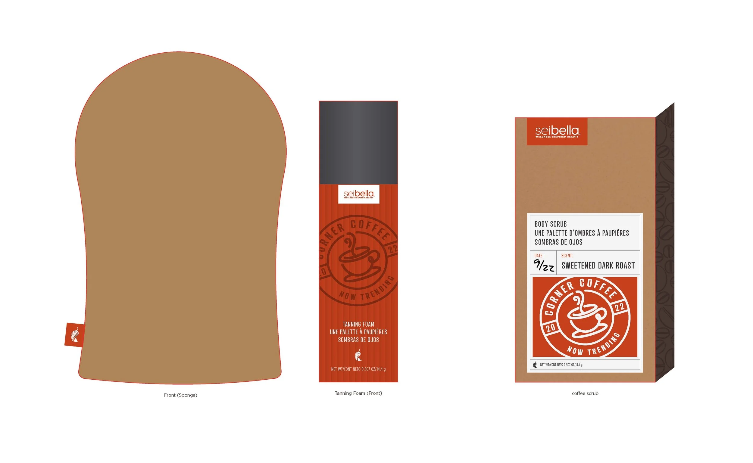
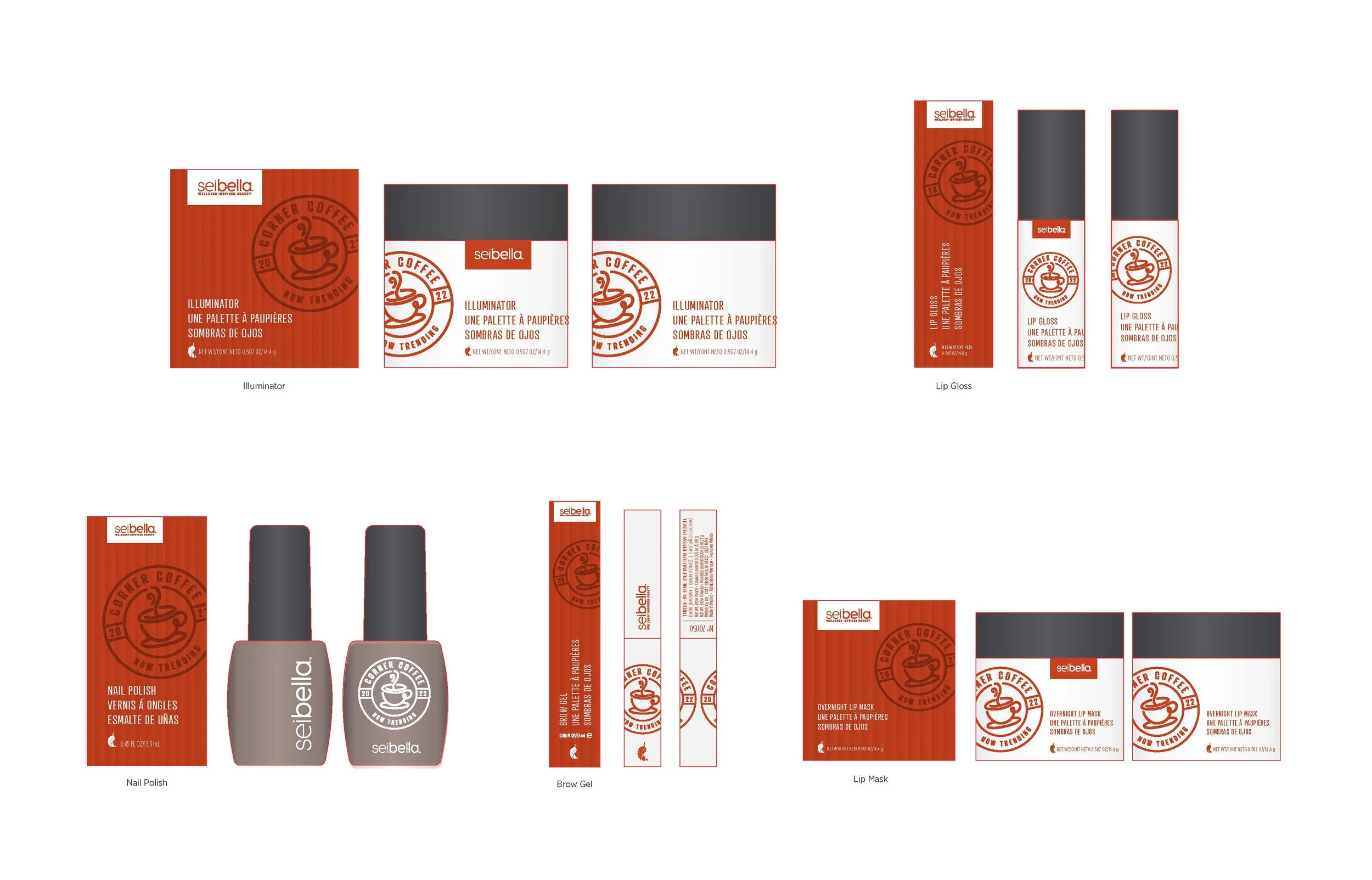
Sei Bella Corner coffee BEAUTY LINE PACKAGING

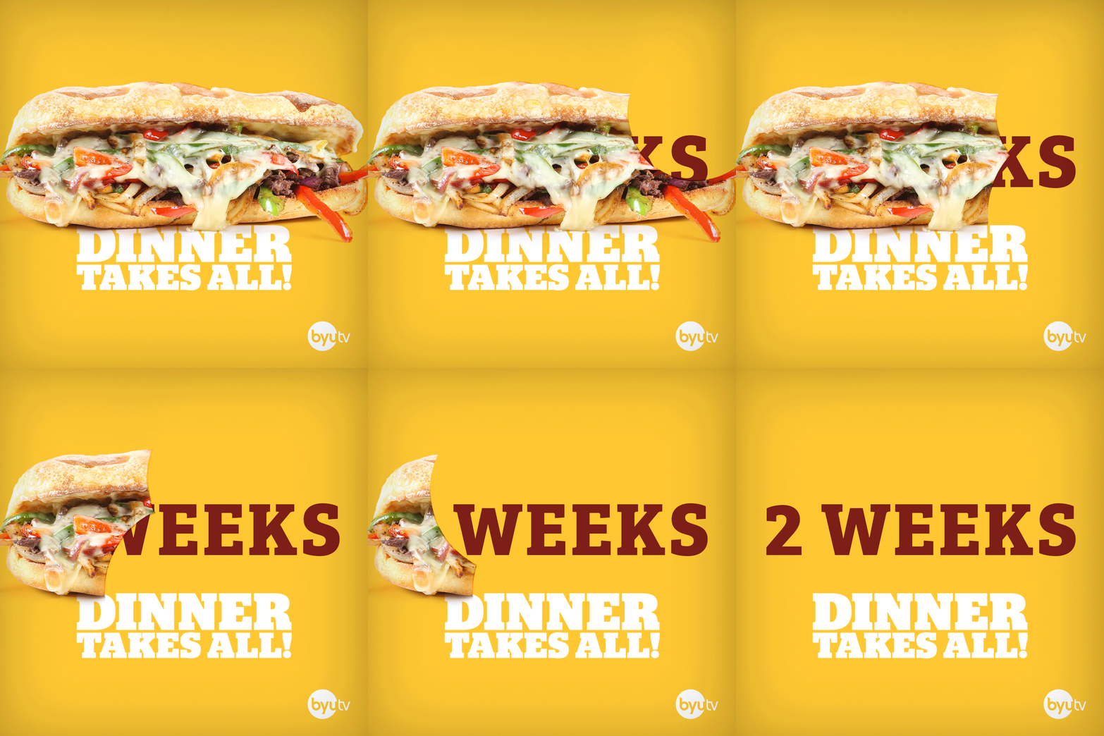
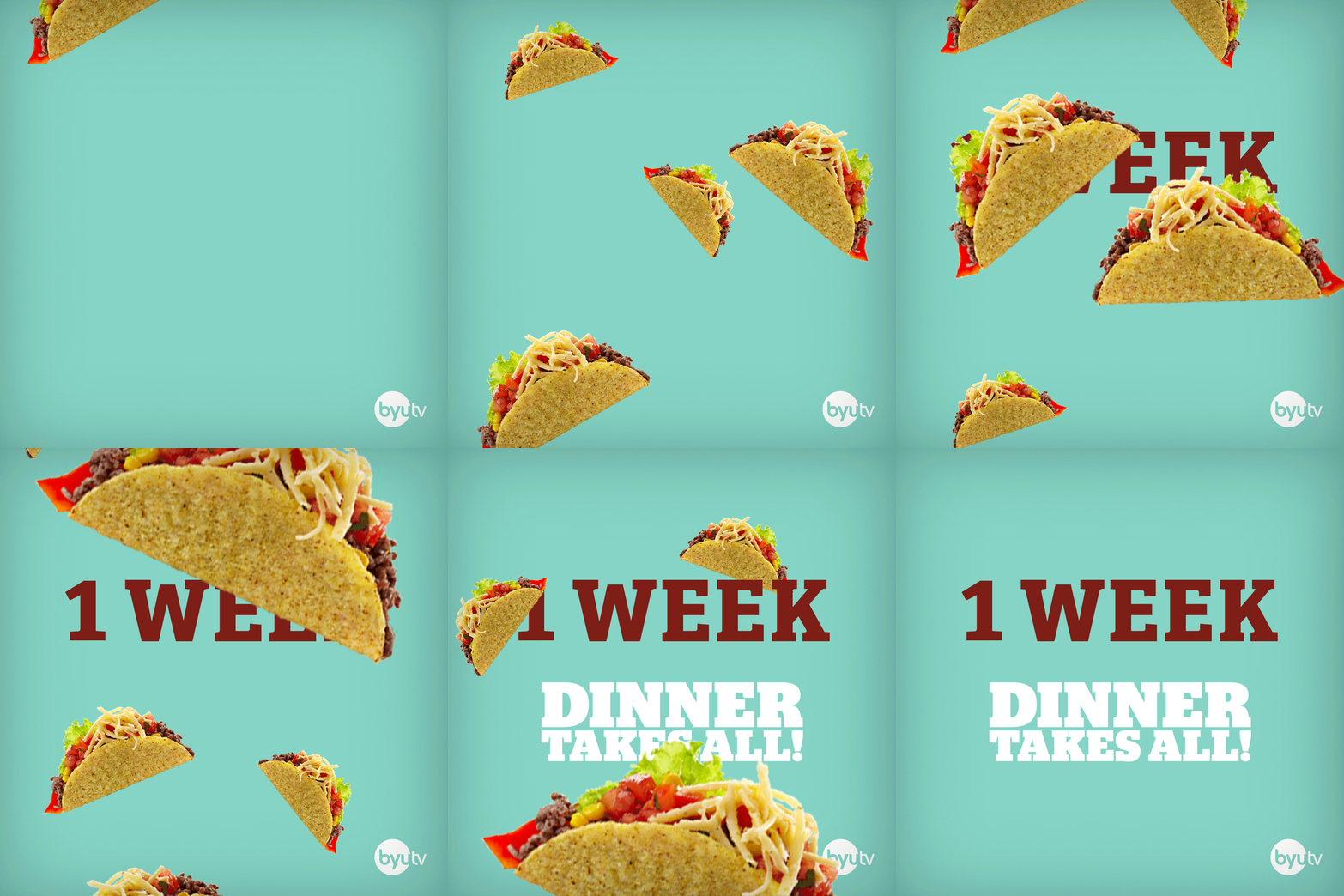
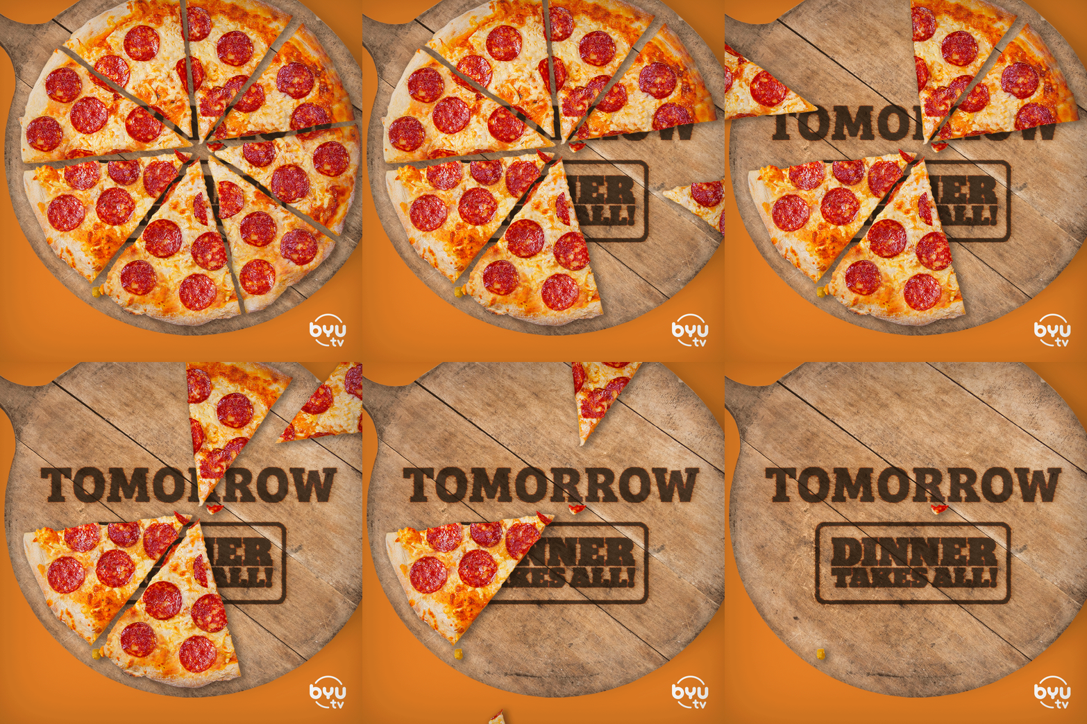
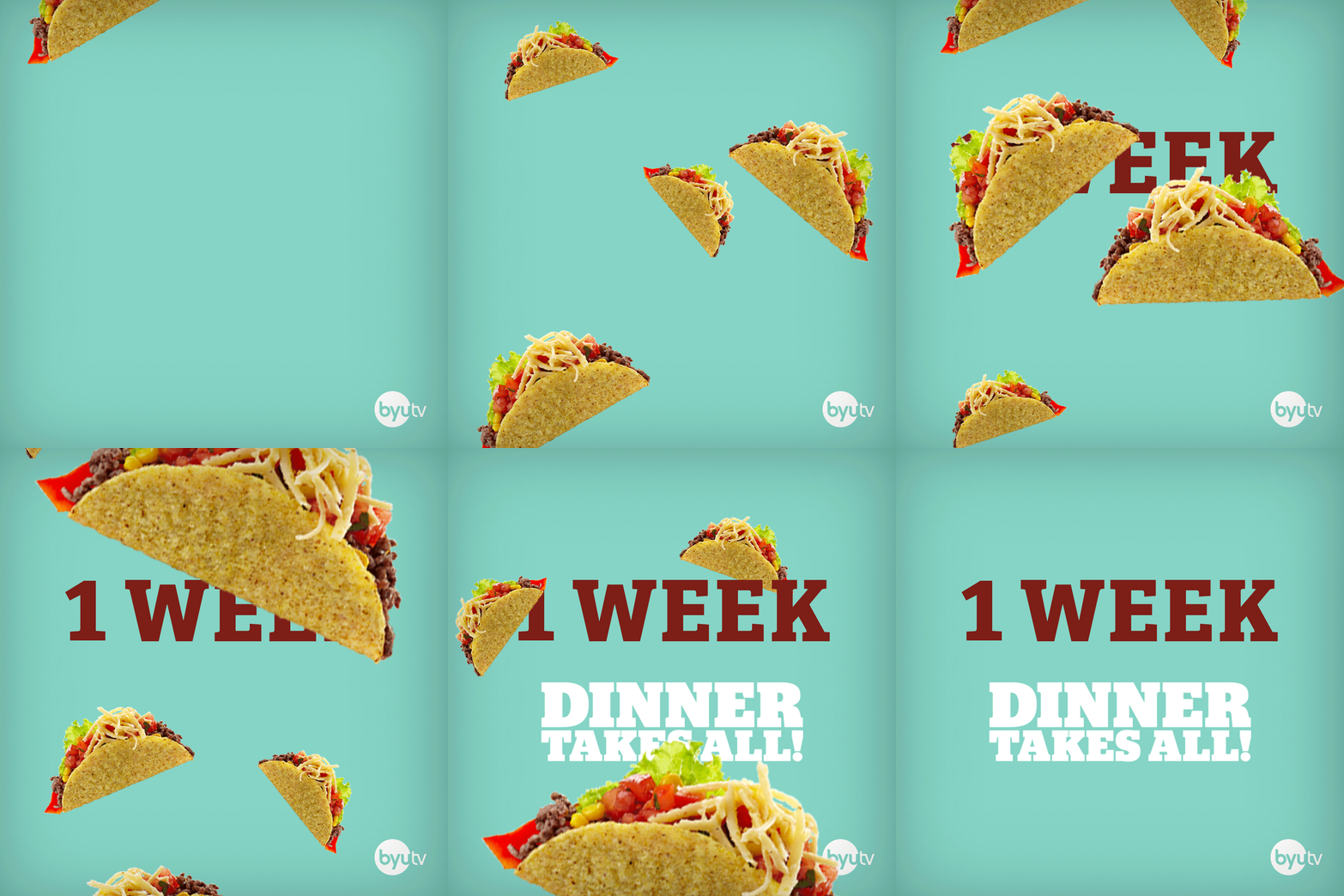
Dinner takes all premiere Countdown
Culinary competition gameshow, Dinner Takes All, needed tasty, attention-grabbing social media content to get viewers hyped up for its upcoming season premiere.
Making good social posts
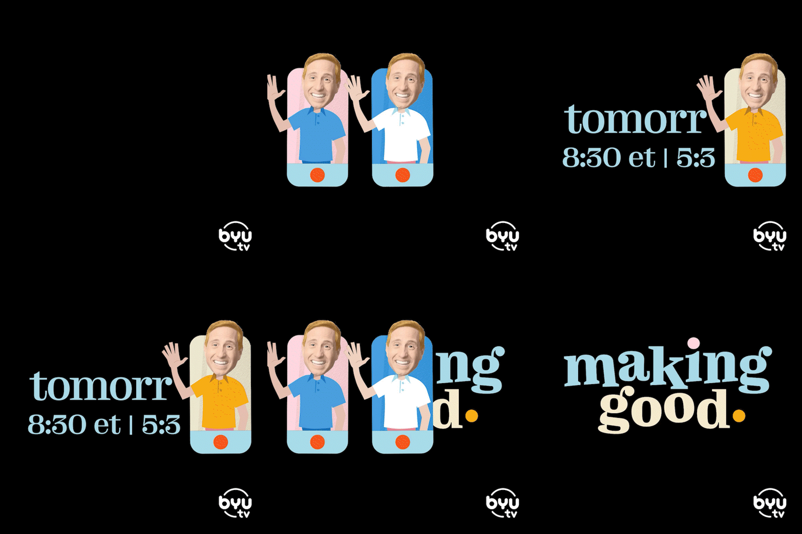
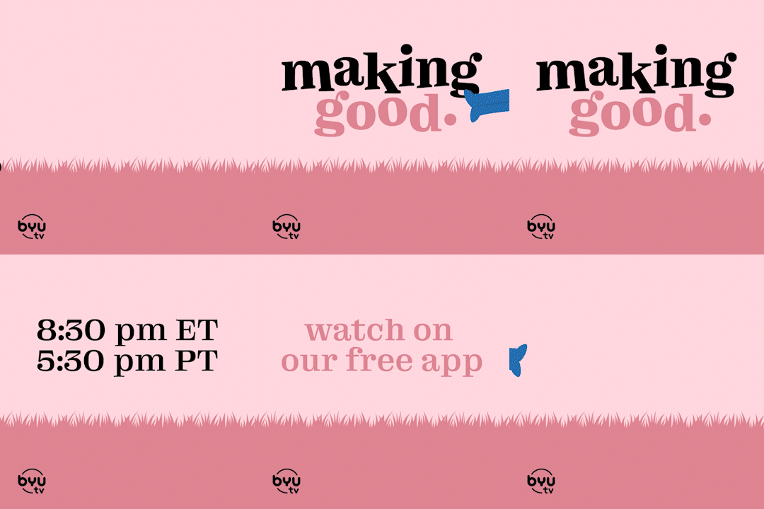
BYUtv’s feel-good, unscripted series, Making Good featuring Kirby Heyborne, needed some social content that matched the fun, quirky, and full-of-heart messaging of the show. I took some inspiration from the show where Kirby sets out to learn about those who serve others for a living and attempts to serve others, as well. In a couple of episodes, he helps mow lawns for those who can’t themselves and flies hot-air balloons for the disabled. Most of the show is filmed with a camera crew, but every once in a while, Kirby uses his phone camera to feature his perspective.

Editorial Direction – Business Magazine
Overview:
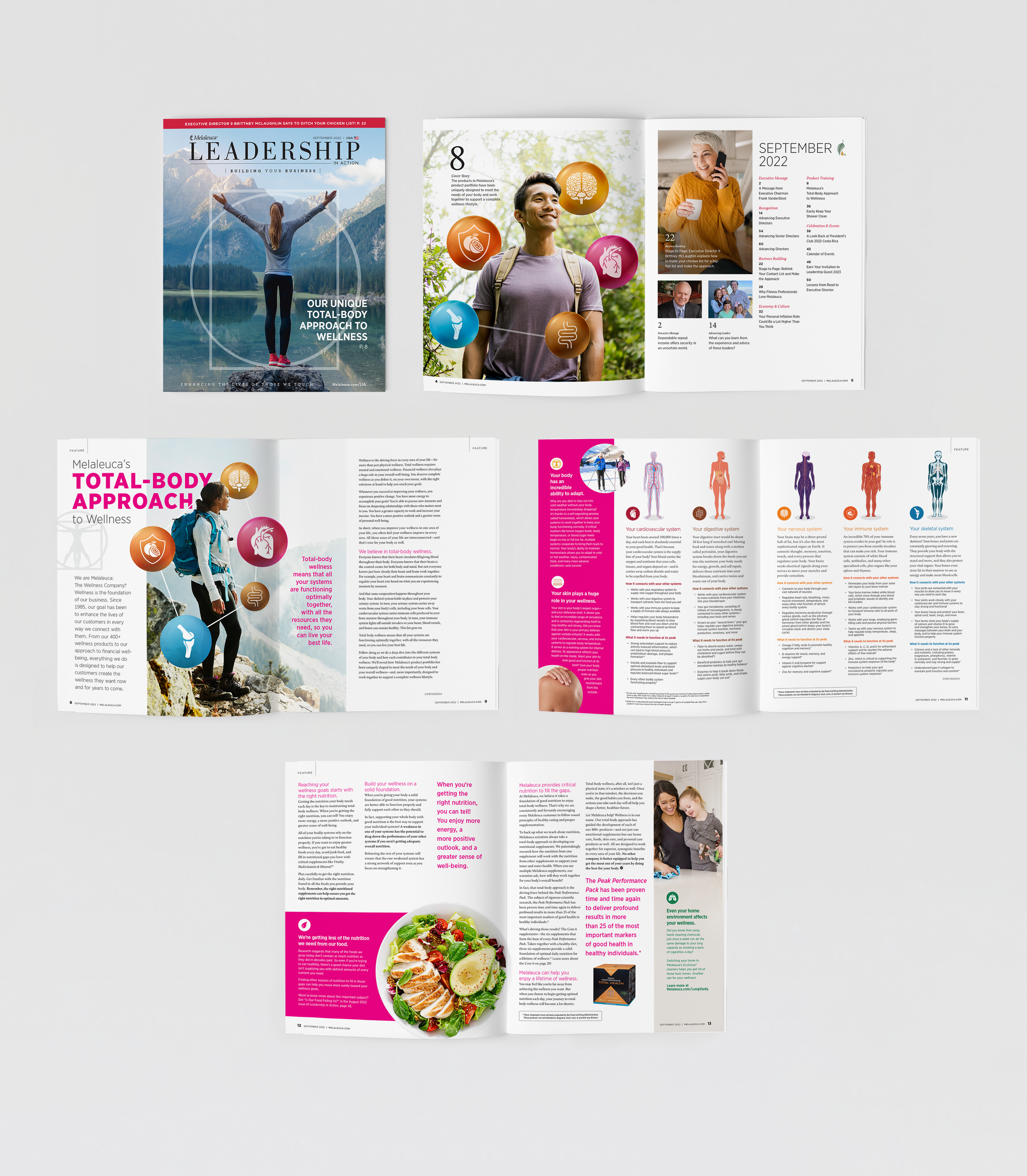
I led the redesign of contents and navigation of Melaleuca’s Leadership in Action magazine, focusing on the cover, contents section, and a six-spread cover story centered on total-body wellness. The goal was to modernize the publication's aesthetic while aligning with Melaleuca’s brand values.
My Role:
Art direction, layout design, content structure, and visual storytelling.
The Challenge:
The existing magazine layout needed a refresh to better engage readers and reflect the company's commitment to wellness and leadership. The challenge was to create a design that was both contemporary and consistent with Melaleuca’s established brand identity.
The Solution:
I introduced a clean, cohesive design language across the magazine. The cover was revamped to be more visually striking, the contents section was reorganized for improved navigation, and the six-spread cover story was designed to effectively communicate the message of total-body wellness through compelling visuals and thoughtful layout.
The Impact:
The redesigned magazine enhanced reader engagement and provided a more intuitive reading experience. It successfully conveyed Melaleuca’s dedication to wellness and leadership, reinforcing the company's brand message through improved visual communication.

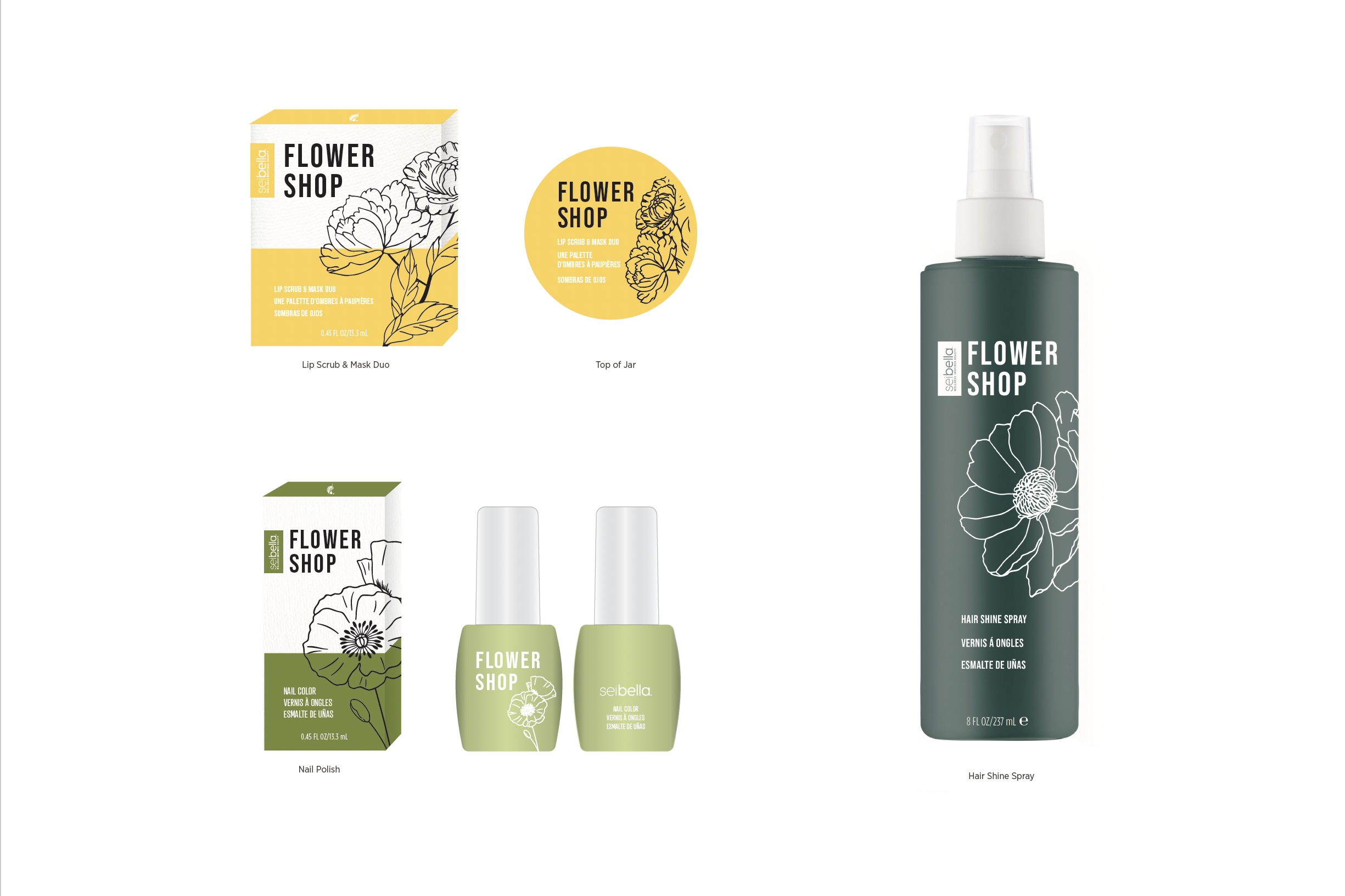
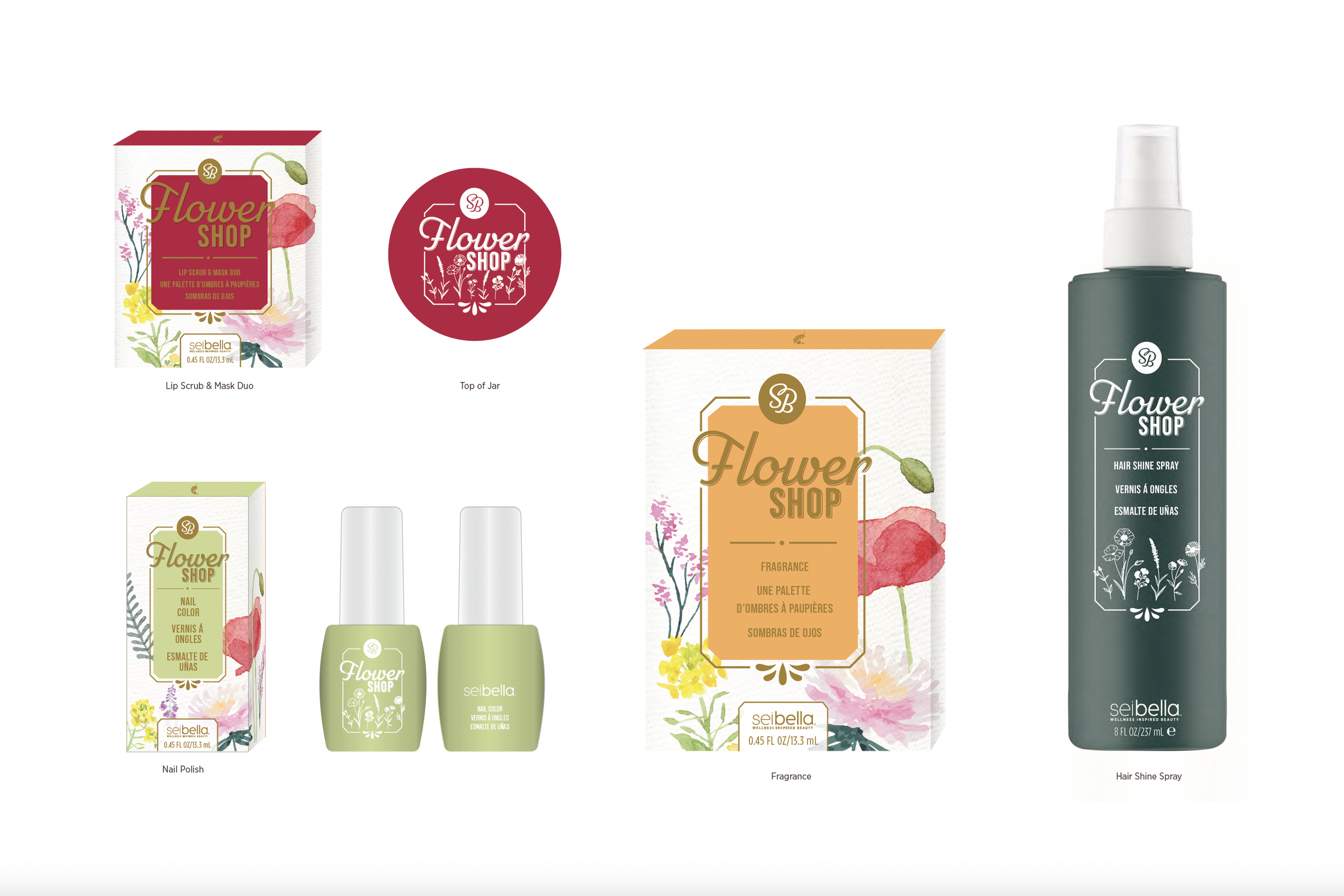
Melaleuca “Flower Shop” LTO Packaging Concepts
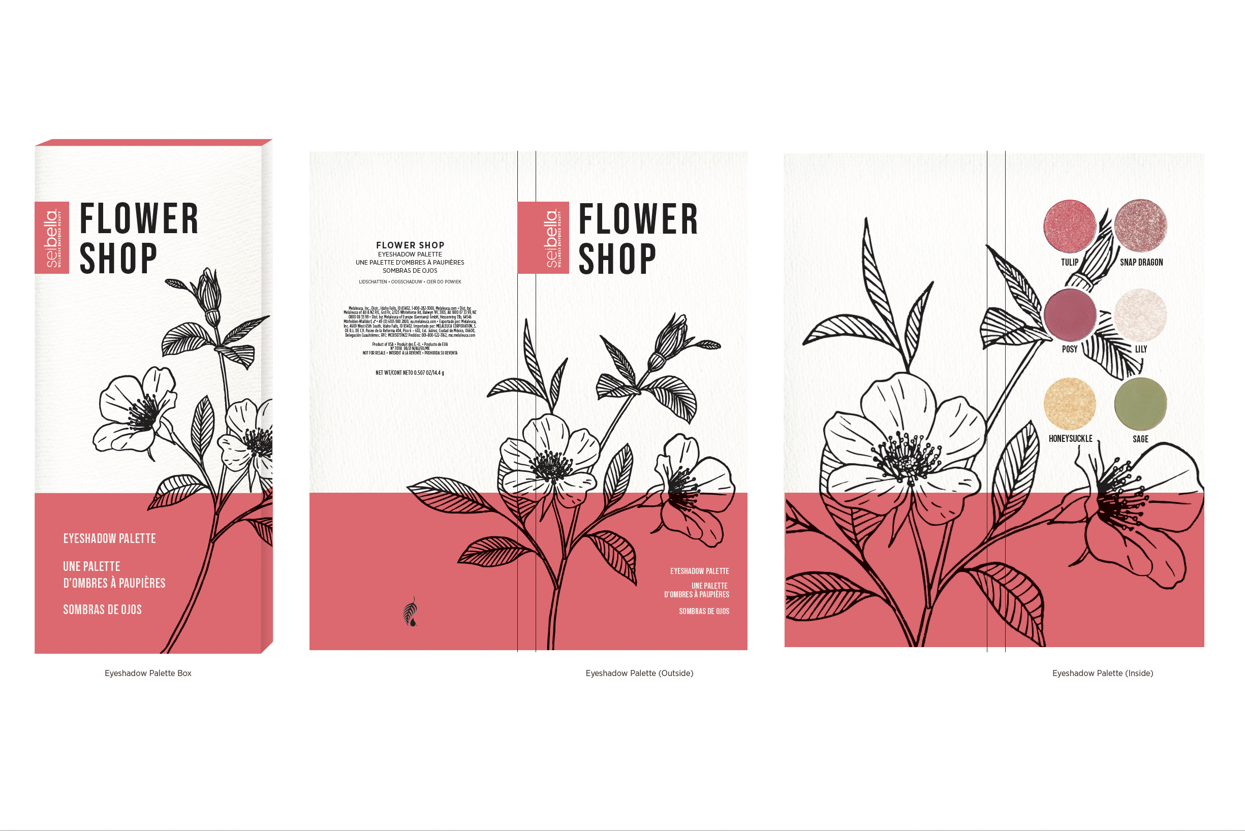
Every fall and spring Melaleuca’s beauty brand, Sei Bella, puts out a Limited Time Only collection. For spring, the theme was “Flower Shop” and the target demographic is 35-60 year-old women. The collection included an eyeshadow palette, a lip scrub and mask duo, nail color, fragrance, and hair shine spray.

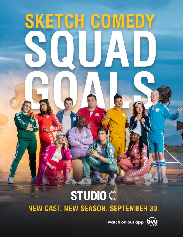
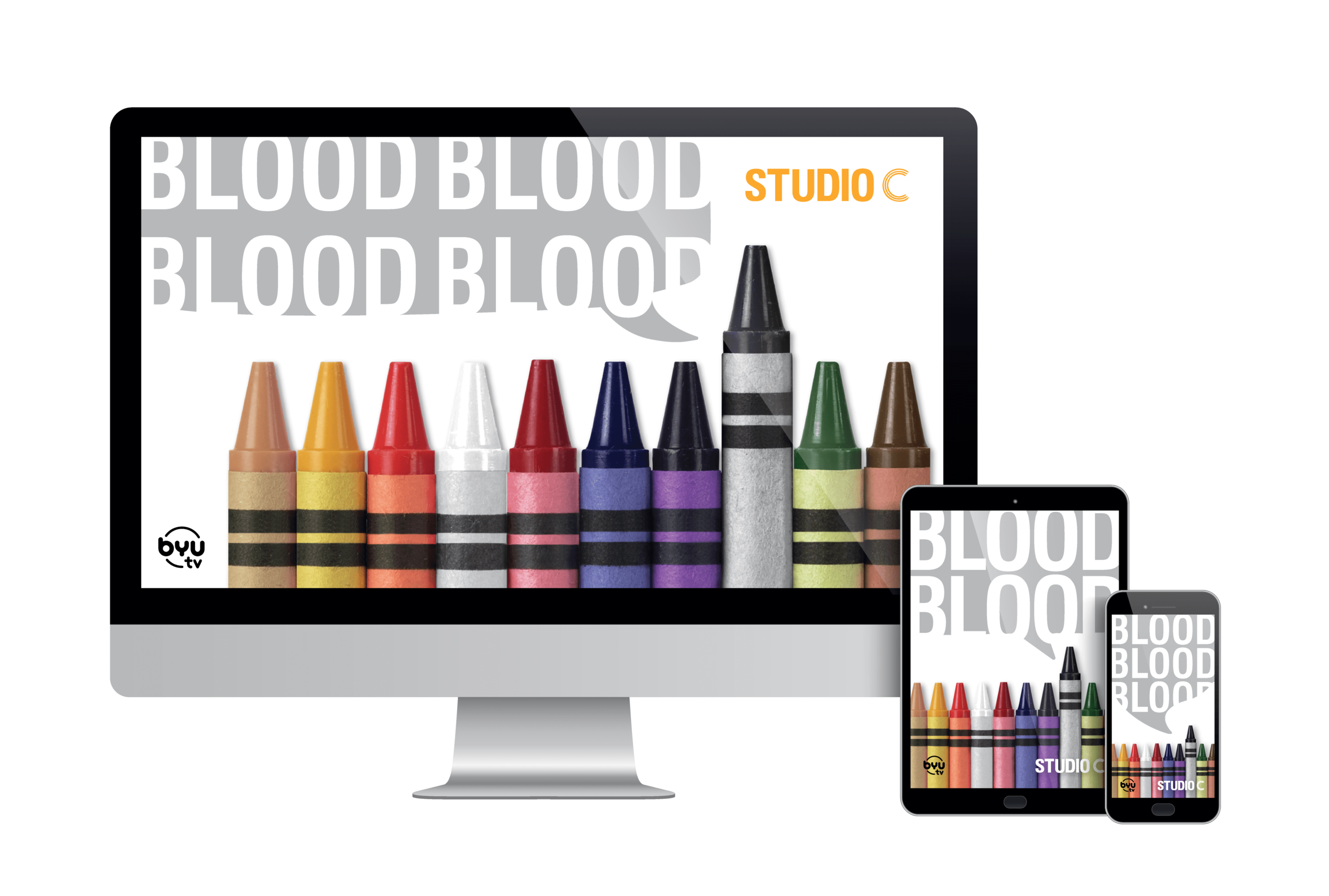
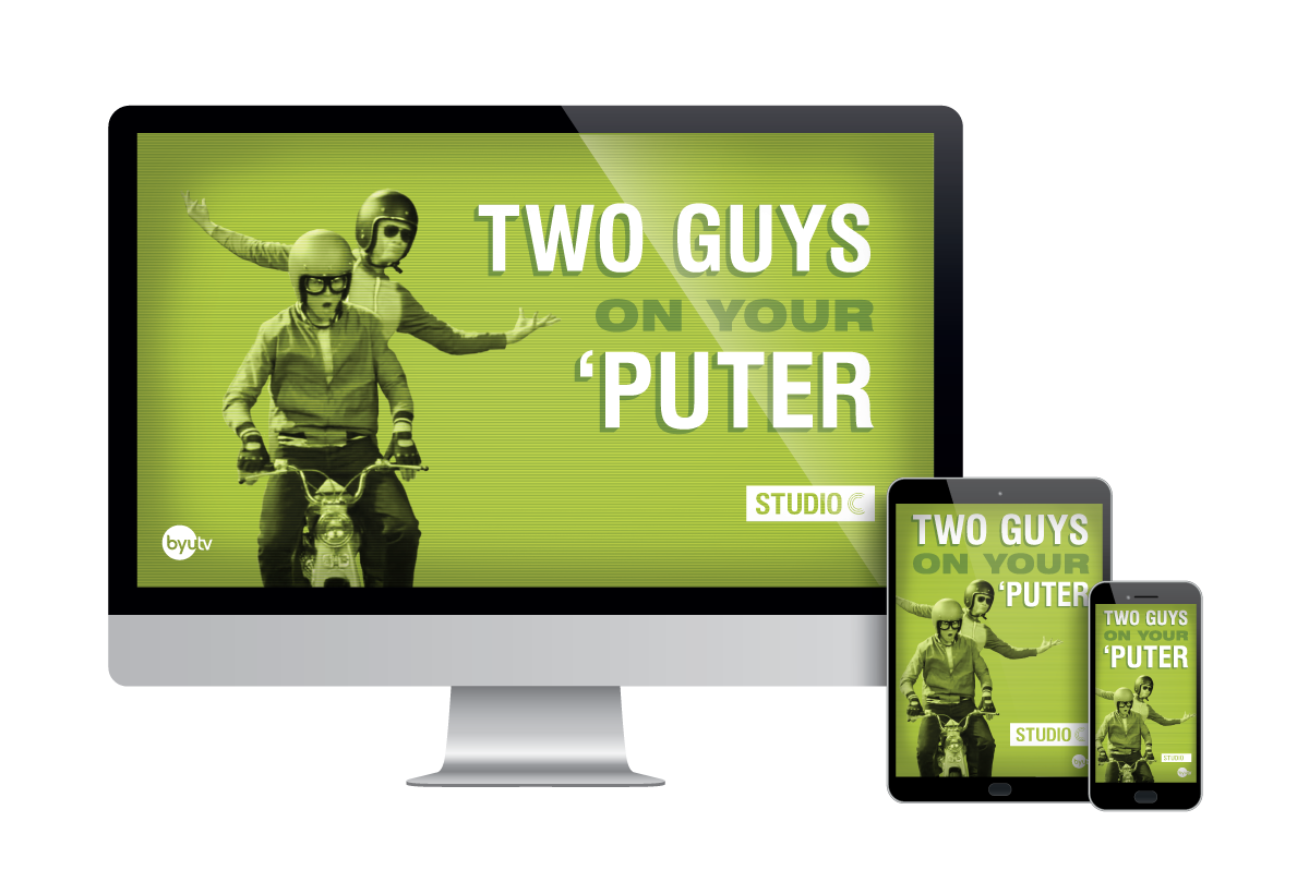
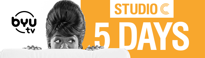
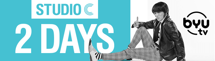
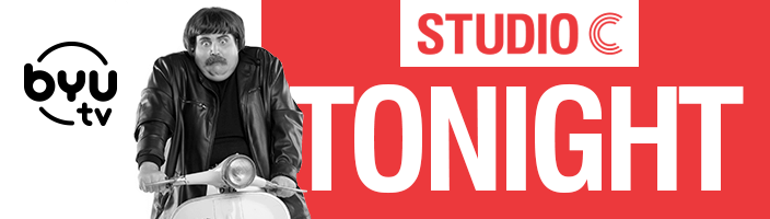
Studio C Marketing campaigns
Season 13 Billboard Campaign
(Click on the right to see more)








BYU Magazine Ad
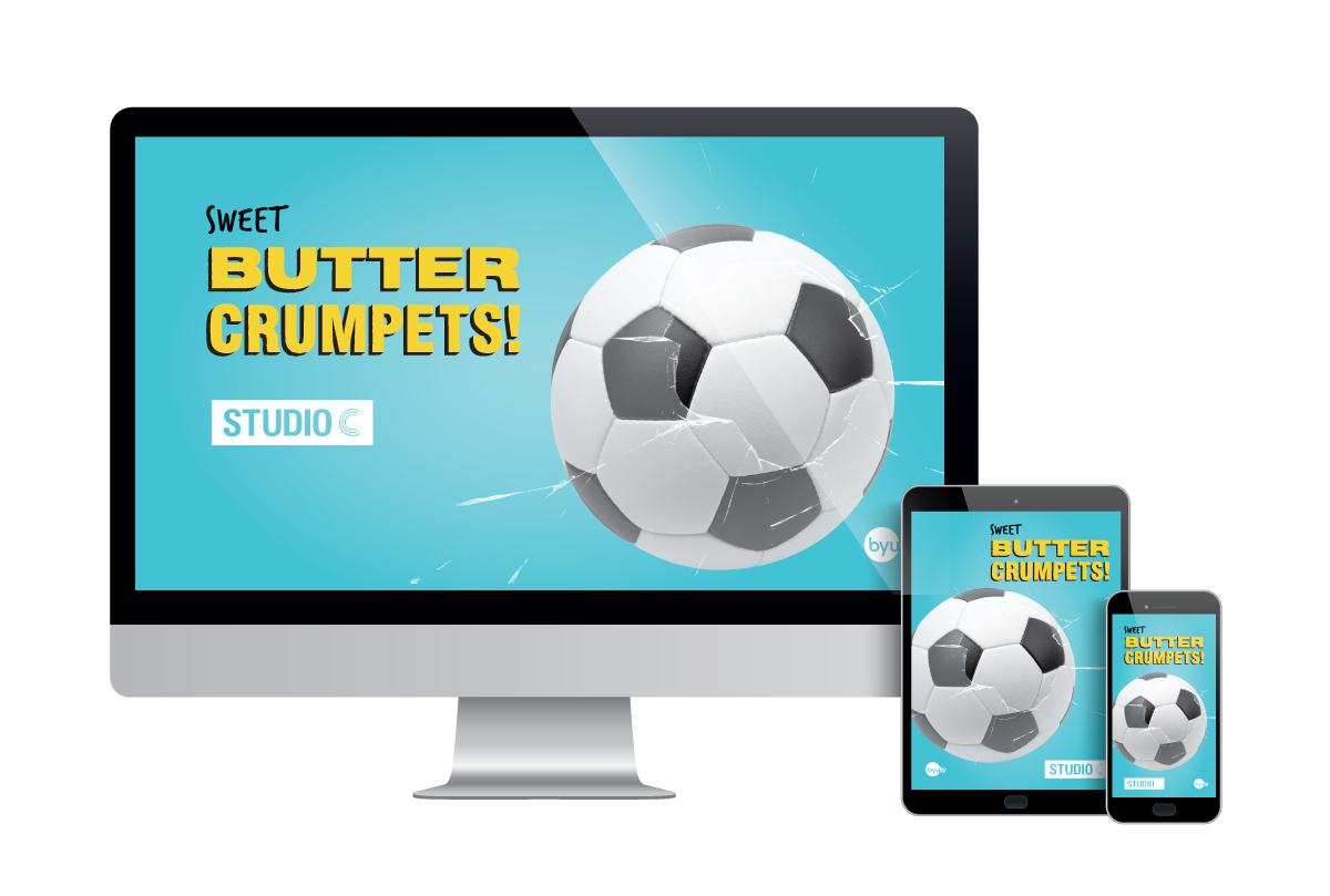
Desktop Backgrounds
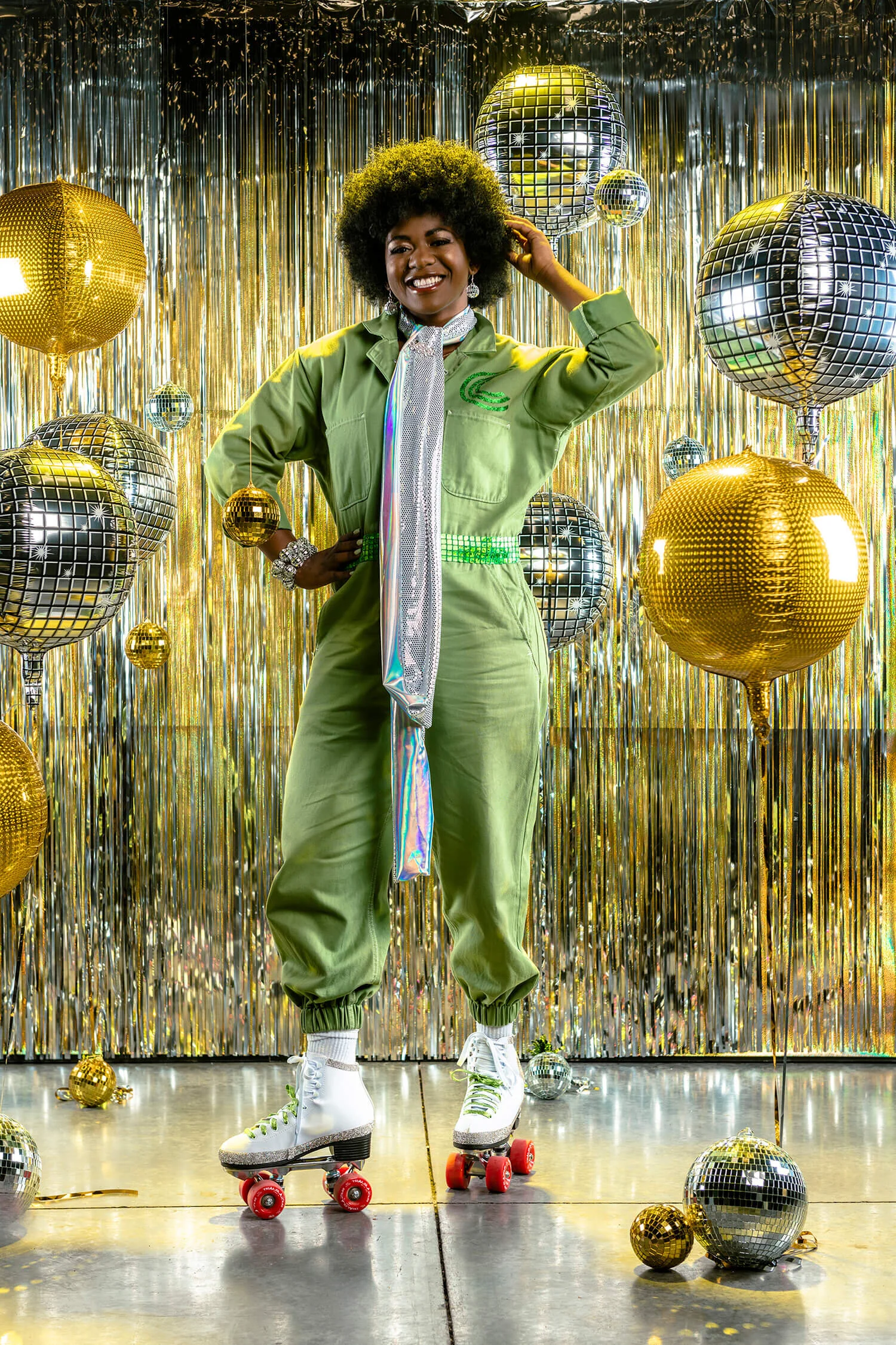
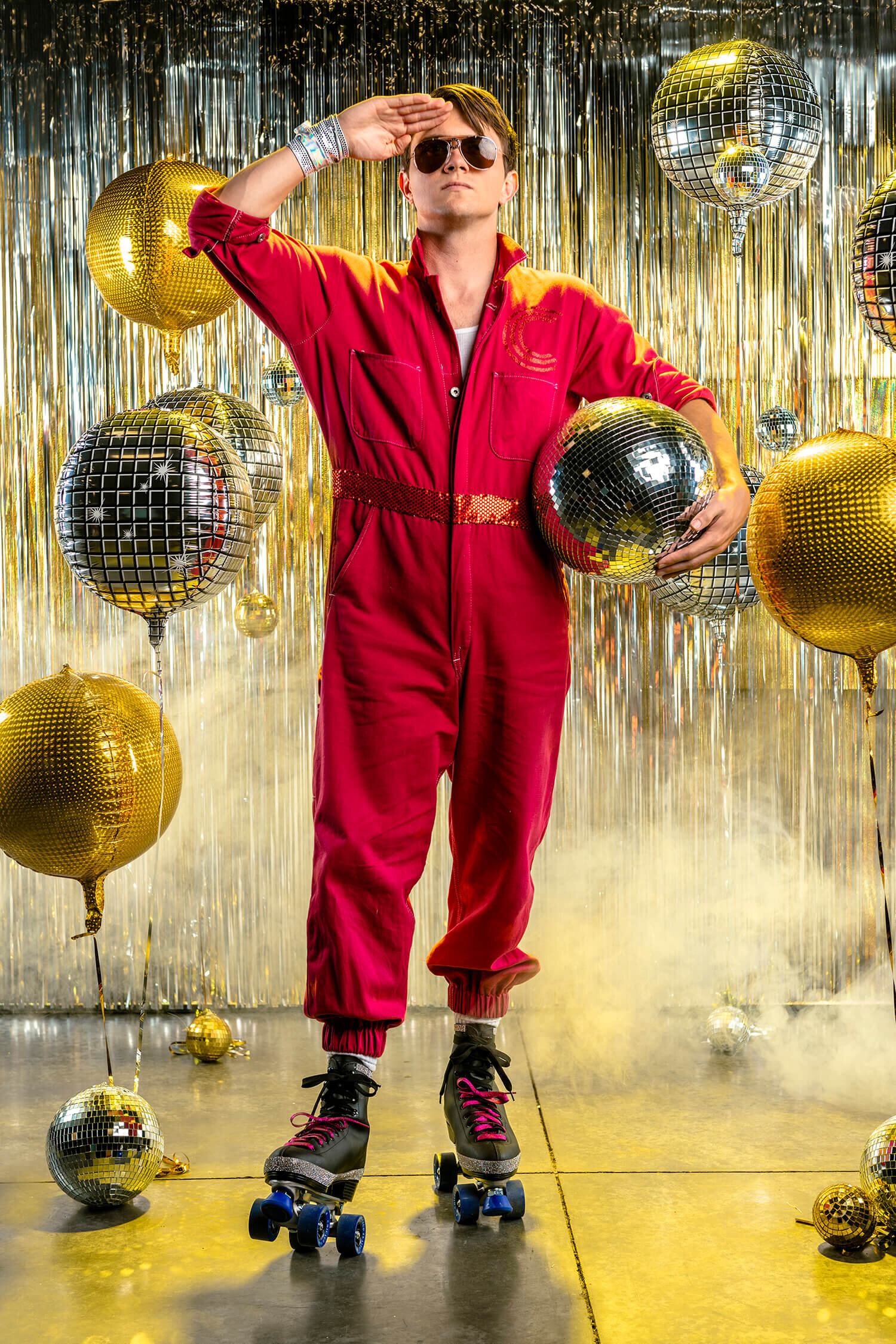
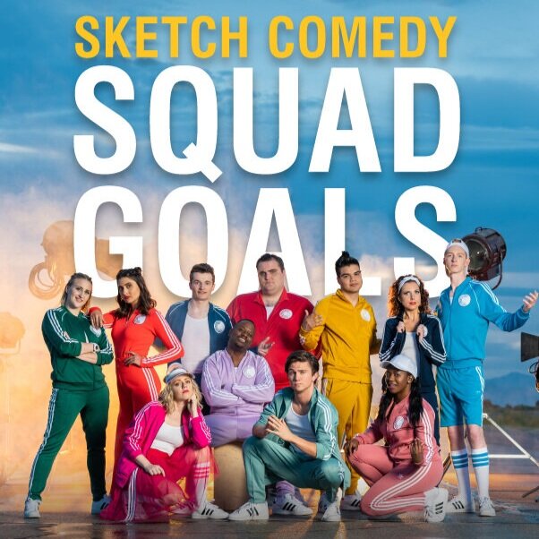
Season 13 Marketing Photography (Art Direction)
Photography: Mark Owens
Children’s Theatre Branding
Overview
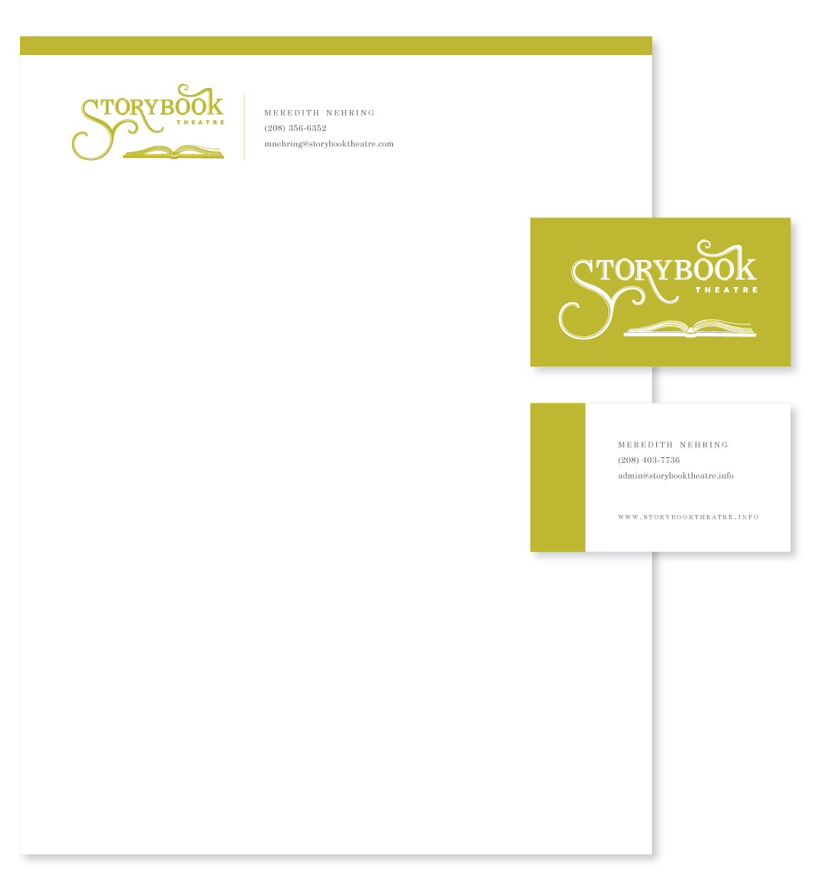
This freelance project came through a client launching an after-school children’s theatre program. She gave me creative freedom to explore concepts and bring her vision to life.
Role
Concept Development, Logo Design, Deliverable Packaging
The Challenge
The goal was to create a logo that struck a balance between tradition and youthfulness—something whimsical and playful, but still refined and professional.
The Solution
I began with hand-drawn sketches and presented several concepts over a few revision rounds. To capture the desired tone, I chose bright, saturated colors with a sophisticated edge—steering away from a look that felt too juvenile or “primary.”
The client loved the concept of an open storybook with elements from each production popping out in a paper-cutout style. For their first show, Charlie and the Chocolate Factory, I designed a custom visual featuring the iconic Wonka hat and factory emerging from the book’s pages.
The Impact
The final branding was used across the program’s promotional materials, including business cards and show flyers. The client was thrilled with the result, and the design helped establish a distinctive, story-driven identity for the program from day one.

Visual Identity for
Melaleuca’s Wellness Insider Article Series
Overview:
I developed a cohesive visual style for the Wellness Insider article series featured in Melaleuca’s Leadership in Action magazine. The objective was to create a distinctive and engaging design that would grab reader’s attention and align with the magazine's overall aesthetic of professionalism.
My Role:
Concept development, art direction, layout design, and typographic styling.
The Challenge:
The Wellness Insider series required a unique visual identity that could be consistently applied across various health topics. The design needed to capture readers' attention while maintaining clarity and professionalism.
The Solution:
I presented three distinct design concepts, each tailored to different health themes. The selected concept (No. 3) featured a bold, eye-catching drop cap integrated into the article title, establishing a strong visual focal point. This approach provided a clean and professional look, ensuring consistency across the series while allowing flexibility for diverse content.
The Impact:
The new visual style enhanced the readability and appeal of the Wellness Insider articles, contributing to a more engaging reader experience. It also provided a template for future articles, streamlining the design process and maintaining brand consistency.
Final Concept Designs for October, November, and December 2024

Glow-in-the-Dark Constellation Card Set
Overview:
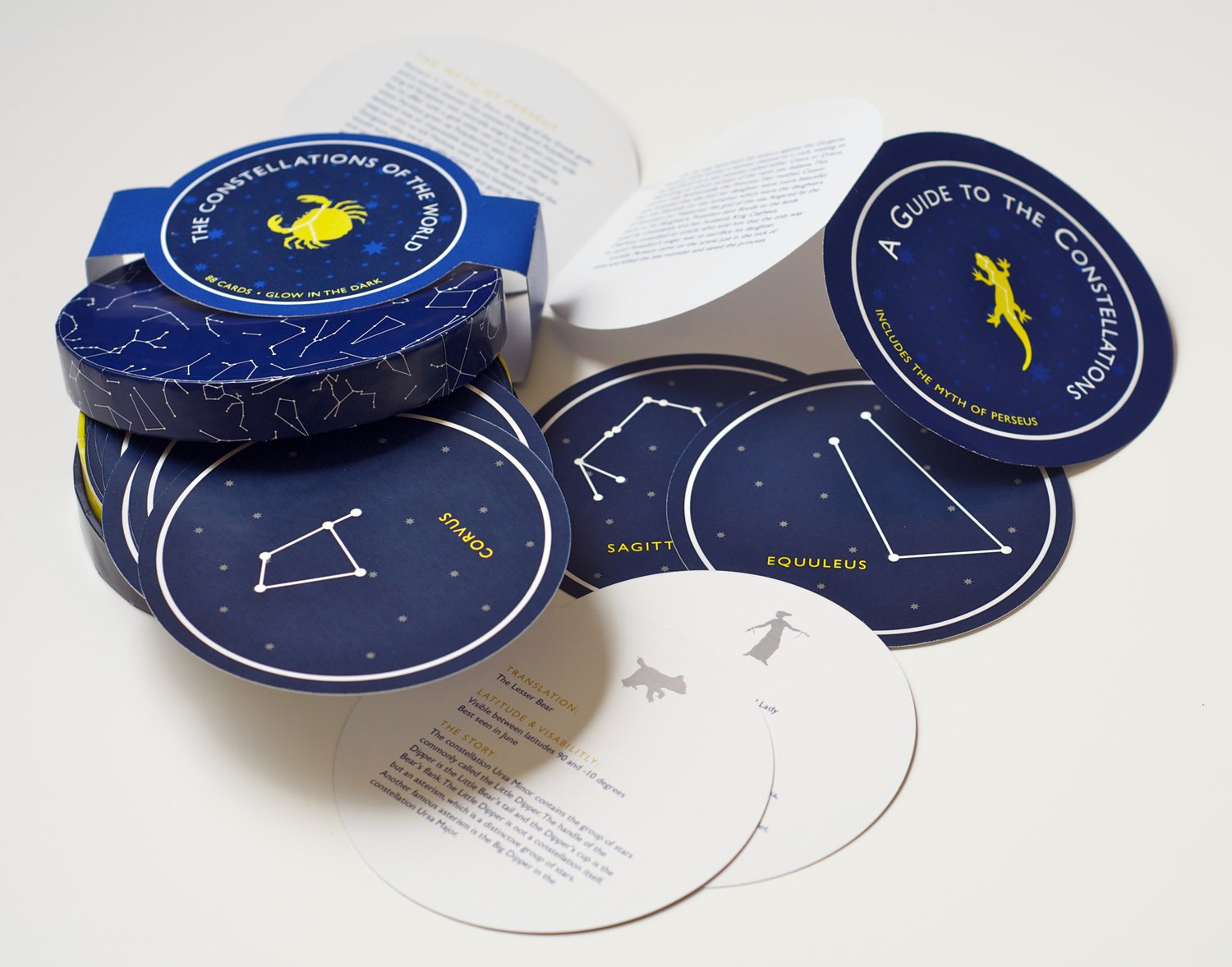
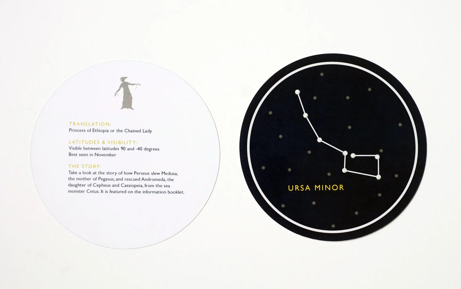
What began as a simple 50-card assignment turned into a glowing, celestial deep-dive. I created an 88-piece card set inspired by the constellations—each designed to mimic the experience of stargazing through a telescope.
My Role:
Concept development, illustration, specialty production
The Challenge:
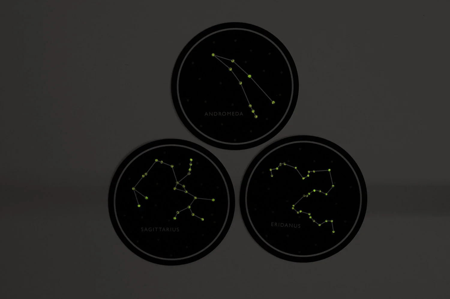
The original brief called for 50 rectangular cards, but I knew constellations belonged in circles—like the view through a telescope. I pitched the idea of a circular format, and it was approved. That’s when the real challenge began. Finding a die-cutter that could reliably handle circles in small-town Idaho? Nearly impossible. After testing multiple tools (and testing my patience), I finally found one that produced clean, consistent cuts. Thank you, Martha Stewart. The packaging wasn’t any easier—I custom-built a circular box, then wrapped it in sticker paper to give it a polished, professional look. And yes, I hand-painted every single dot with glow-in-the-dark paint. Because if you're making constellation cards… they have to glow.
The Solution:
I expanded the project to feature all 88 officially recognized constellations. Each card was carefully designed, cut into a circular format, and finished with a touch of glow-in-the-dark paint to bring the stars to life—even indoors.
The Impact:
A class project turned into an immersive experience. The cards were a standout piece in the program, with both peers and faculty praising the ambitious scope, tactile presentation, and creative problem-solving behind the glowing, galactic design. I later went on to receive a BYU-Idaho art department design award for this particular project.

Christmas Jars Key Art
Overview
BYUtv produced a movie adaptation of the New York Times bestseller Christmas Jars, and needed key art to support its marketing campaign. The artwork would be used across promotional channels, including movie posters, DVD packaging, and a limited-edition book cover.
Role
Concept Development, Art Direction, Presentation Design
The Challenge
The visual direction needed to blend the enchantment of Christmas with the emotional heart of the story. Key themes included warmth, generosity, and a central symbol—a jar of coins. The challenge was creating an image that felt magical and heartfelt without leaning too heavily into cliché.
The Solution
I concepted an image of red mittens gently cupping a jar of coins, subtly forming the shape of a heart. The jar was backlit with soft fairy lights, while a blurred background of warm, glowing bokeh added a touch of holiday magic. The composition conveyed intimacy and wonder in a grounded, cinematic way.
The Impact
The final artwork was used across multiple platforms—including movie posters for special screenings, DVD packaging sold at Walmart and Deseret Book, and a custom book cover for promotional release. It successfully captured the emotional core of the film and served as a visual anchor for the campaign.


"Lucky" Countdown Animation
Overview:
This animation project was an early exploration of the principles of motion design, built around the concept of a countdown. The goal was to create a compelling narrative using minimal tools and limited experience.
The Challenge:
Just a few weeks into learning linear animation and Adobe After Effects, I was still developing basic skills. Despite that, I set out to create something that went beyond a technical exercise—I wanted to tell a story.
The Solution:
With limited proficiency in After Effects, I focused on timing, sound design, and selective movement. By keeping most elements static—except for the slot machine visuals—I emphasized rhythm and pacing to convey meaning and emotion.
The Impact:
The project was well received by both classmates and the instructor, praised for its effective use of space, motion, and narrative despite technical constraints. I earned an A, but more importantly, it sparked my passion for storytelling through motion—laying the foundation for my continued growth in animation and After Effects.


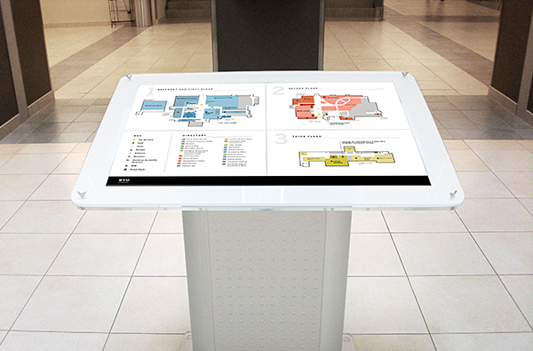
BYU-Idaho Manwaring Center Way-finding Map
Overview
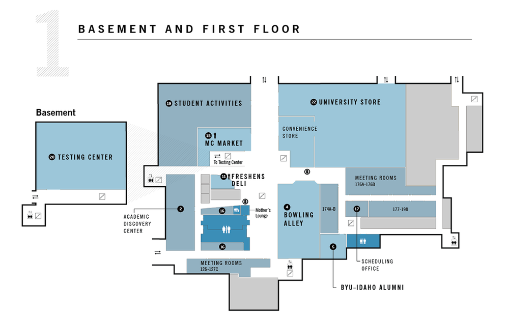
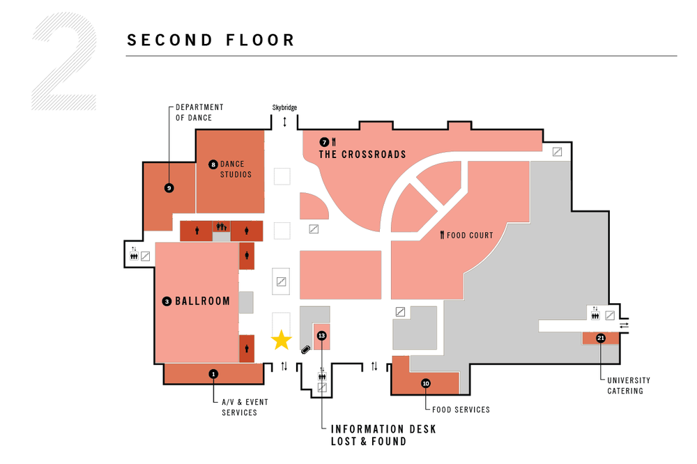
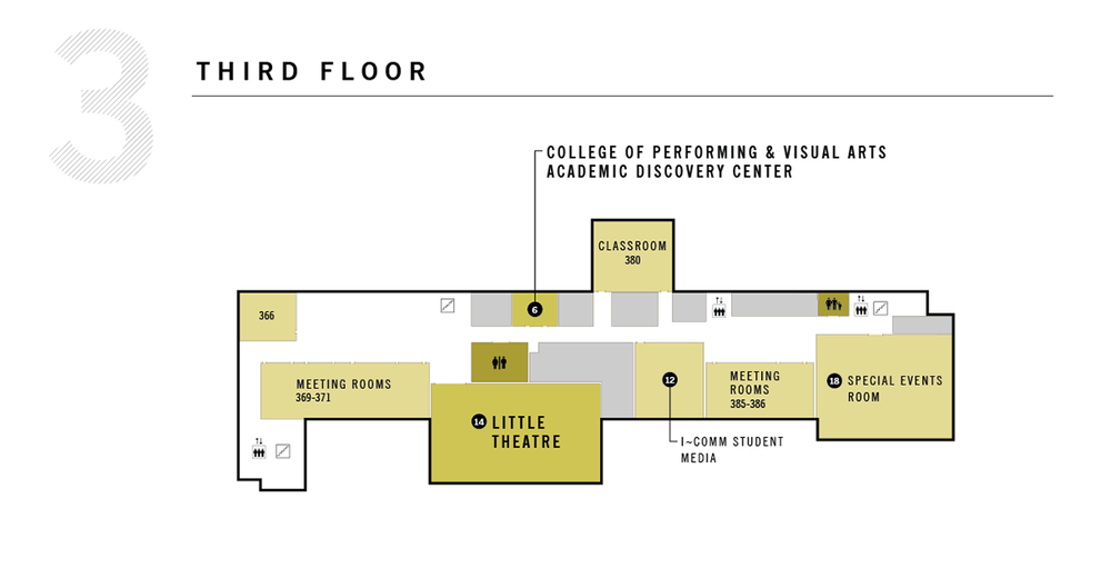
As part of the university's effort to improve campus navigation, University Communications was tasked with designing two wayfinding maps for the newly reconstructed Manwaring Center at BYU–Idaho. The goal was to create clear, intuitive visuals that would help new students and visitors easily find their way around.
Role
Lead Designer
Team
Client: BYU–Idaho
Art Direction: Tony Carpenter
Additional Concept Development: Adrian Walsh
Deliverables
Wayfinding maps, iconography, spatial layout design
Approach
To ensure accuracy and usability, I made several on-site visits to explore the building’s layout—mapping every corner, hallway, and hidden nook. Drawing inspiration from airport signage systems and mall directories, I developed a simplified, easy-to-read visual language that aligned with the university's branding and served a highly practical purpose.
Outcome
The final maps were installed just before that semester’s graduation ceremony and continue to serve as helpful guides for thousands of students and campus guests. The project combined thoughtful user experience design with clean, functional visuals—turning a complex building layout into something approachable and accessible.

BYU Broadcasting’s
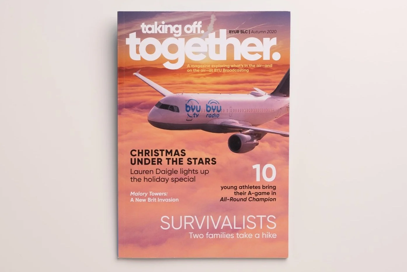
first annual Together Magazine
Overview:
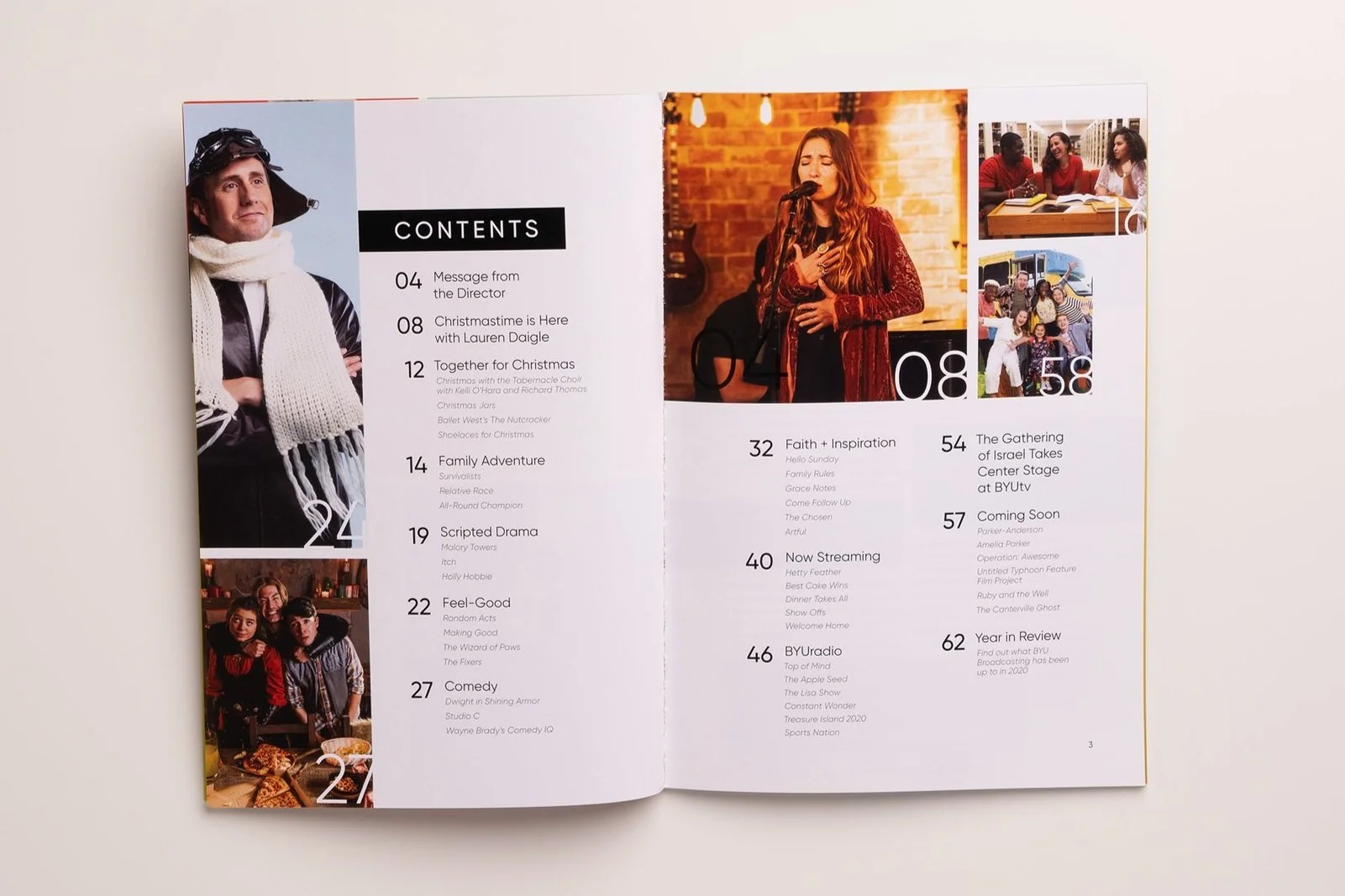
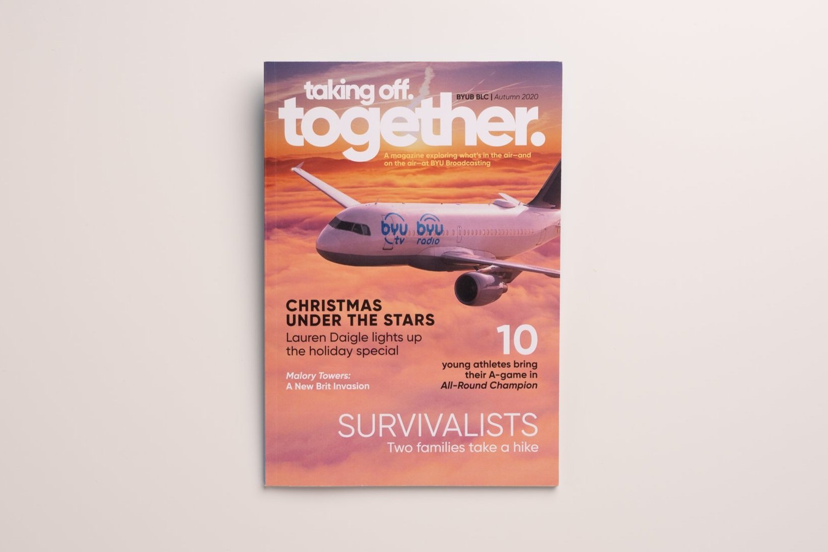
Each fall, BYU Broadcasting hosts an annual donor meeting to showcase the impact of supporter contributions. But in 2020, with in-person events off the table due to COVID-19, the traditional gala experience had to be reimagined. We wanted donors to feel as if they were en route to visit us—so the theme? Taking off, together.
My Role:
Concept development, editorial strategy, art direction, magazine layout design, custom mockups, visual storytelling.
The Challenge:
How do you deliver a memorable, meaningful experience to major donors—without the event? We needed a creative way to say thank you, showcase the network’s achievements, and preserve the spirit of the annual gala during a time when gathering wasn’t possible. As part of their “thank you” gift from the network, we included an in-flight magazine, Together.
The Solution:
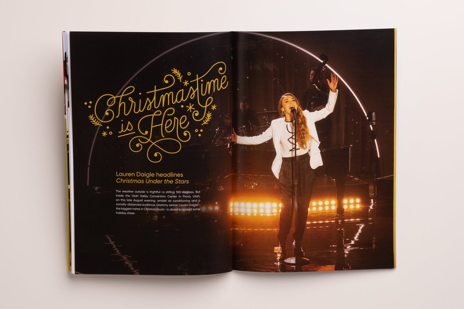
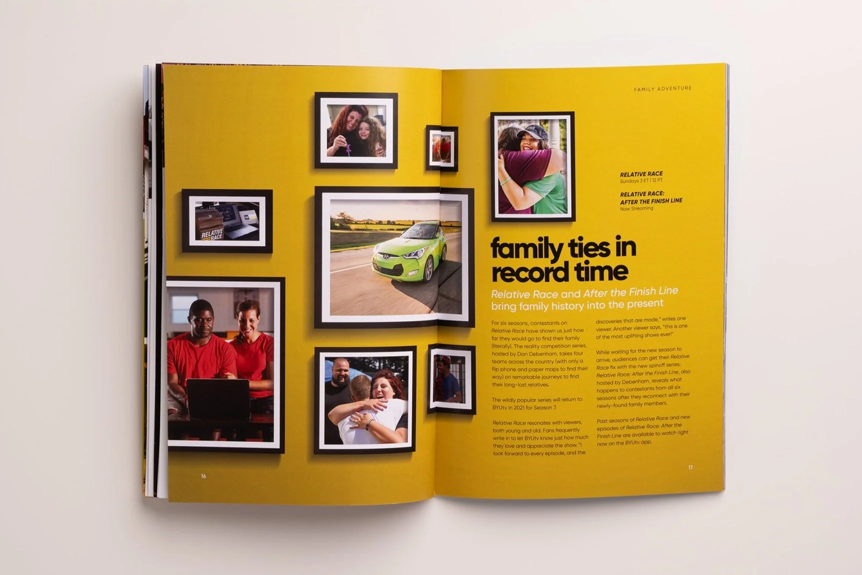
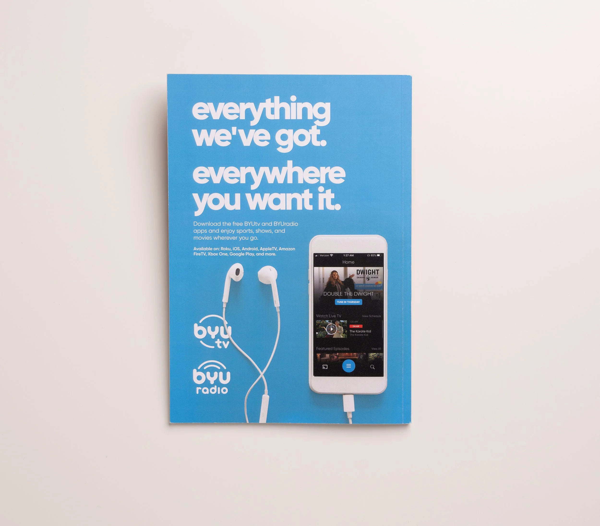
I pitched and prototyped Together, a print piece modeled after an in-flight entertainment magazine. It blended storytelling, programming highlights, and organizational vision into an immersive, tactile experience—making donors feel like valued passengers on a shared journey. Writing credit goes to Scott Champion.
The Impact:
The magazine was a hit—earning high praise from both donors and BYU Broadcasting leadership. What began as a one-time solution became a new tradition: Together is now produced annually as the official publication for BYU Broadcasting’s vision and outreach, continuing to build connection long after the 2020 pivot.
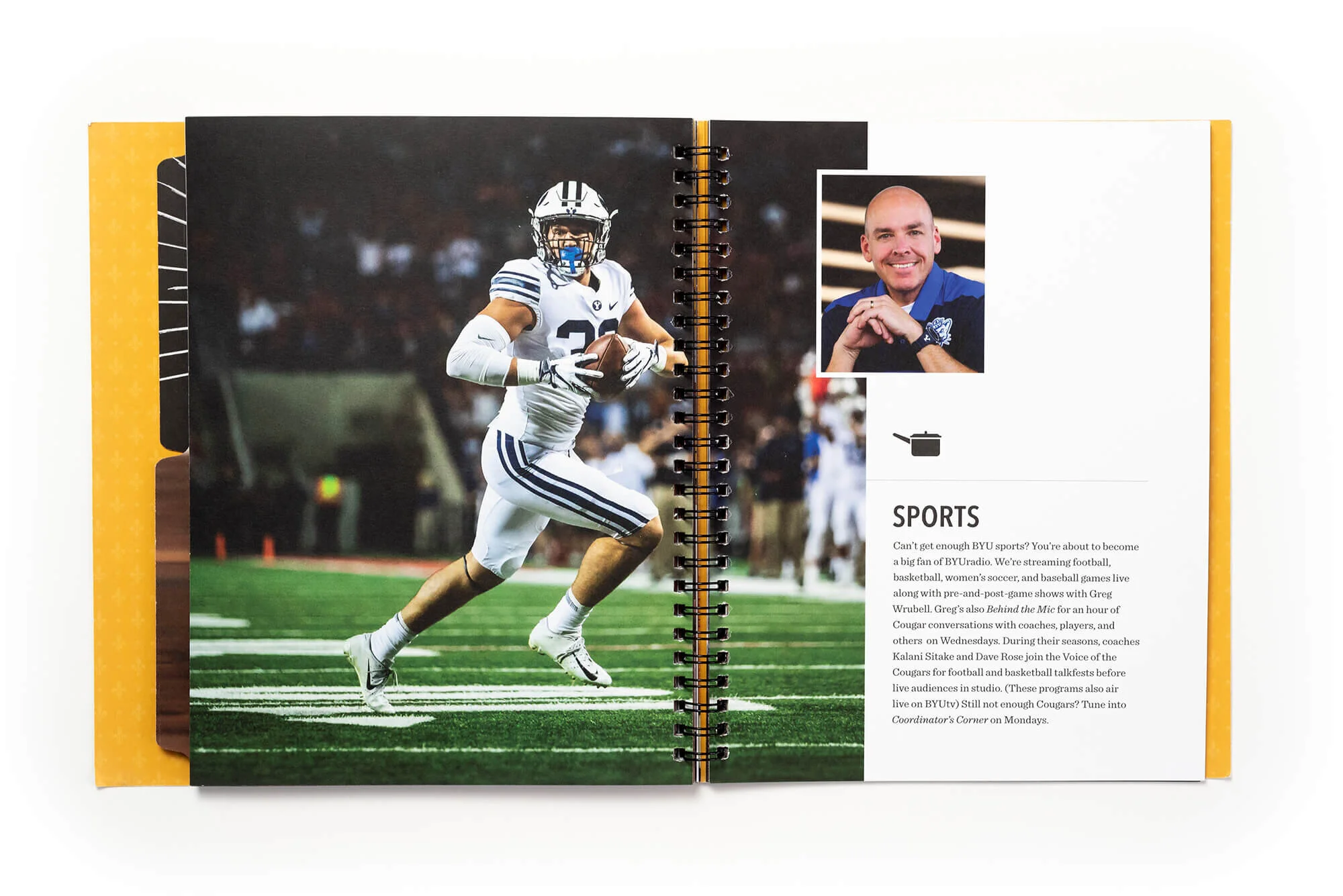
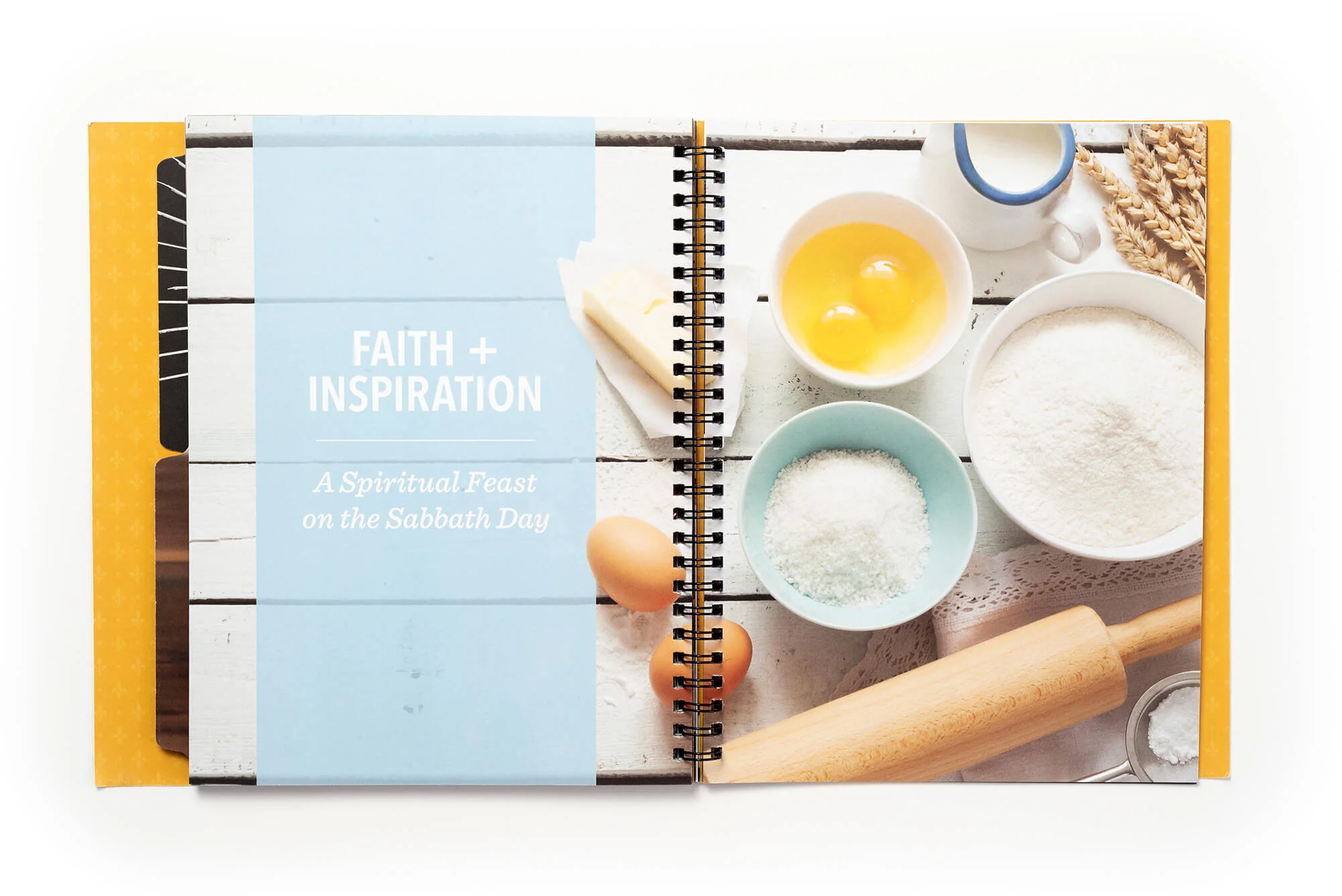
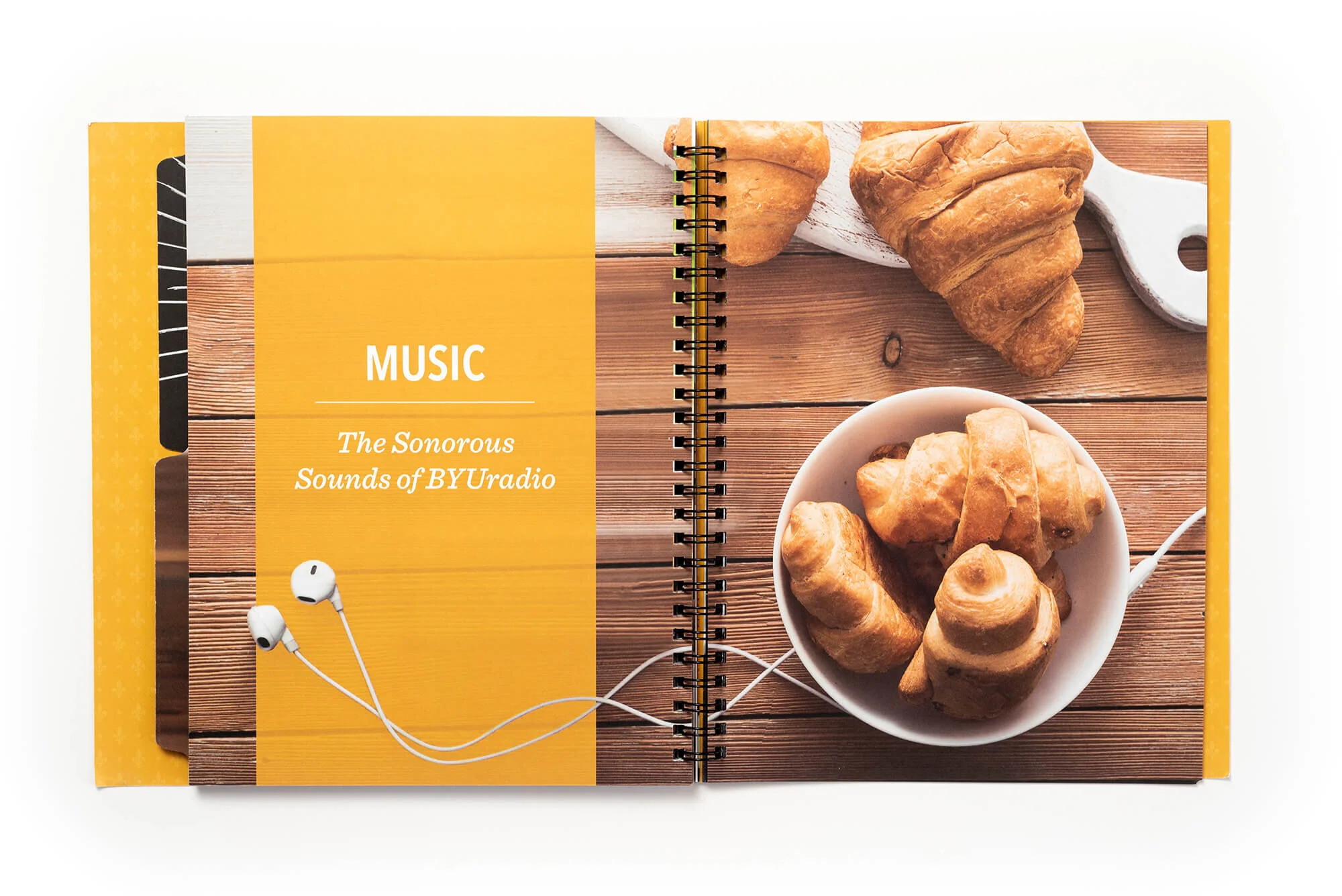
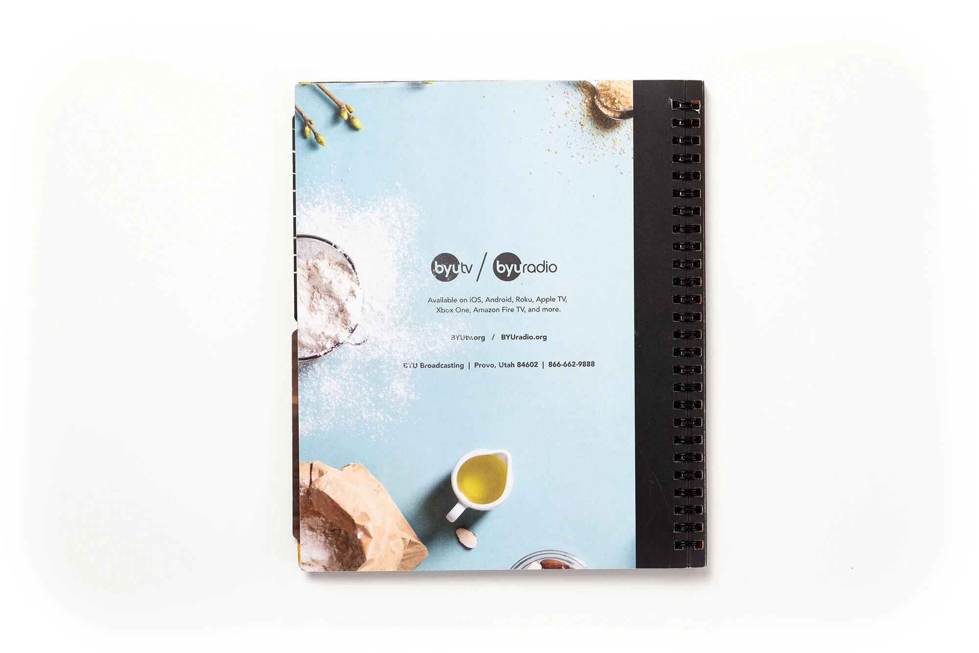
BYU Broadcasting 2019 Annual Report
Overview:
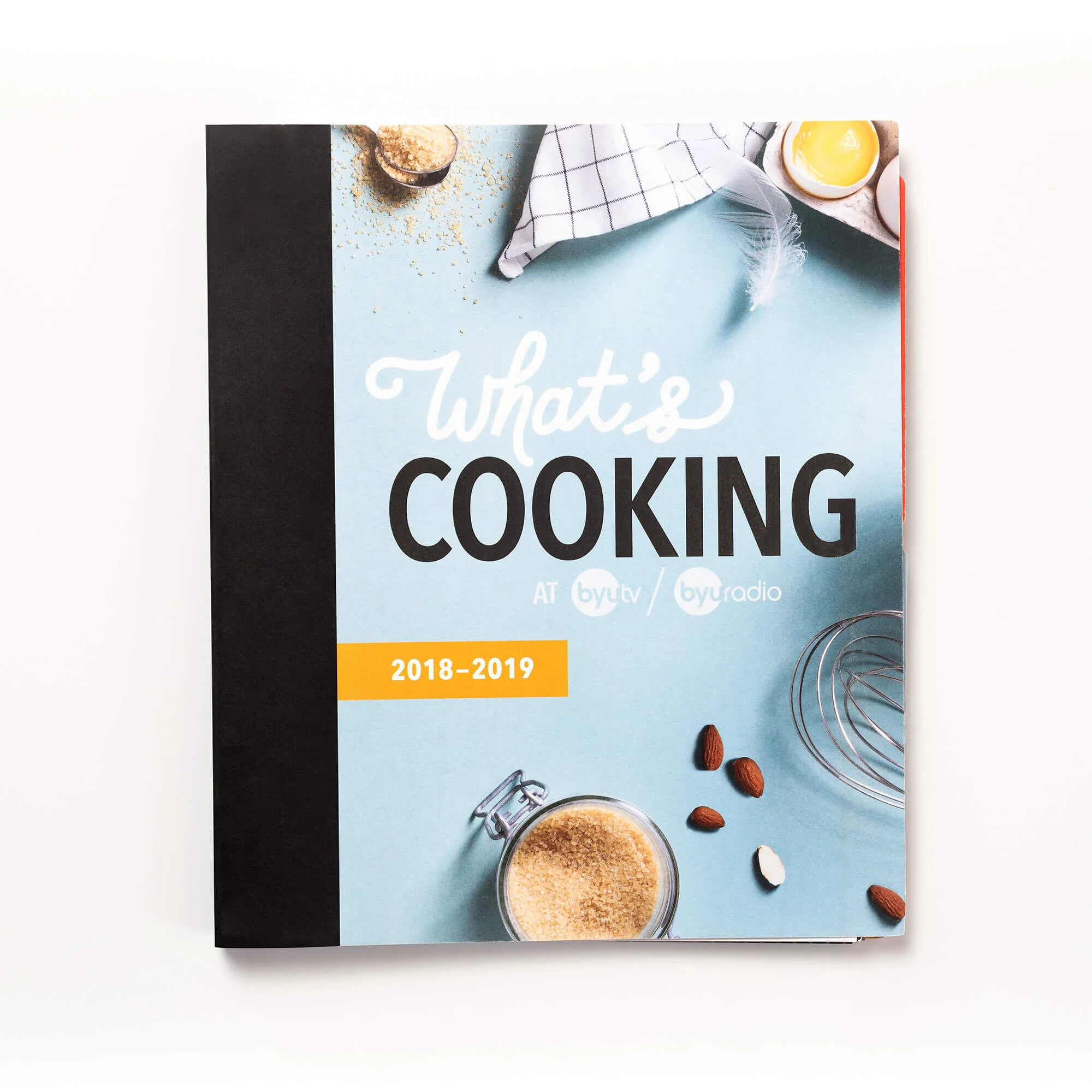
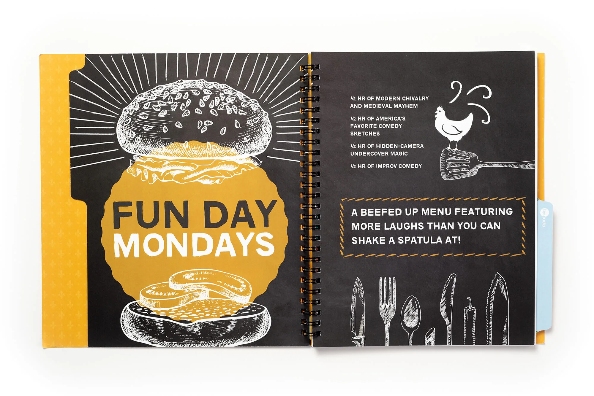
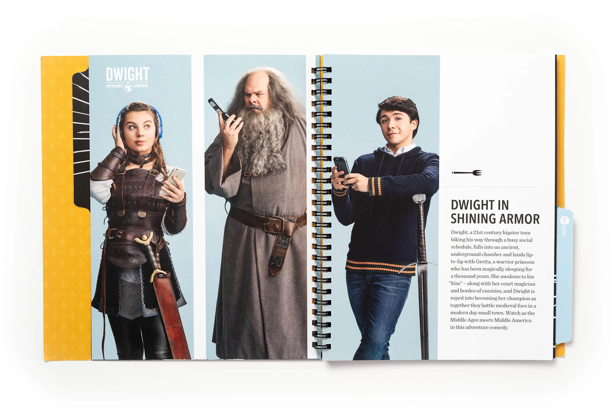
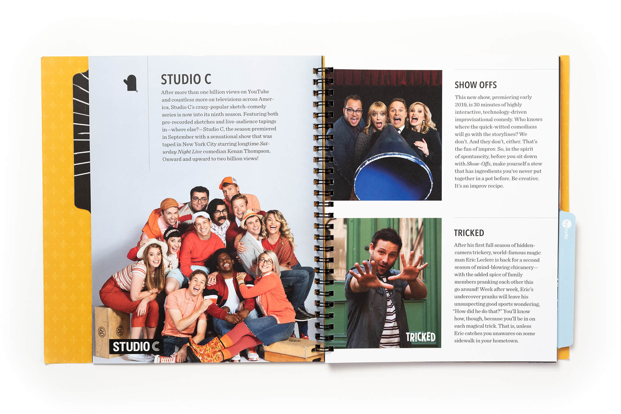
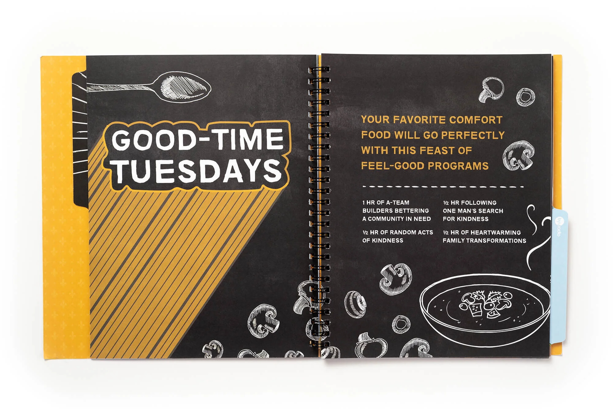
For BYU Broadcasting’s annual report, I flipped the script on the usual corporate format—creating a culinary-themed visual concept that dished out data with flavor and style.
My Role:
Concept development, editorial layout, graphic design, data visualization, production prep.
The Challenge:
BYU Broadcasting needed to present its yearly accomplishments to stakeholders in a way that would actually get read—without falling into the forgettable, stats-on-a-page trap.
The Solution:
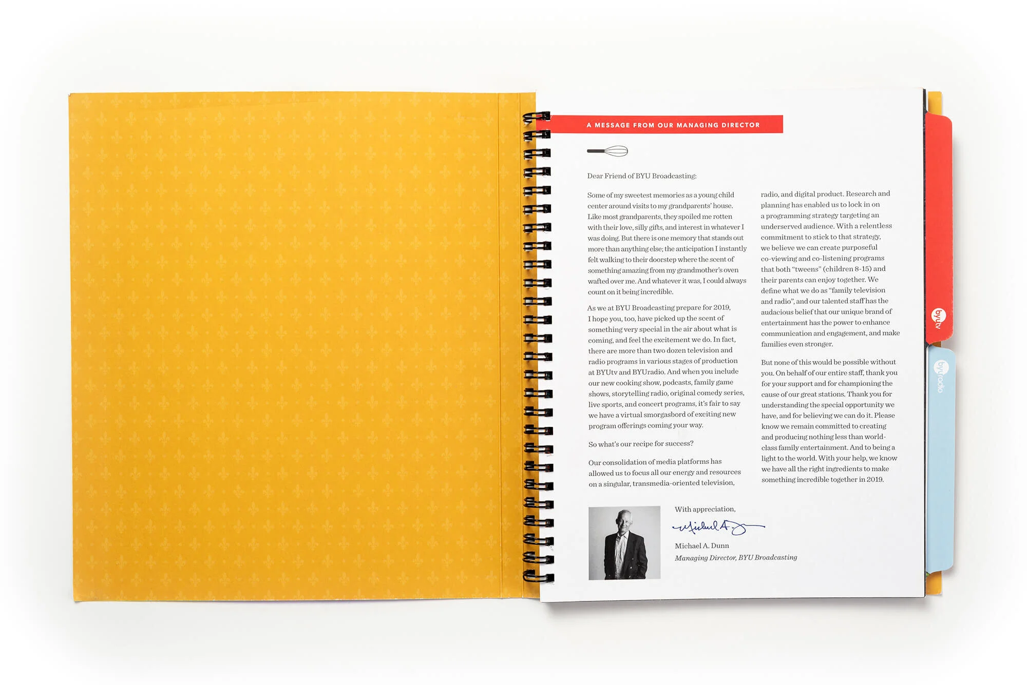
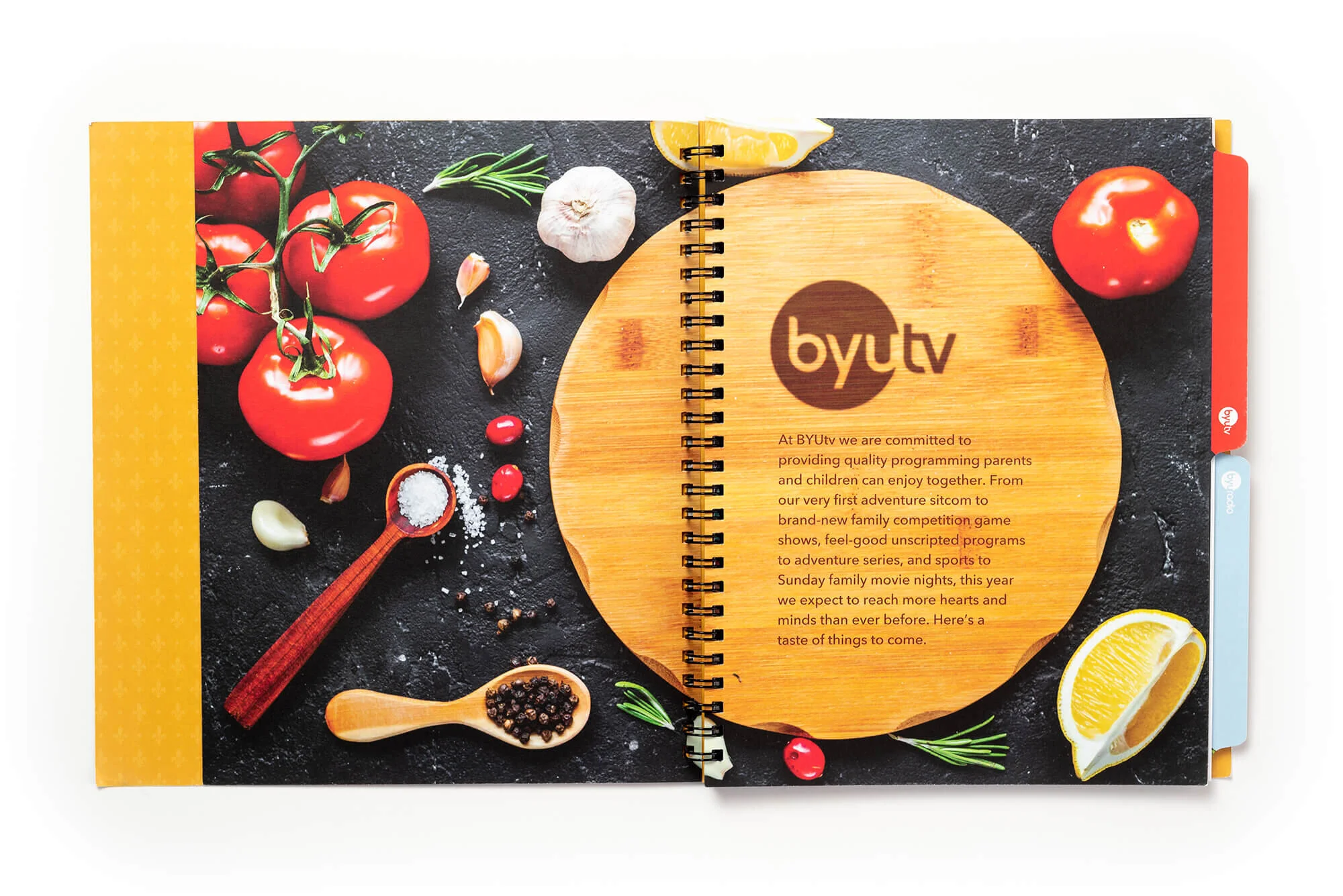
I developed the What’s Cooking? theme to mirror the network’s growing creative output (especially with its latest family competition series Dinner Takes All) and appetite for fresh ideas. From cover to final page, each section was styled like a gourmet cookbook: clever section headers, playful illustrations, and digestible infographics made performance metrics feel like ingredients in a success recipe.
The Impact:
This creative approach not only made the report more engaging but positioned the organization as both strategic and imaginative. It became a reference piece for future reports and internal storytelling—and directly led to a performance bonus in recognition of its excellence.
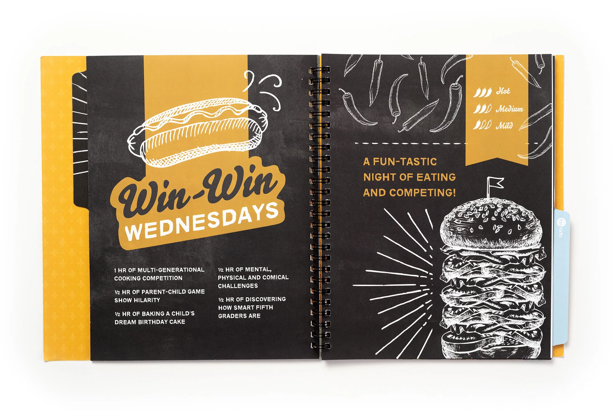
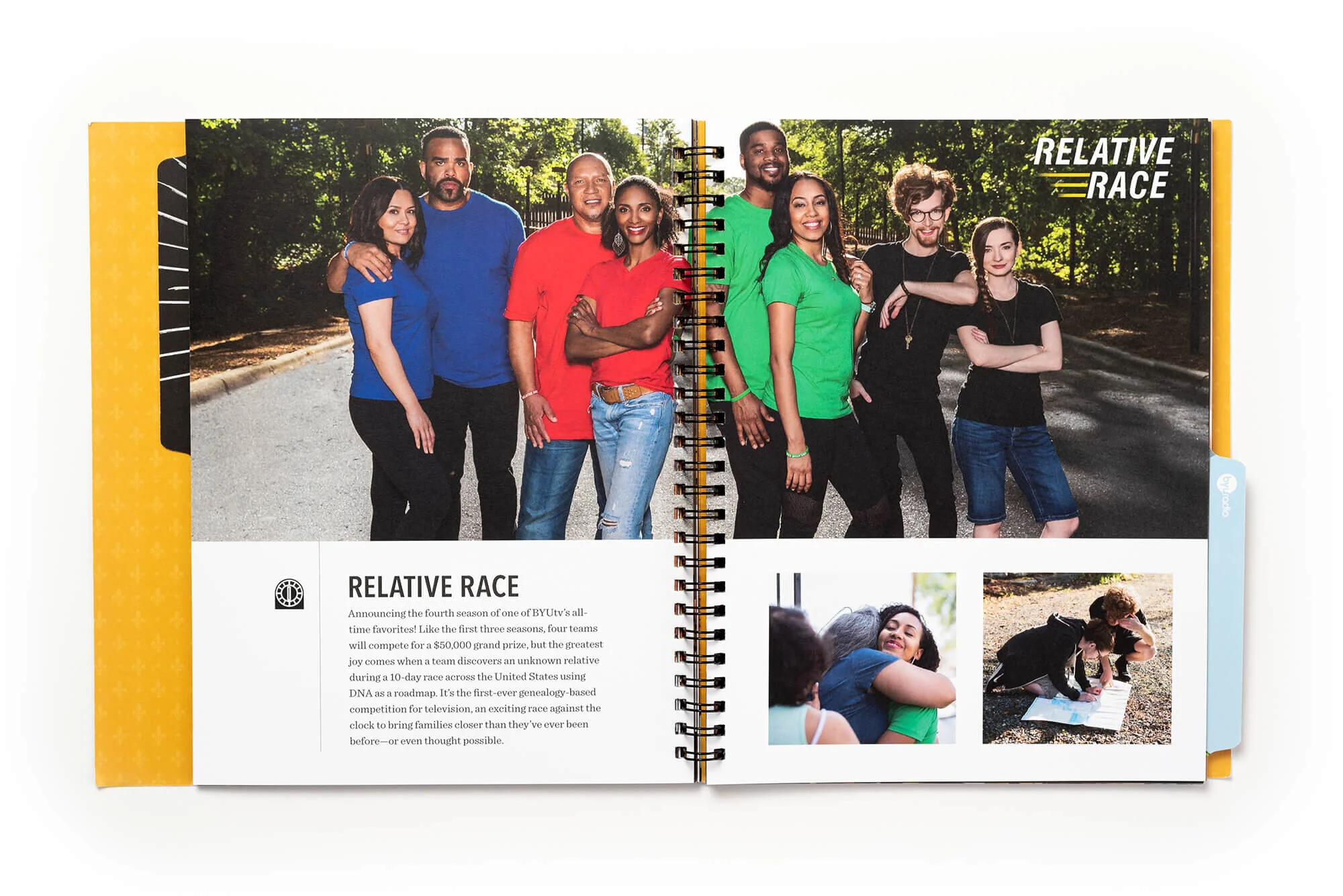
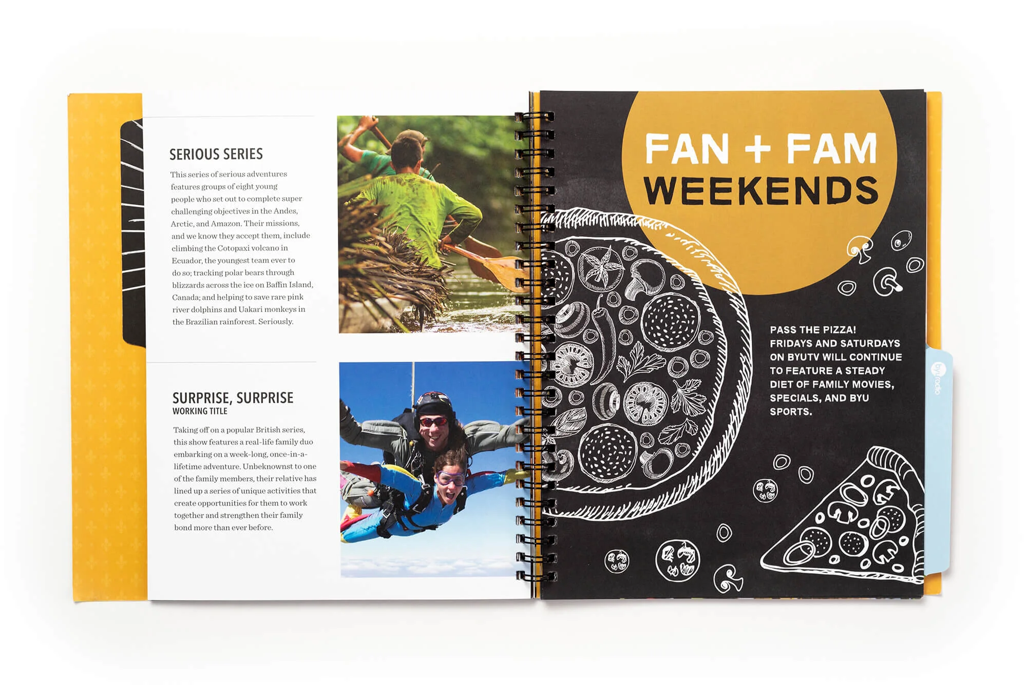
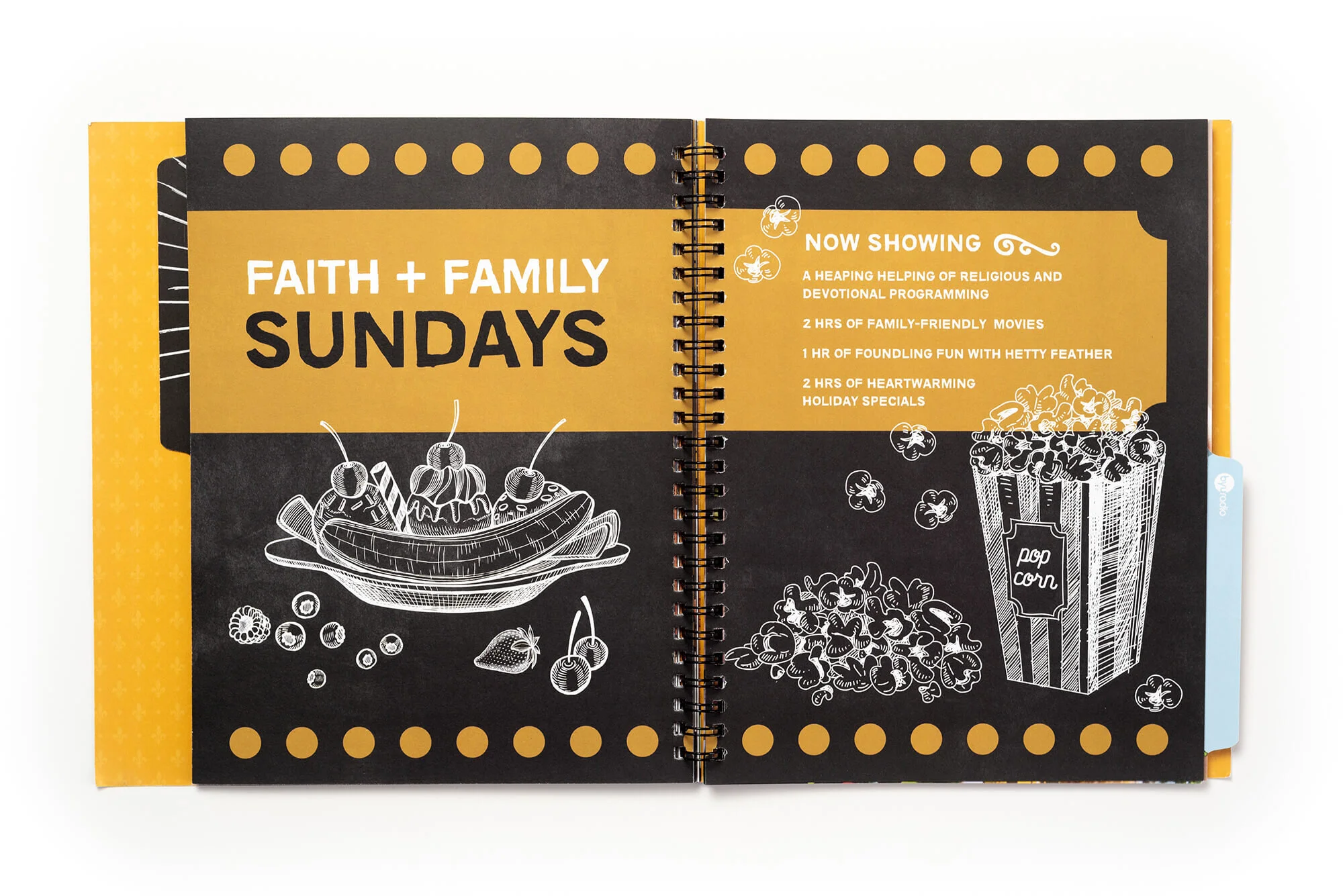

Relative Race Ancestor Profile
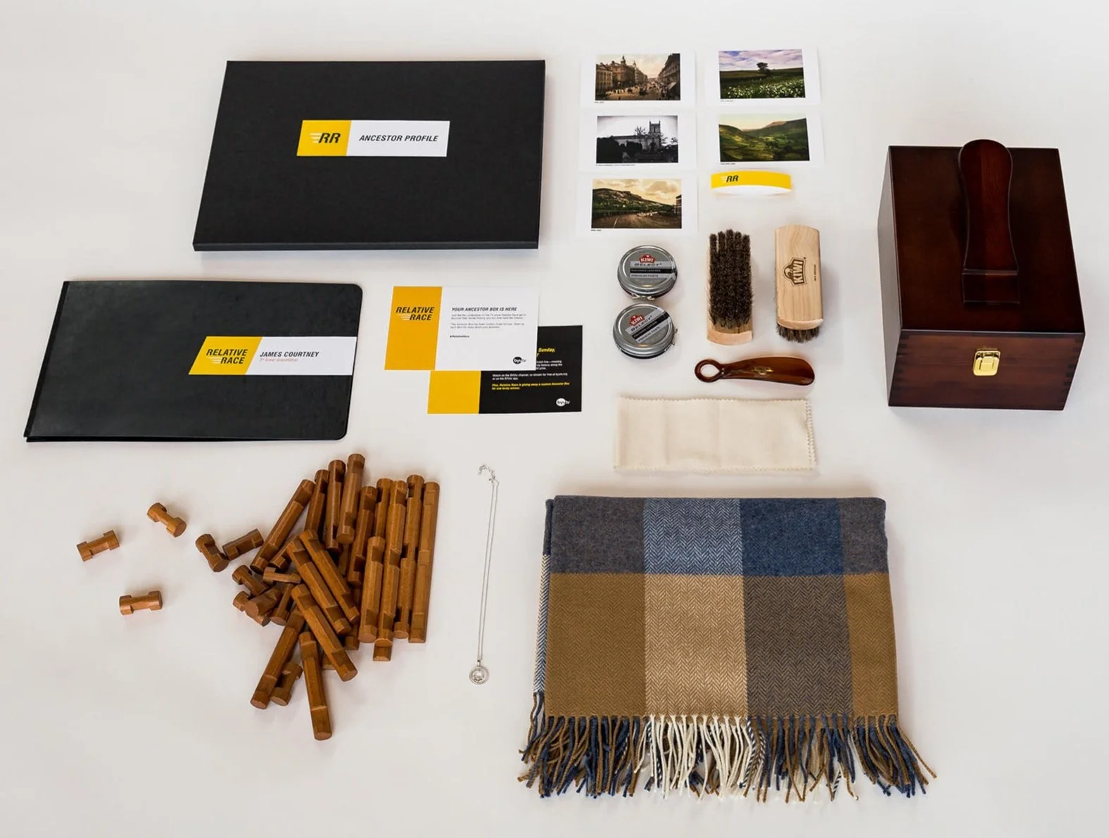
Relative Race Ancestor Profile
Overview
To generate buzz for a new season of Relative Race—BYUtv’s family-finding, race-against-the-clock reality series—we created custom “Ancestor Profile” kits for social media influencers. Each kit offered a deeply personal and shareable experience designed to connect the influencer with their own family history, while organically promoting the show.
Role
Concept Development, Print Design, Packaging Experience, Printing Coordination
Team
Copy: Sara Nelson, Rickey Sanford
Design: Angie Steggell, Adrian Walsh
The Challenge
We needed to create something highly customized and emotionally resonant, while coordinating with genealogists, managing variable content, and ensuring the unboxing experience would translate well on social media.
The Solution
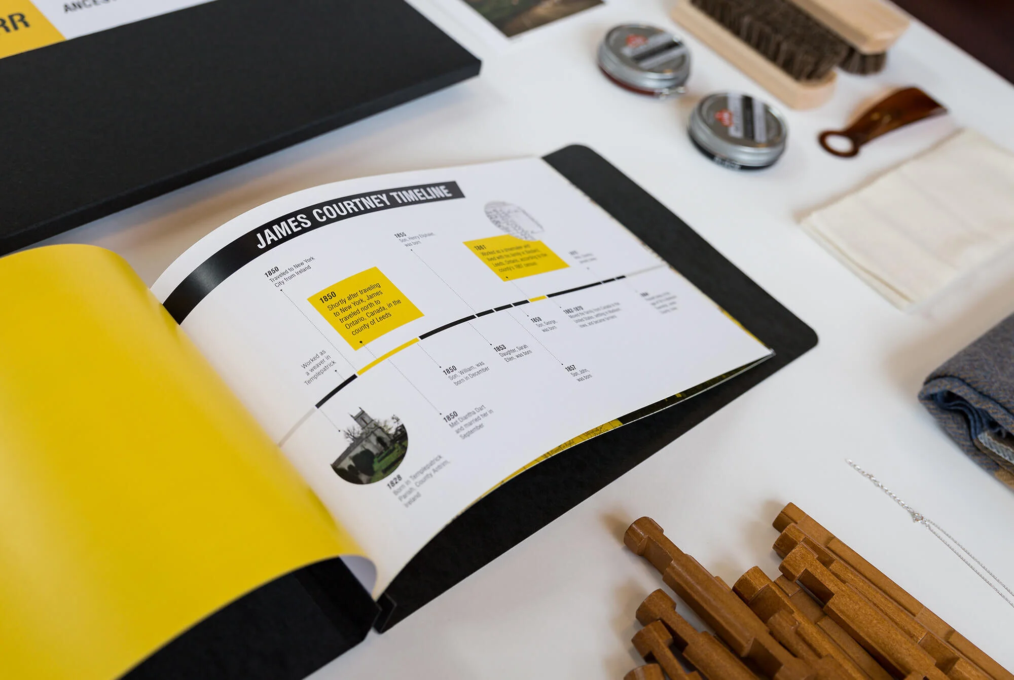
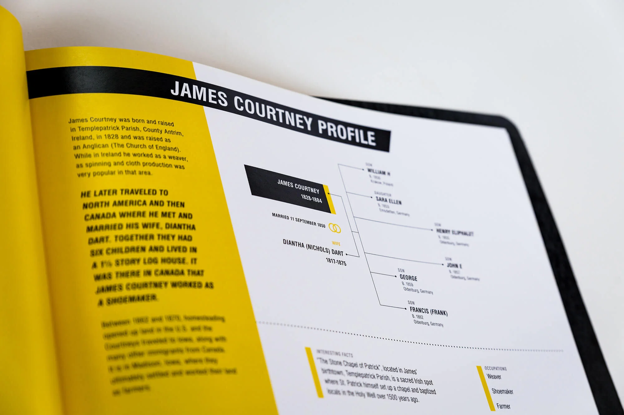
After receiving family tree data from participating influencers and partnering genealogists, we designed an immersive kit centered around their unique ancestor. Each profile included a custom folio with a life story narrative, personal timeline, historical documents (newspaper clippings, obituaries, maps), and photos. To enhance the tactile experience, we added high-quality keepsake clues—objects that represented who their ancestor was, where they came from, and what they did.
The Impact
The kits sparked meaningful engagement, with influencers sharing emotional, personalized unboxings across platforms. The campaign helped broaden Relative Race’s reach through authentic storytelling and strengthened the show's connection to its core themes: family, identity, and discovery.

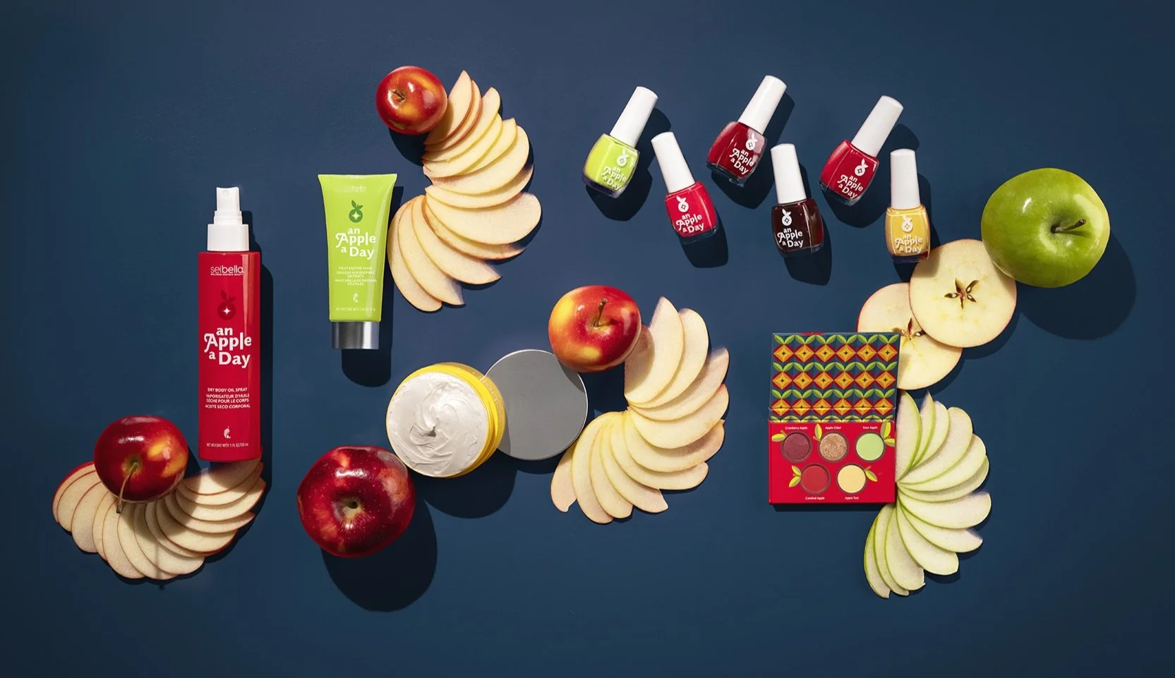
Melaleuca “An apple a day” LTO Packaging Concepts
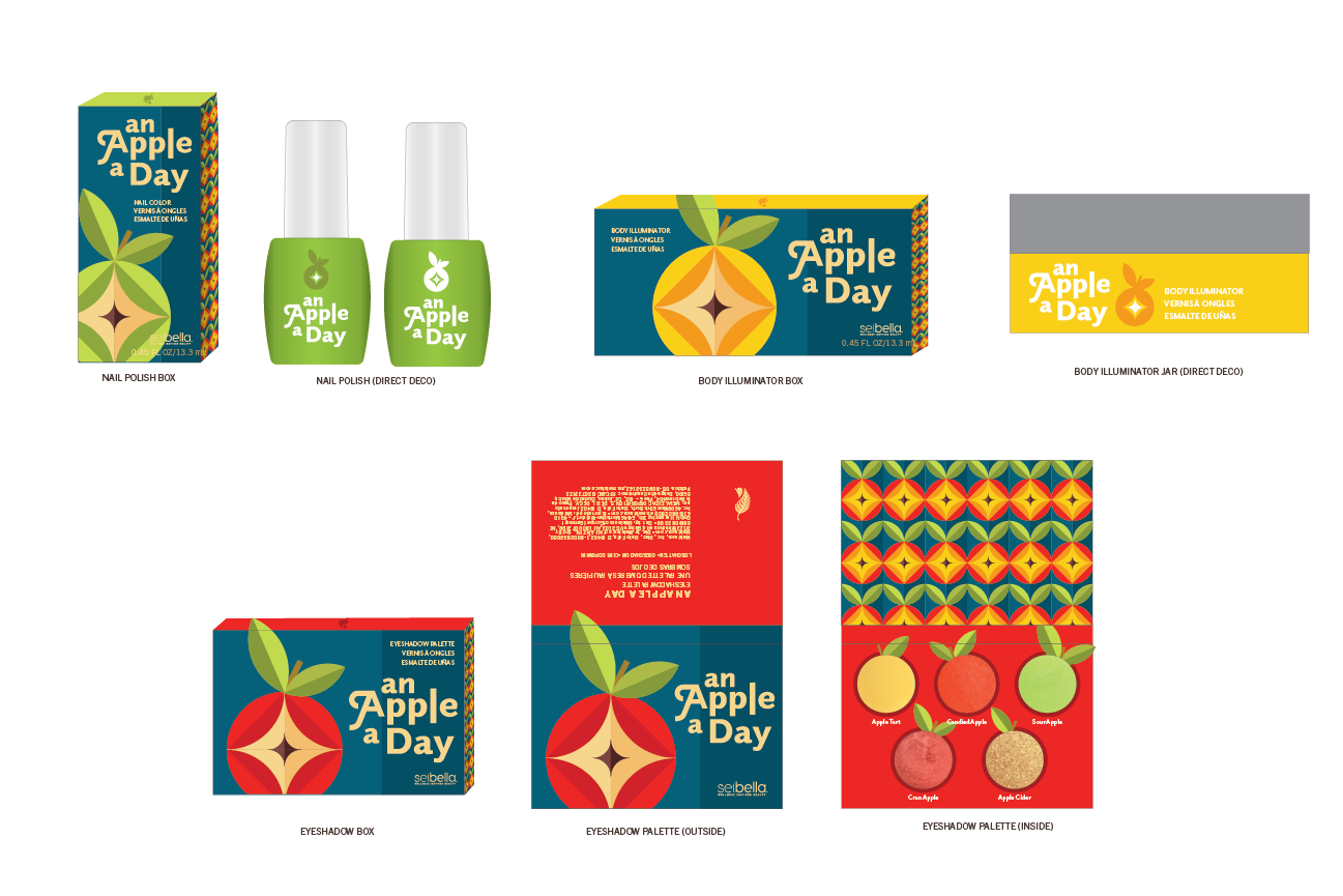
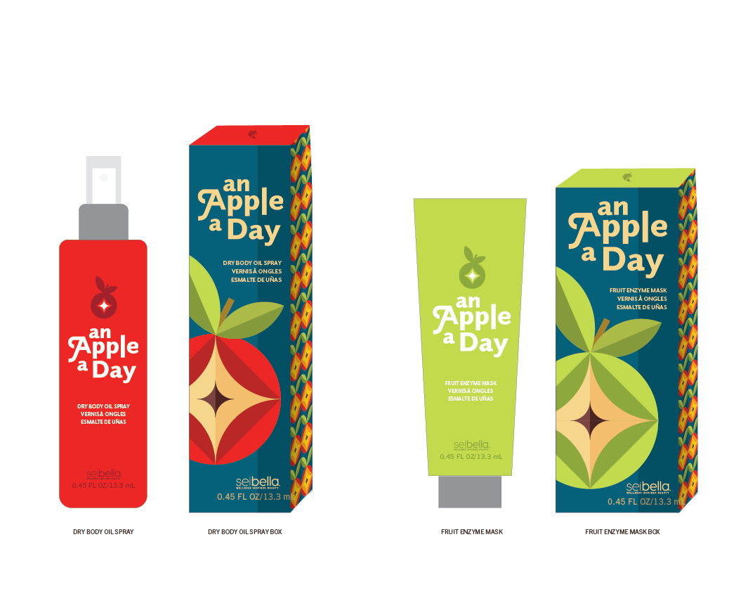
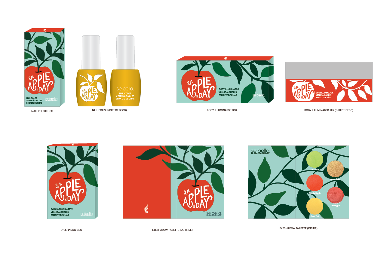
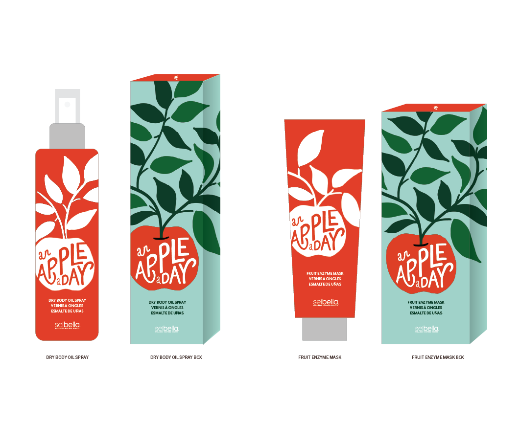
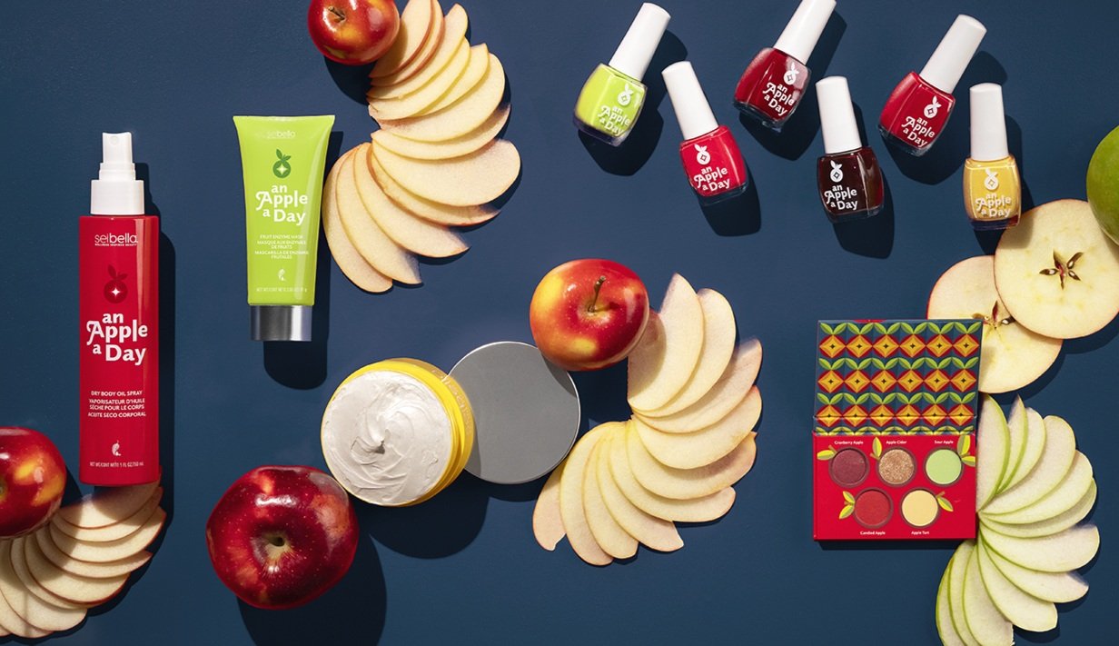
Every spring and fall Melaleuca’s beauty brand, Sei Bella, puts out a Limited Time Only collection. For fall, the theme was “An Apple a Day” and the target demographic was 35-60 year-old women. The collection includes an eyeshadow palette, body illuminator, nail color, dry body oil spray, and a fruit enzyme mask. The first option was chosen for the fall 2024 LTO collection and is currently in production.
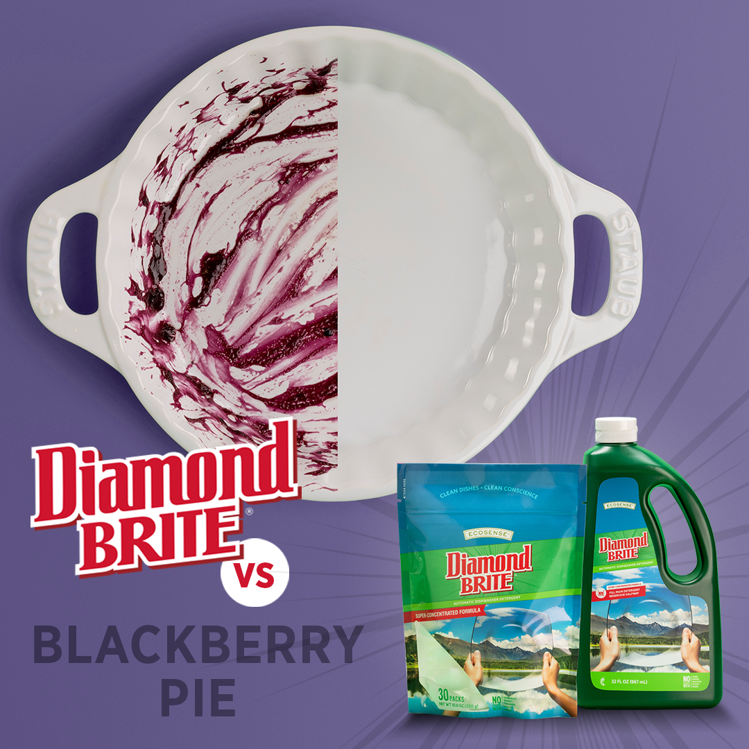
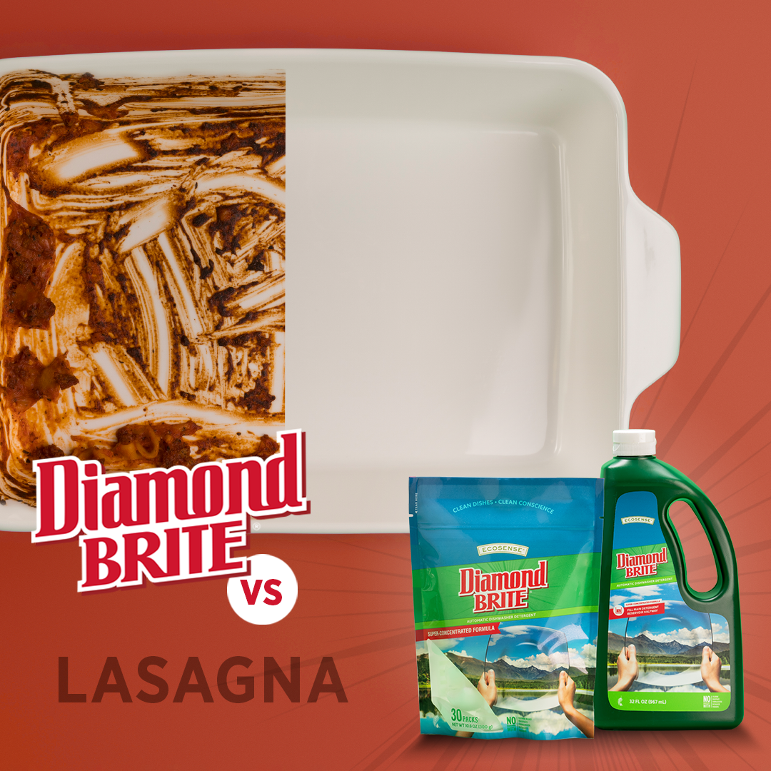
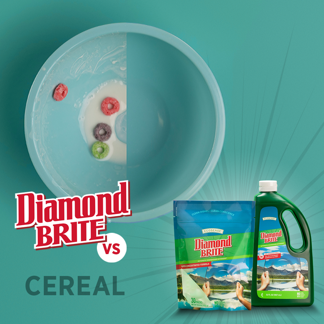
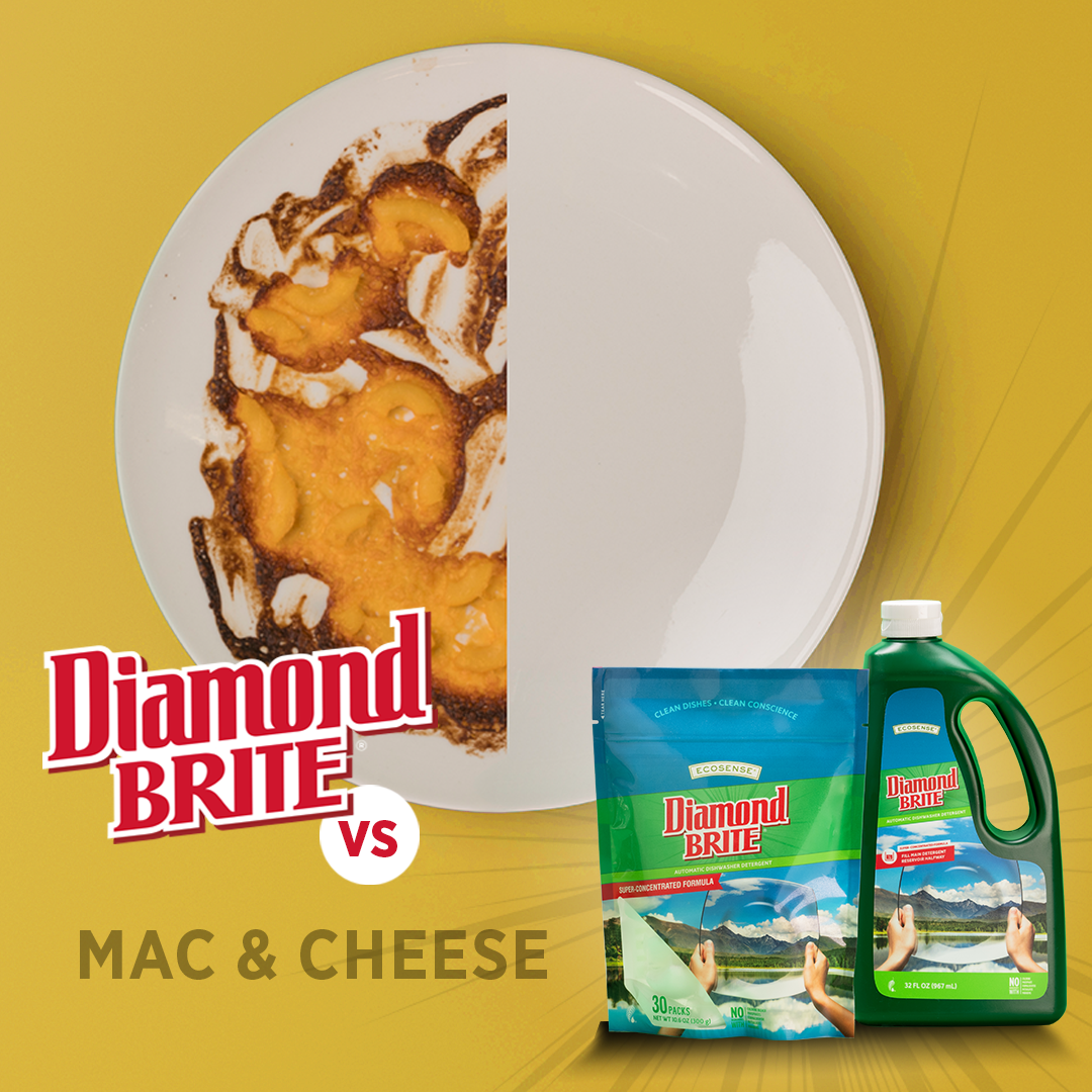
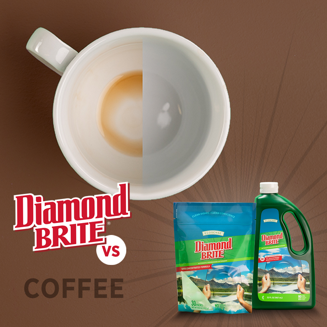
DiamondBrite Dish Detergent Social Ad Campaign
DiamondBrite, Melaleuca’s brand dish detergent, goes head-to-head with life’s hardest dish messes in this social ad campaign. Bold background colors are meant to convey a feeling of fun, playful confidence, while maintaining layout and typography across the campaign to promote consistency and recognition. The ad is challenging brand consumers to give DiamondBrite their worst and see how it handles even the toughest food and stain residue.

Convention Booth for Melaleuca
Overview
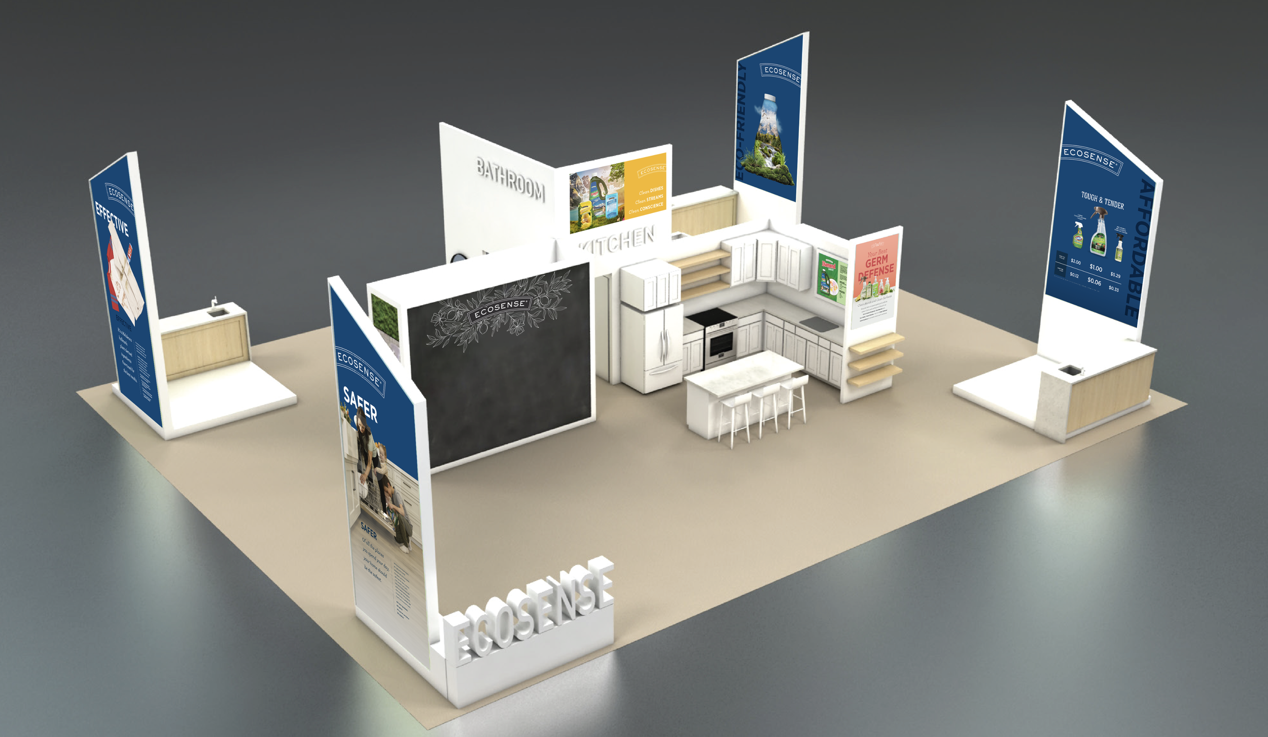
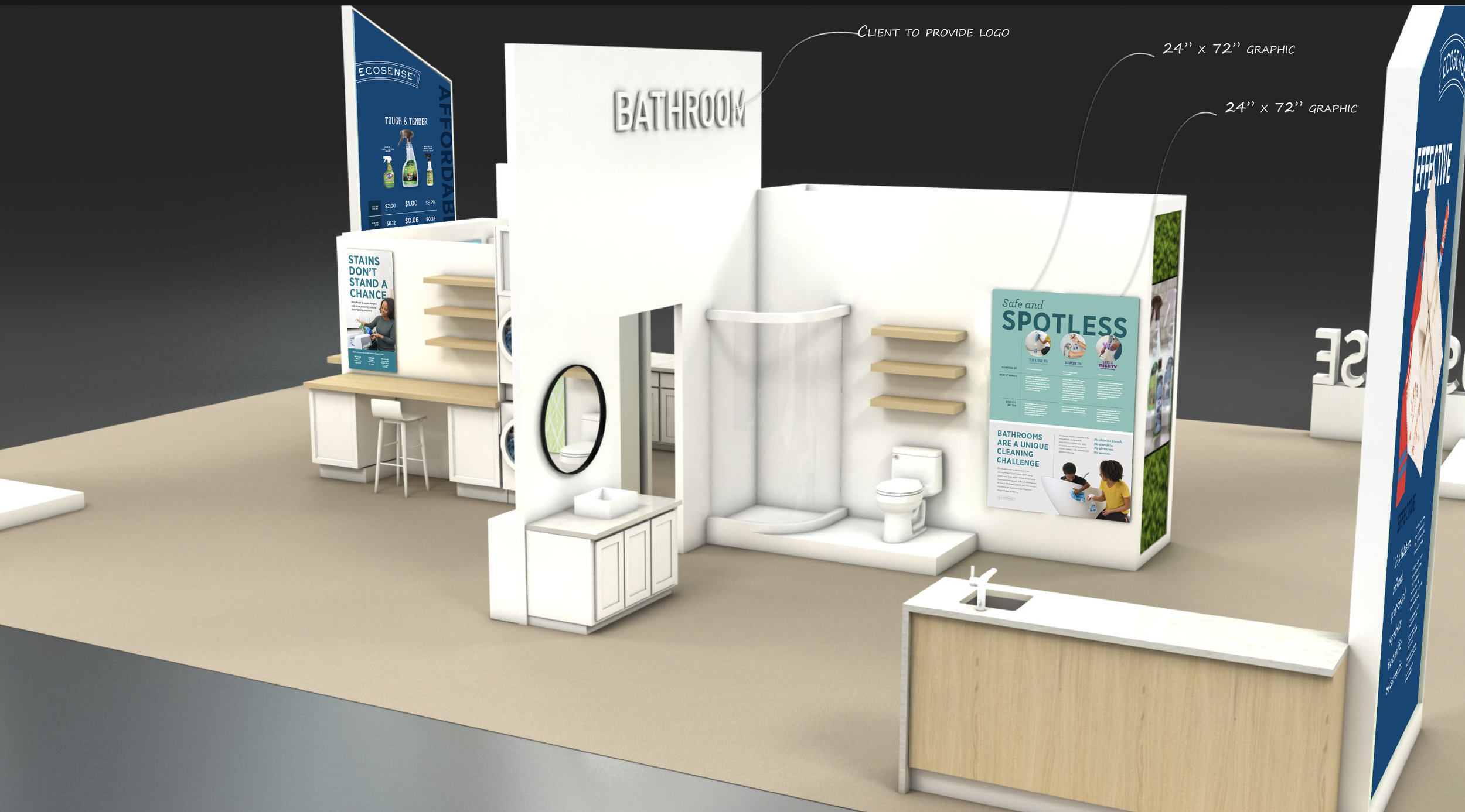
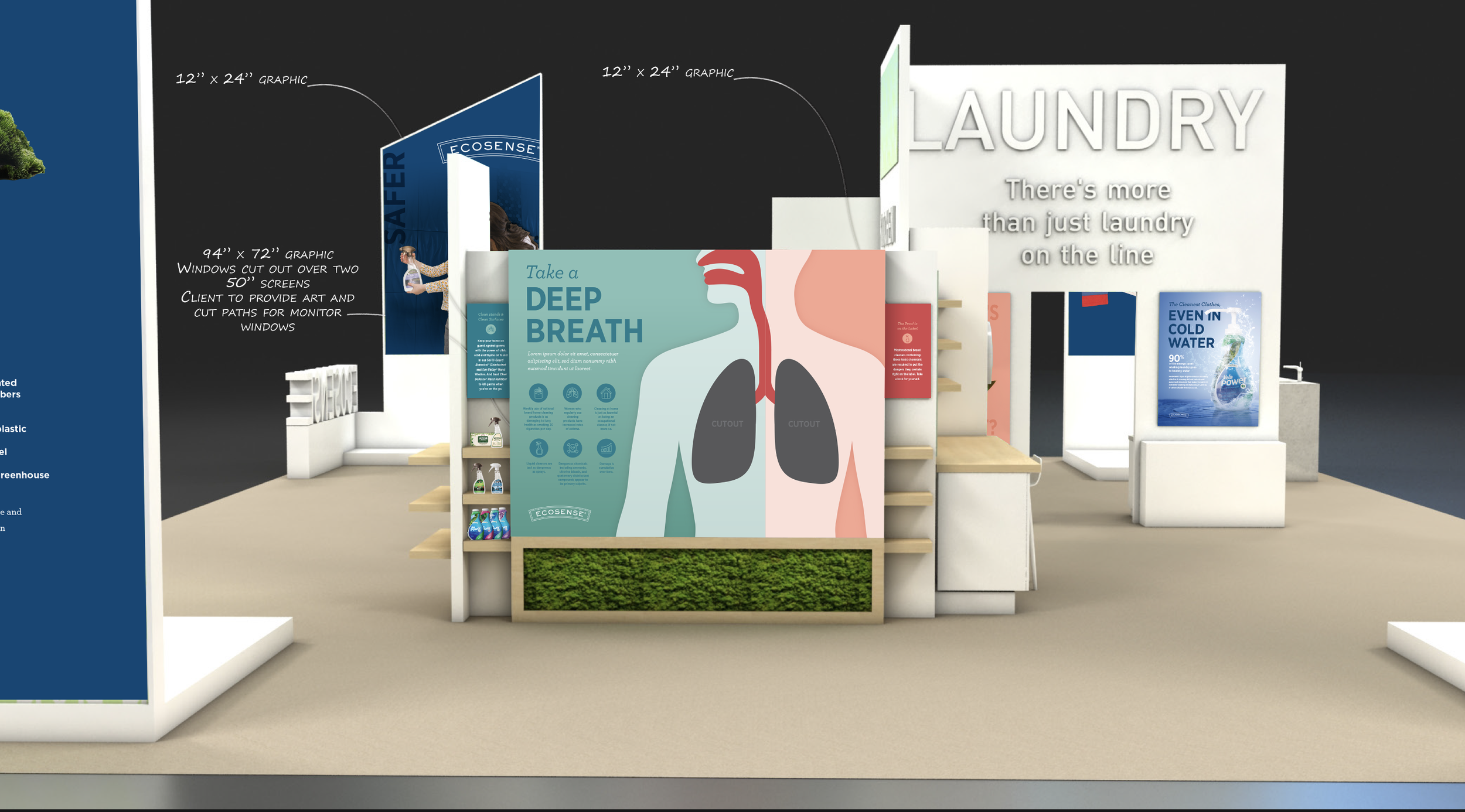
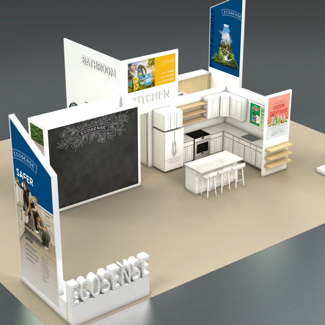
Each year, Melaleuca hosts a large convention where customers and employees gather to learn about new products, celebrate achievements, and connect with the company’s mission. Each brand under the Melaleuca umbrella is featured in its own booth, offering demos, product samples, and educational experiences. I was assigned to lead the visual development for the EcoSense cleaning brand booth.
Role
Concept Development, Graphic Design, Print Packaging
The Challenge
One of the main challenges was working with limited control over the photography provided—many assets weren’t formatted for large-scale graphics or weren’t captured with display use in mind. Additionally, I needed to ensure that all designs were legible and impactful at various viewing distances, from close-up to across the convention floor.
The Solution
Using advanced Photoshop techniques, AI-powered tools, and strong layout design principles, I adapted and optimized the photography for large-scale use. I also prototyped the graphics at scale to ensure clarity, accessibility, and visual hierarchy—so that type and imagery communicated effectively in a high-traffic, immersive environment.
The Impact
The booth was well received by attendees and stakeholders, offering an engaging, informative experience that aligned with the EcoSense brand. The graphics helped create an inviting space that encouraged interaction and brand connection.
Orchard House Design Co.
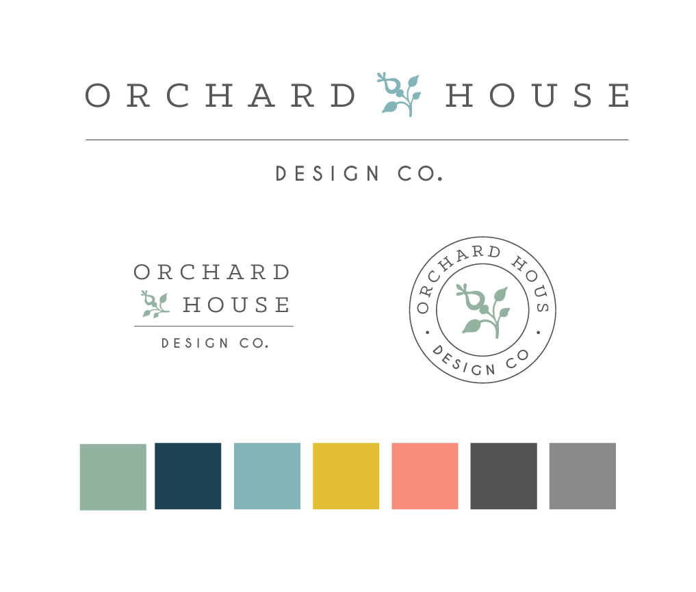
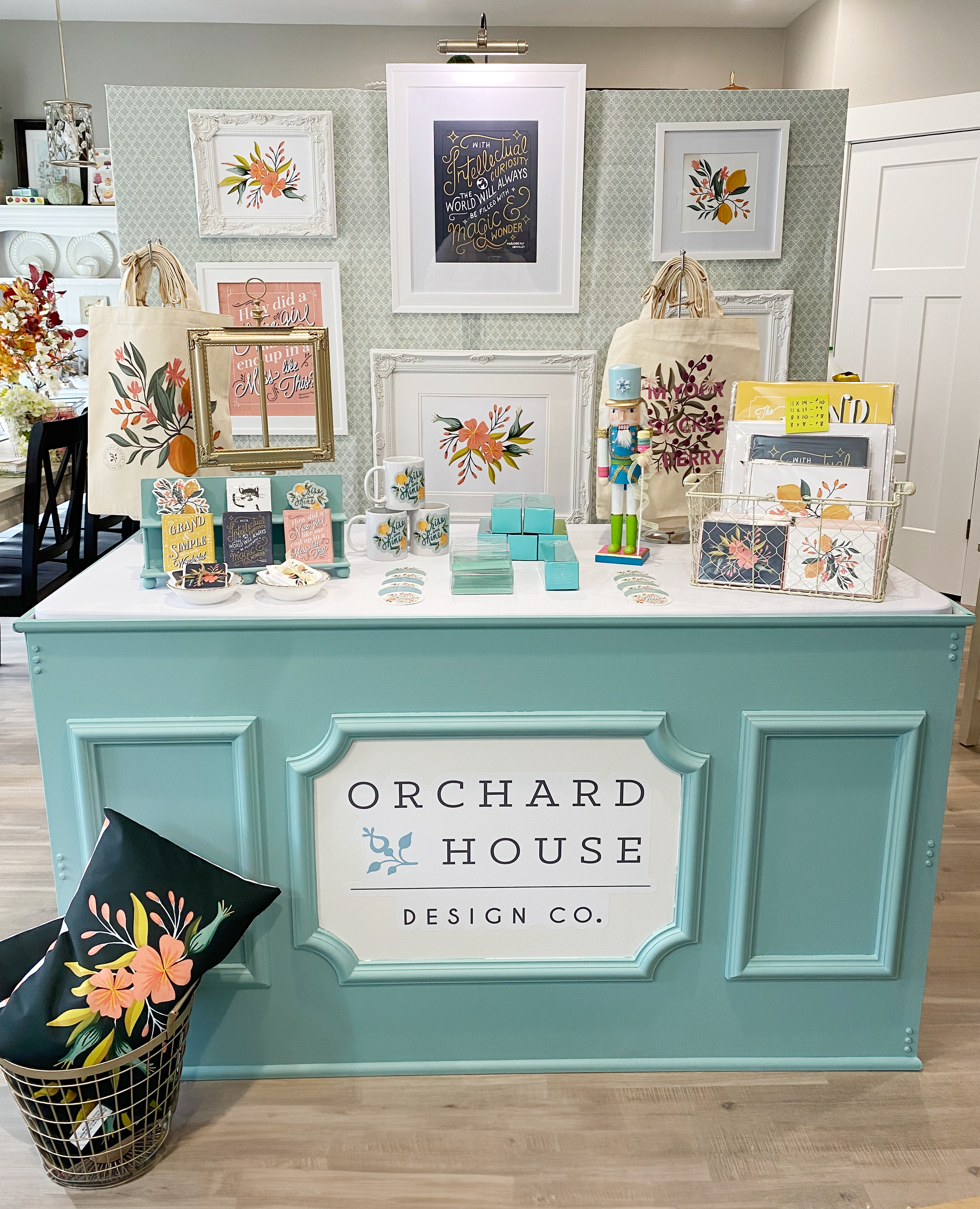
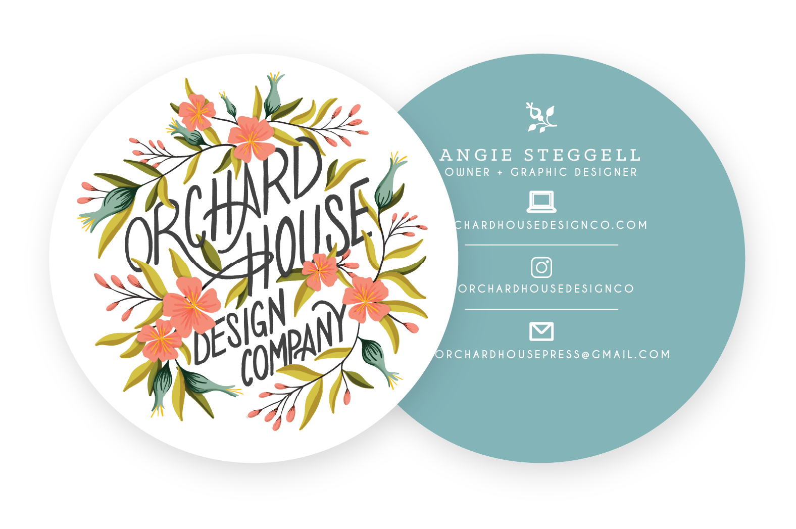
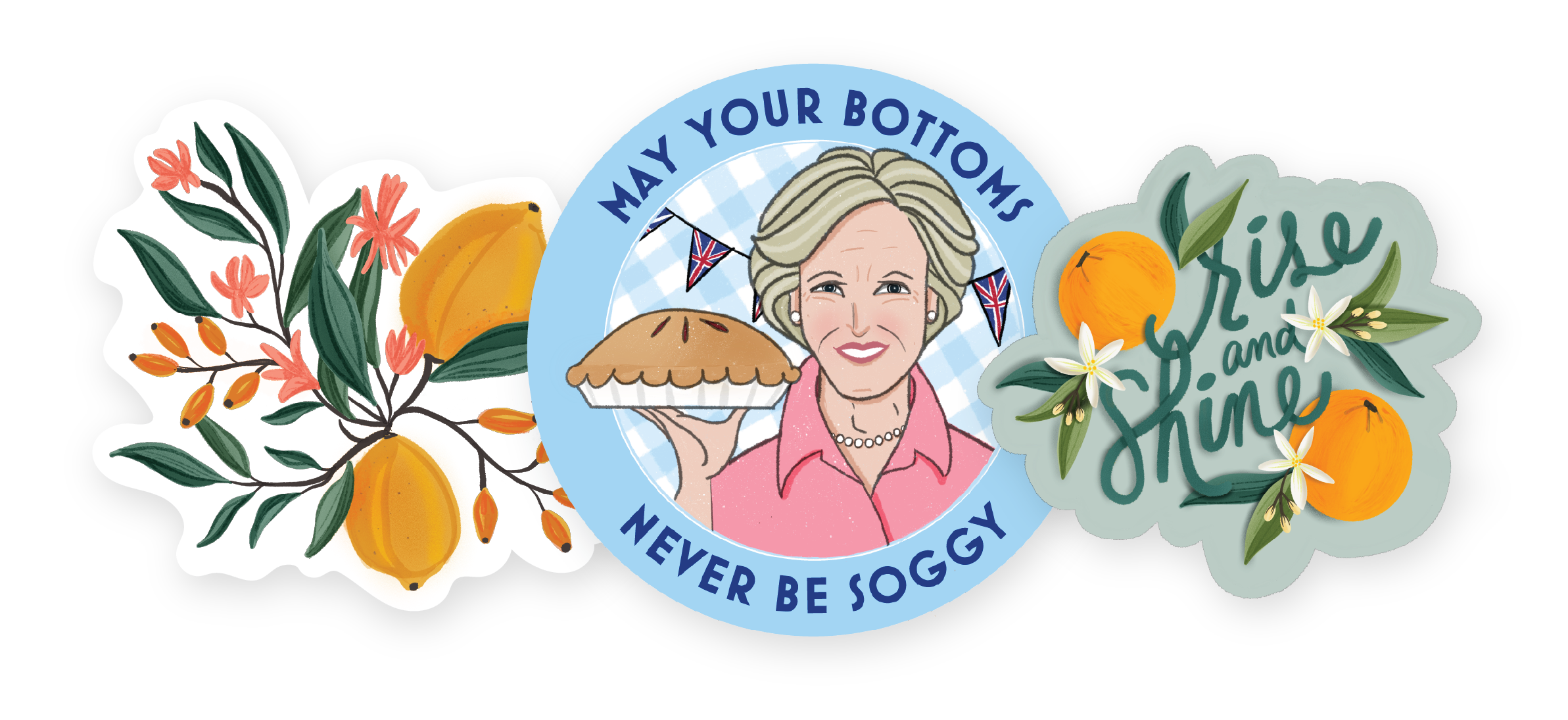
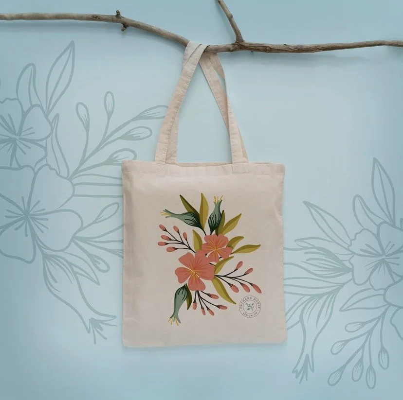
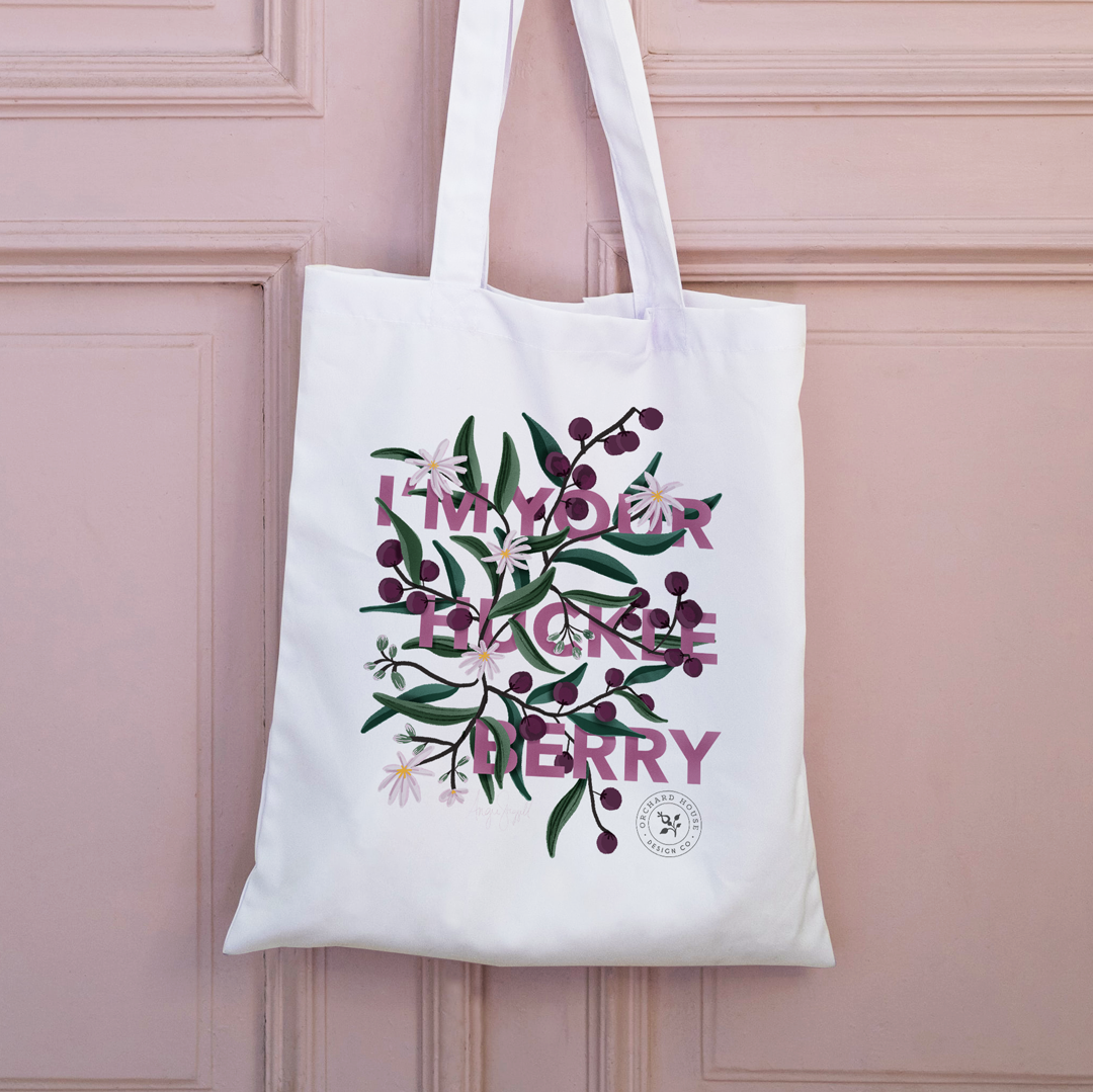
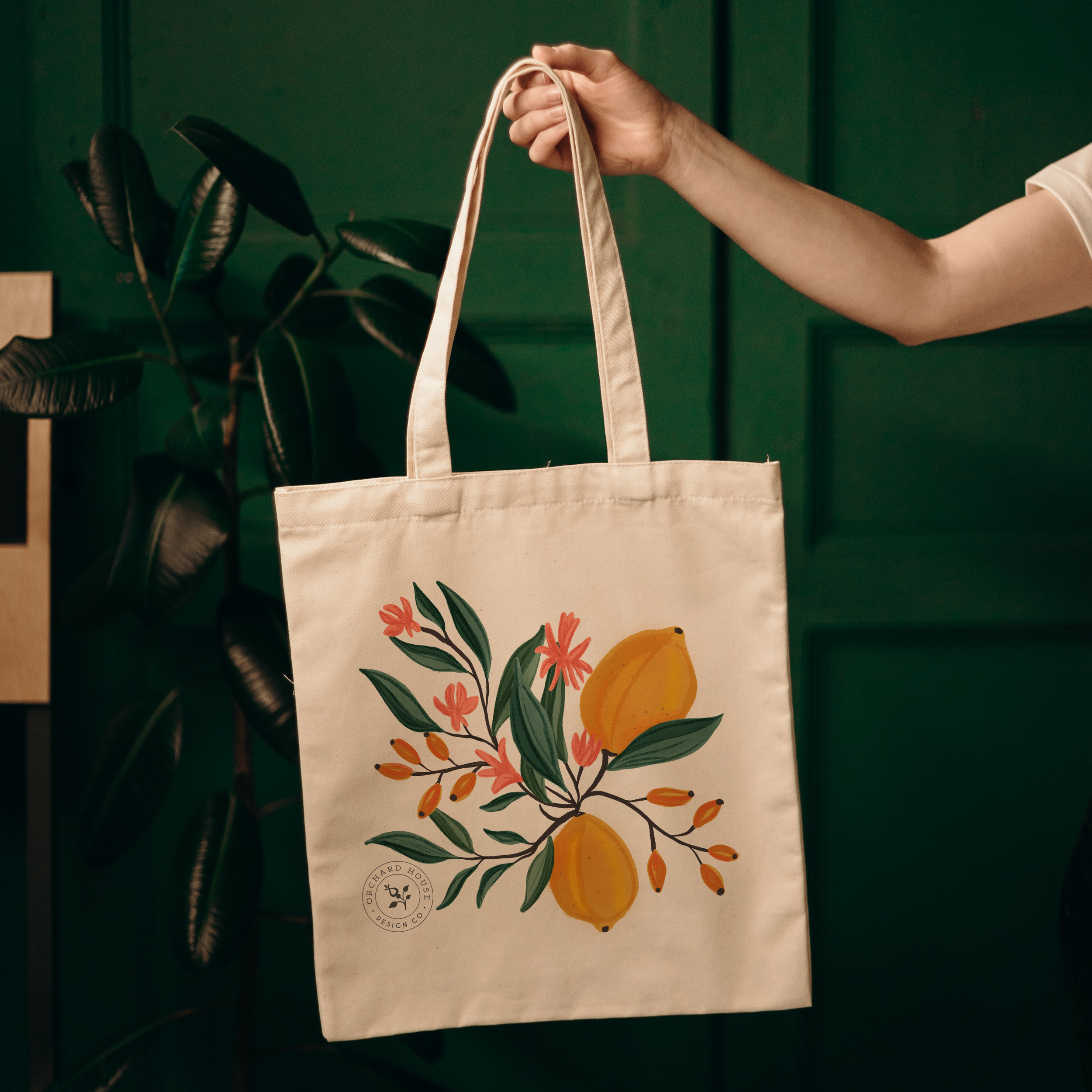
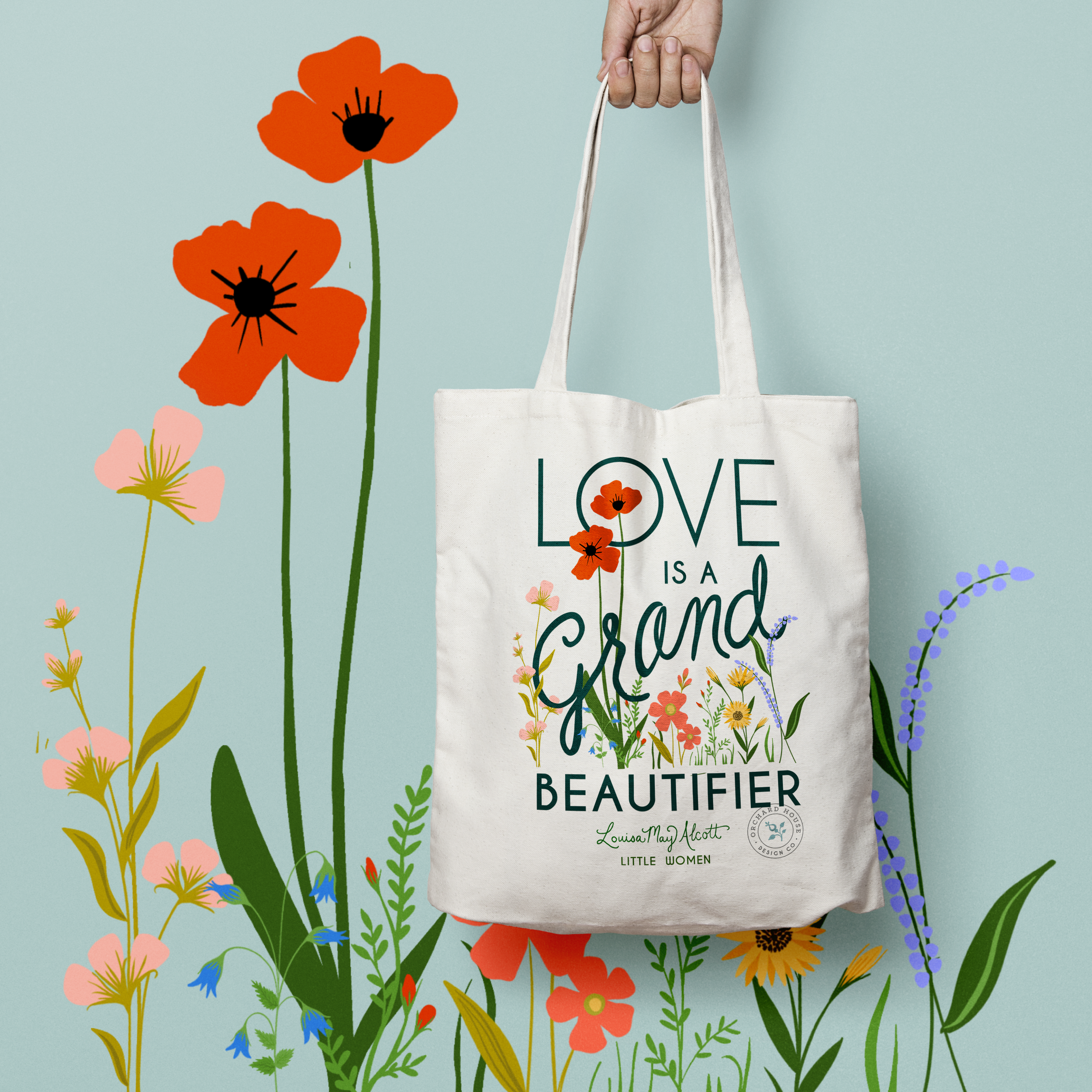
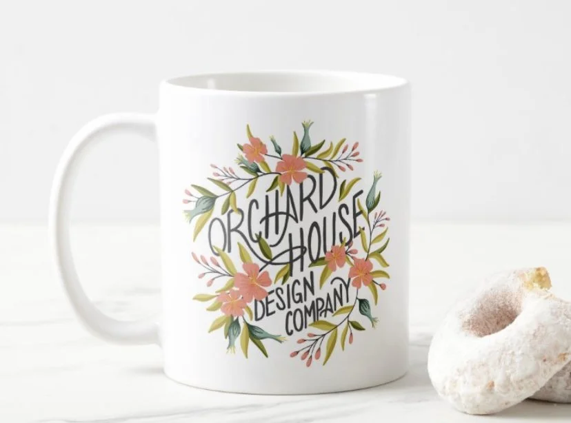
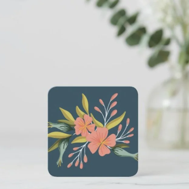
I started a small business/booth that I took to markets and craft fairs for a couple of years designing stickers, tote bags, prints, and other small giftables along with fresh-baked French macarons. For this side venture, I developed branding, packaging, the designs for the products, social media marketing, and the booth itself.


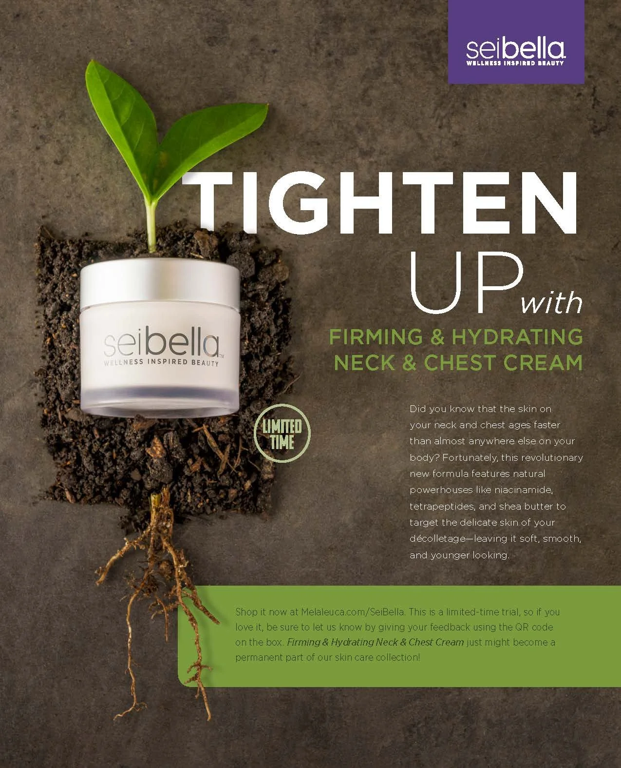
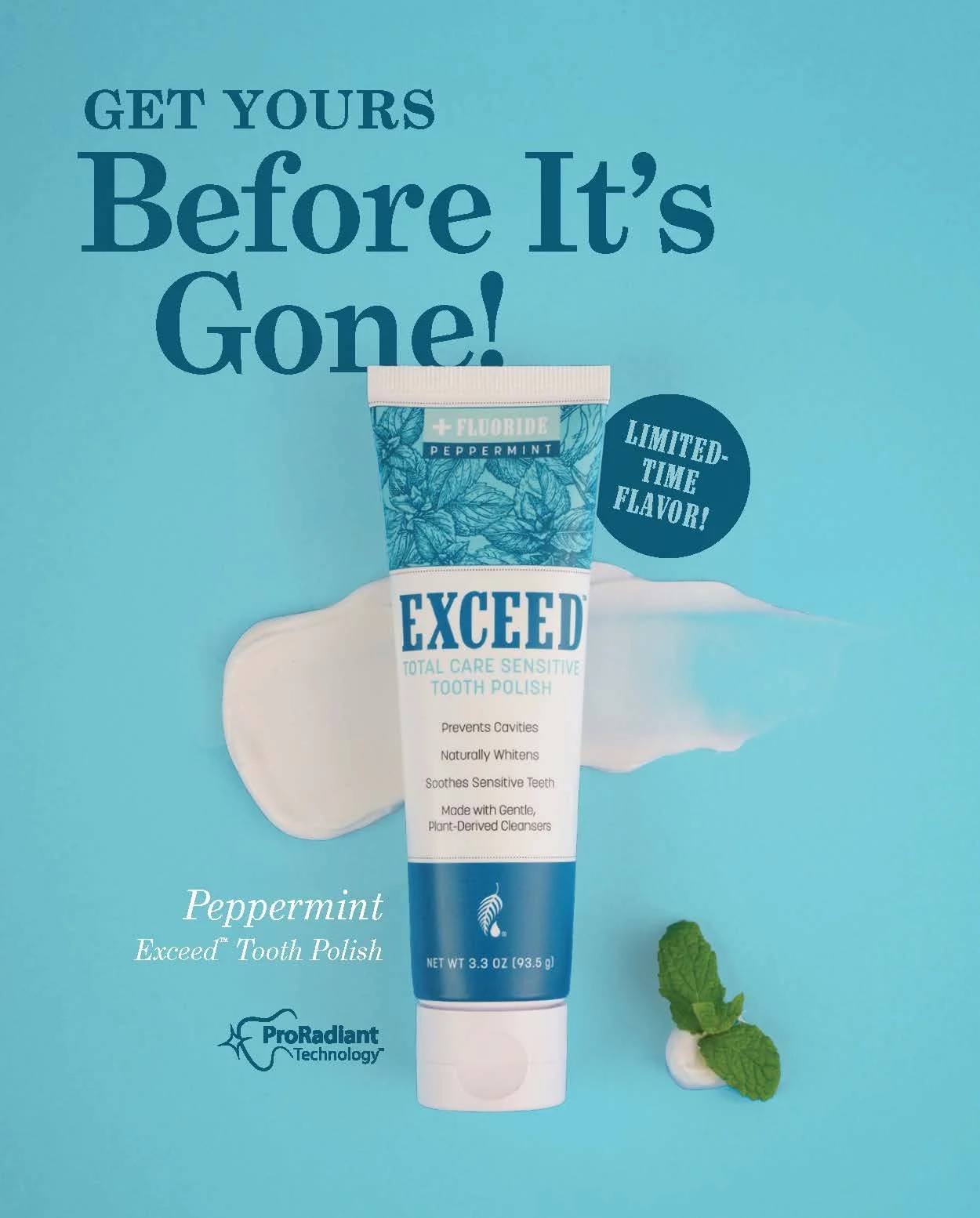
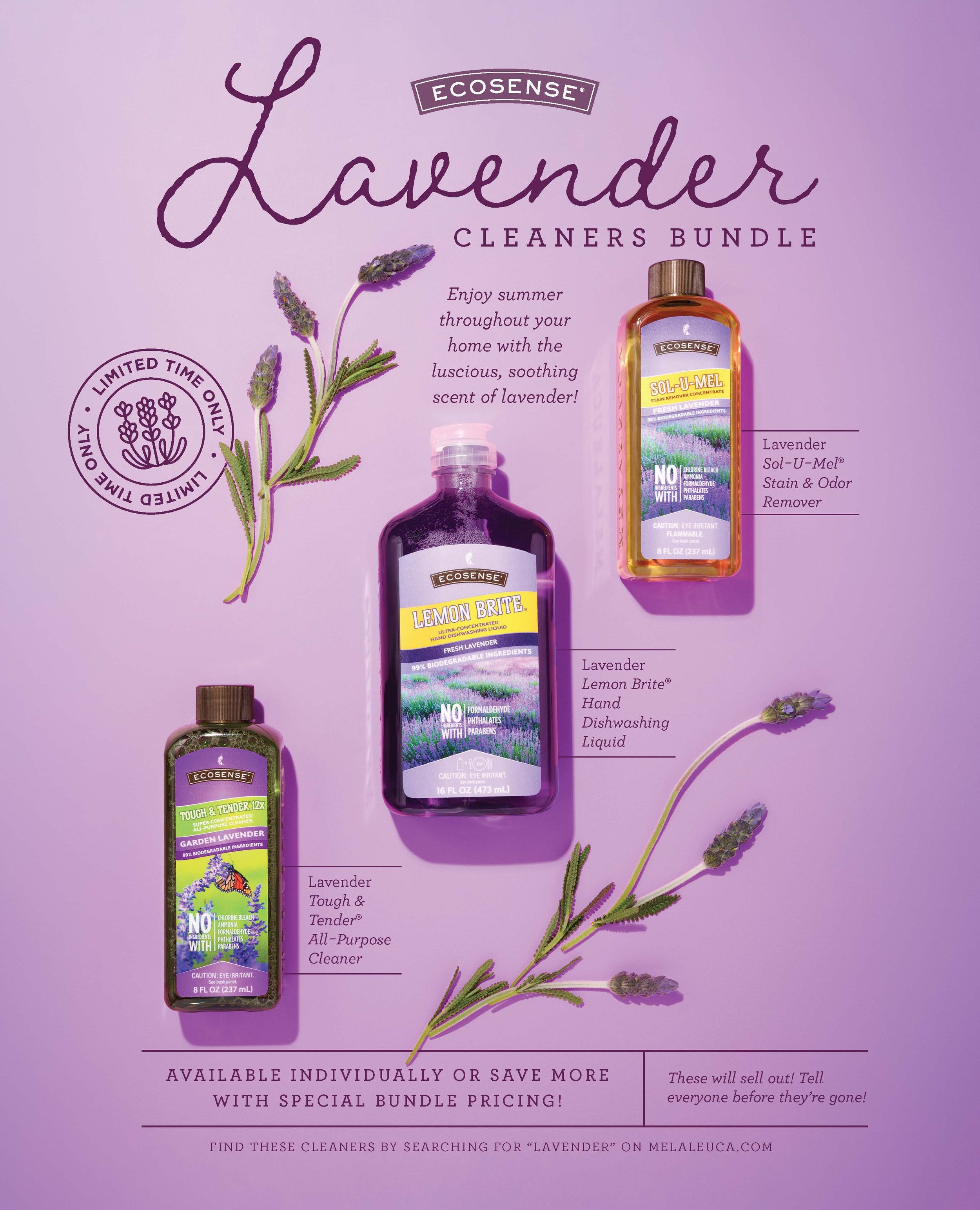
Leadership in Action product ads
Leadership in Action, Melaleuca Inc.’s monthly business builder magazine, often features ads of their newest products and upcoming promotions.

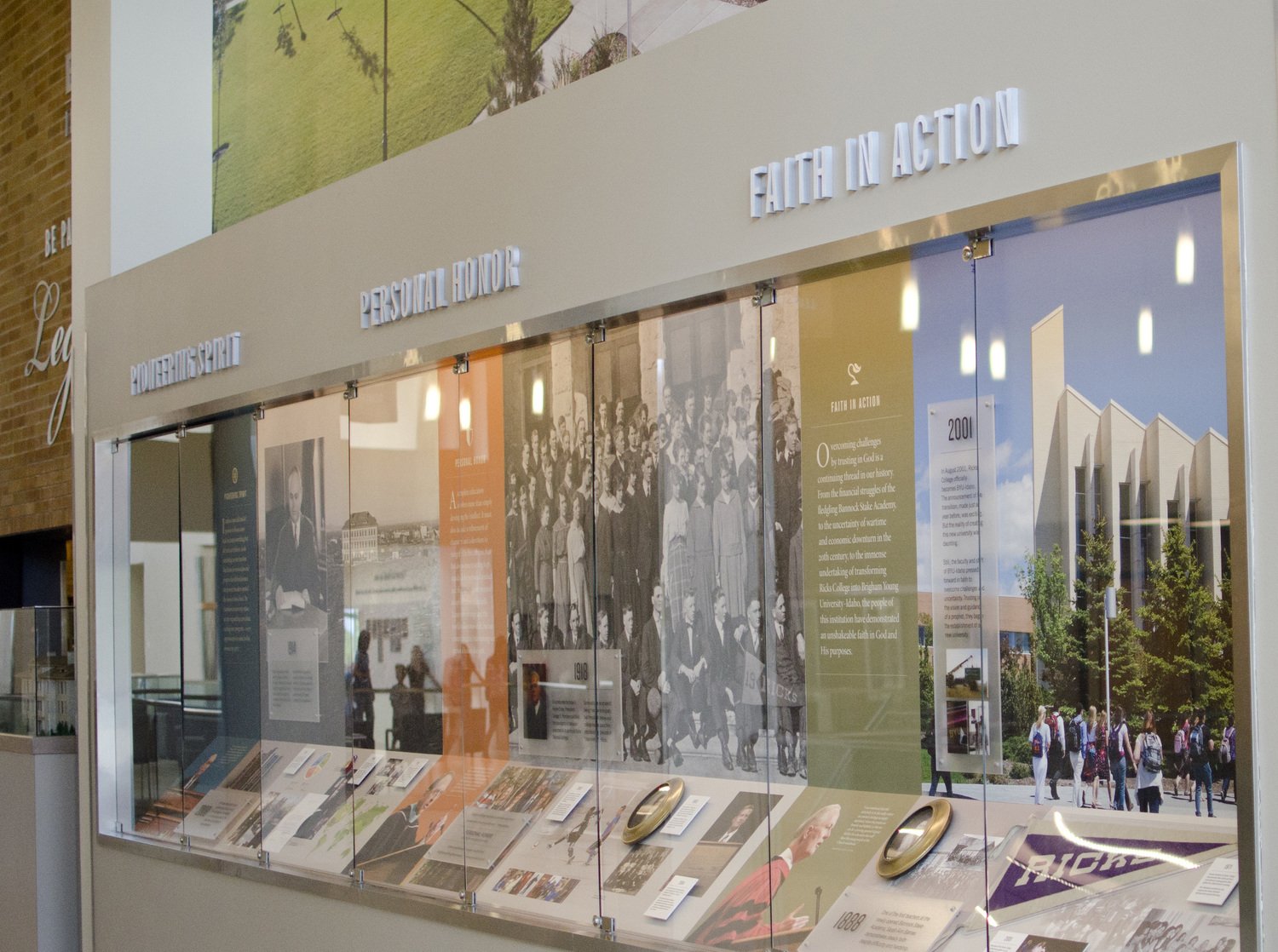
BYU-Idaho’s LEgacy Hall: Phase 1
Overview:
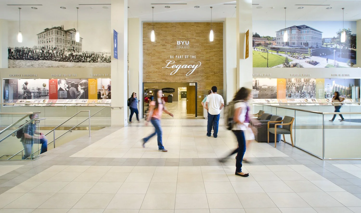
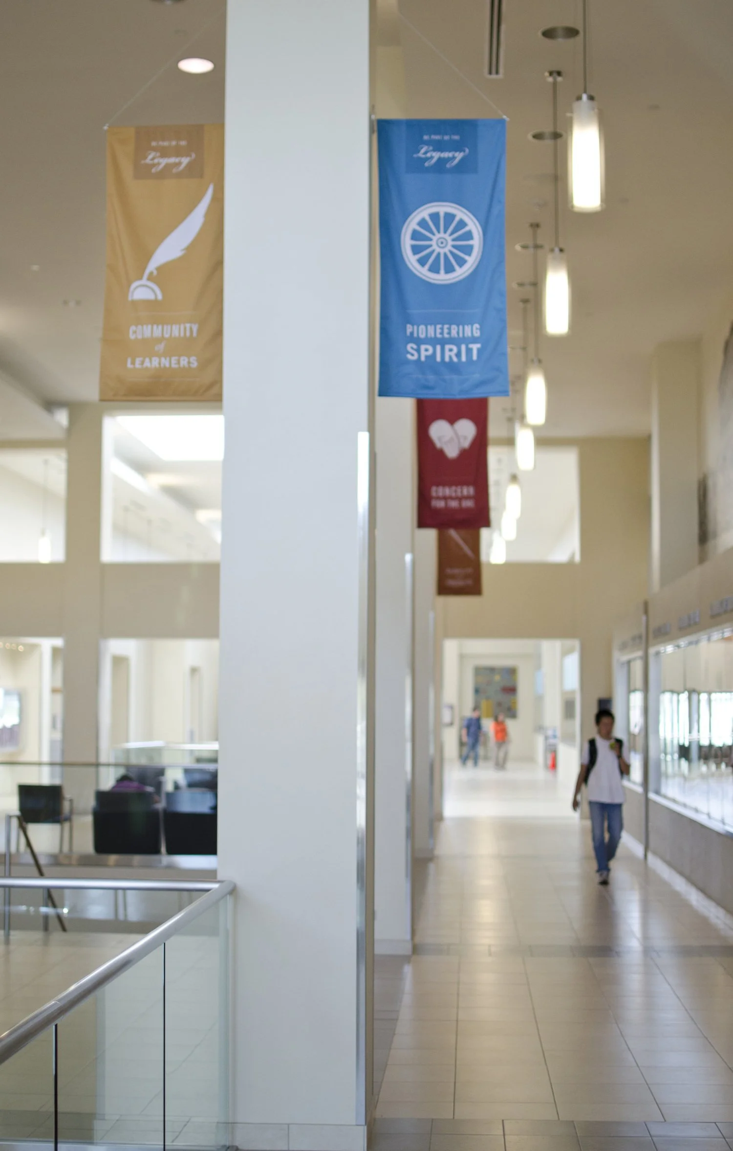
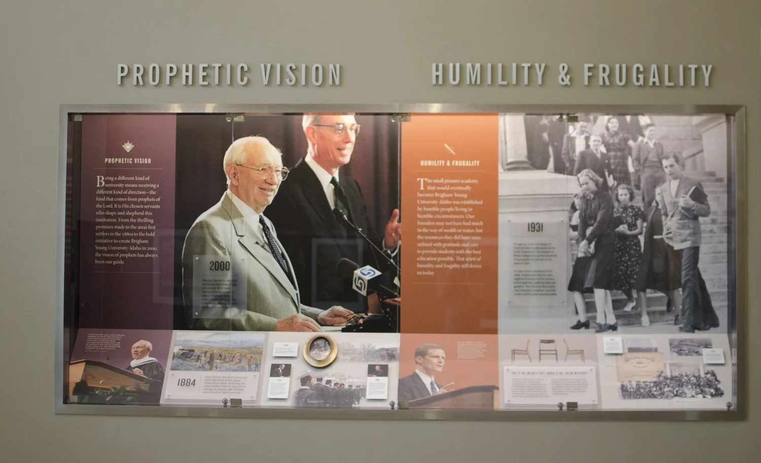
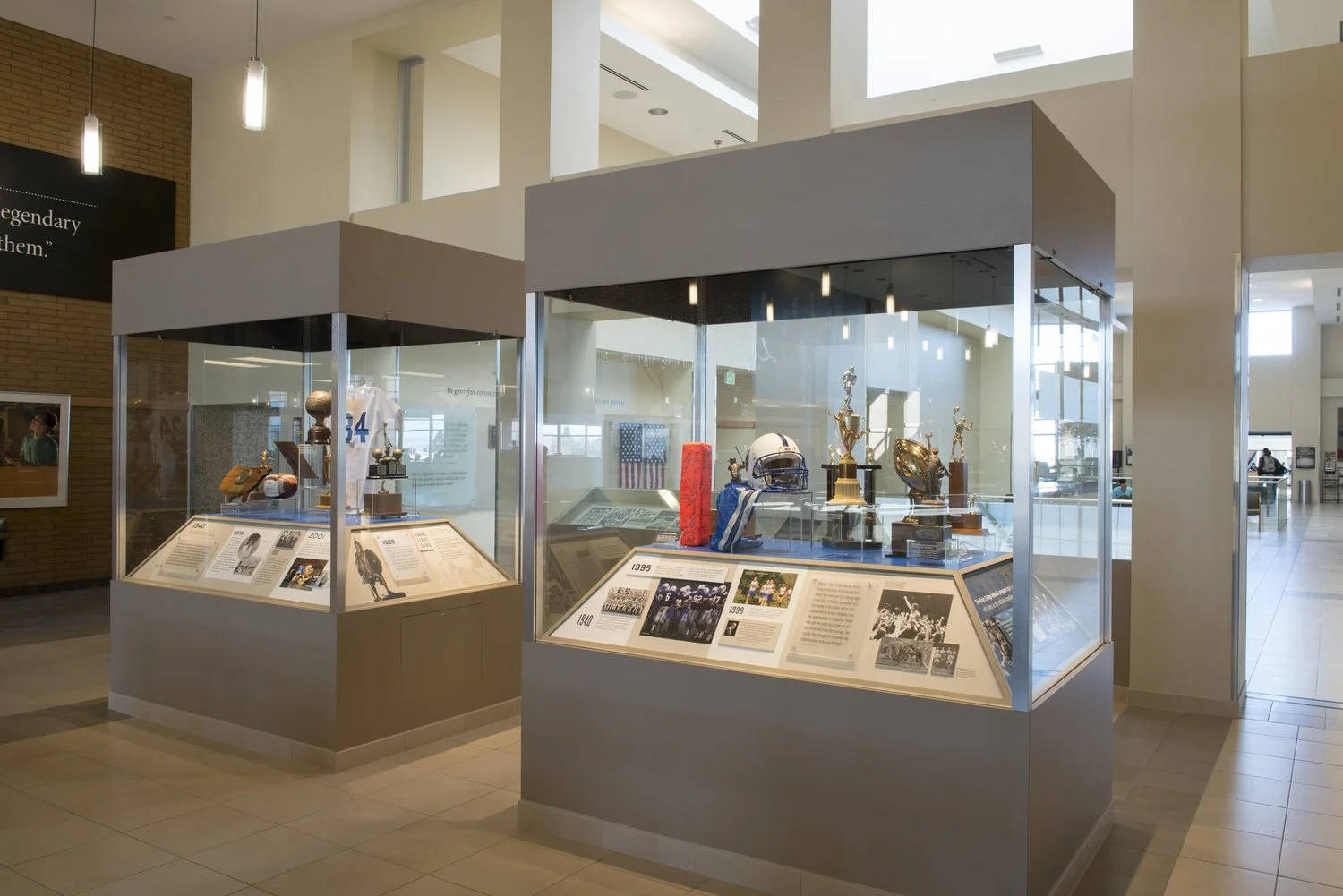
BYU-Idaho's University Communications department was asked to create an environmental design telling the story of BYU-Idaho through the nine "enduring characteristics” of the institution.
My Role:
Production design: I did a significant amount of file prep, working with printers and other vendors, icon development, photo sourcing, and retouching. I became really good friends with the folks over in the archives.
The Challenge:
There was an open area with built-in glass cases in the Manwaring Center on the BYU-Idaho campus was constructed with this project in mind. However, it was built without a vision. It was the job of our creative team to take what existed and turn it into a tribute to the legacy and history of the BYU-Idaho campus.
Project Team:
Merv Brown – Creative Direction
Marc Stevens – Copywriting
Tony Carpenter – Art Direction, Design
Michael Commons – Design
Angie Steggell – Design
Matt Beynon –Design
Mike Lewis – Photography
Doug McKay – Photography
Anne Stott – Project Management

BYU-Idaho’s LEgacy Hall: Phase 2
Overview
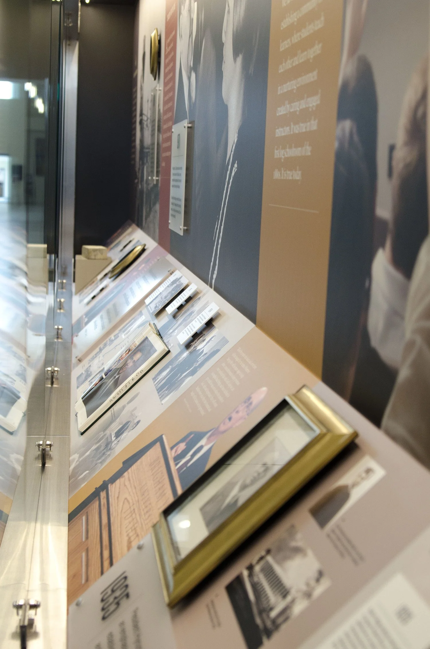
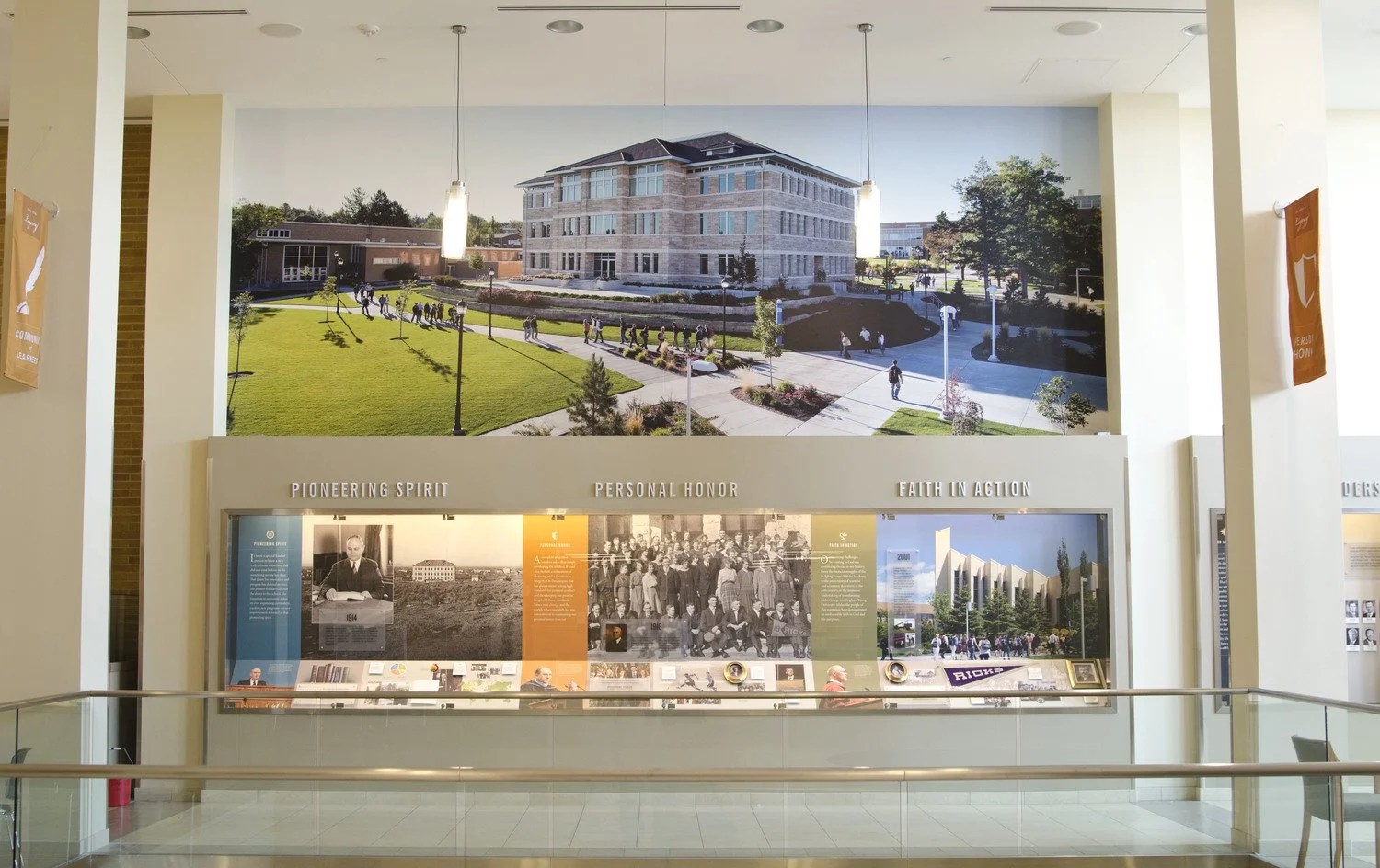
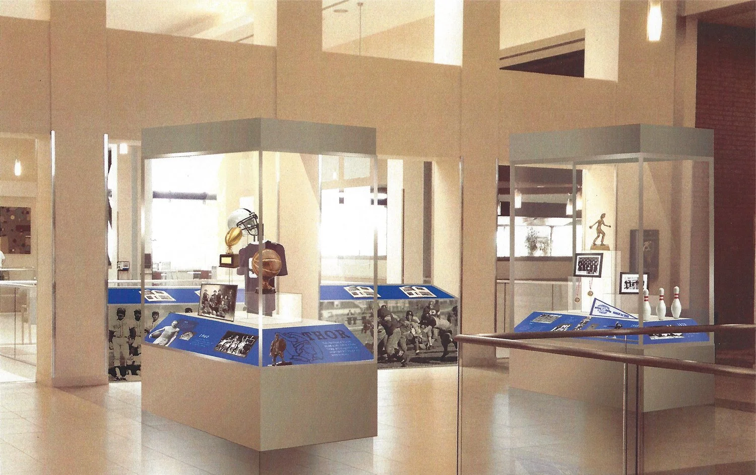
As a continuation of Legacy Hall: Phase 1, this exhibit expansion was designed to showcase BYU–Idaho’s “enduring characteristics” and celebrate its rich athletic history. Through stories, quotes, and archival photos, the installation invites visitors to reflect on the legacy of Ricks College athletics and the university’s evolving identity.
Role
Lead Designer
Team
Client: BYU–Idaho
Art Direction: Tony Carpenter
Deliverables
Environmental concepting, design renderings, large-scale display graphics
Approach
I was tasked with designing a new exhibit that visually complemented the original built-in Legacy Hall display while standing on its own as a cohesive experience. I explored multiple layout and material options through renderings, ultimately landing on a concept that seamlessly bridged old and new. The final design featured dynamic layouts and layered storytelling that aligned with the tone of the original installation.
Outcome
I presented my renderings to the executive team over the project and the option they selected was brought to life as a permanent display. One unique aspect of the process was gaining access to the Hart Auditorium’s archive of athletic trophies—some dating back to the 1920s. This rare glimpse into BYU–Idaho’s athletic history helped inform both the tone and visual narrative of the exhibit, grounding it in authenticity and pride.

Binns Logo + Style Guide
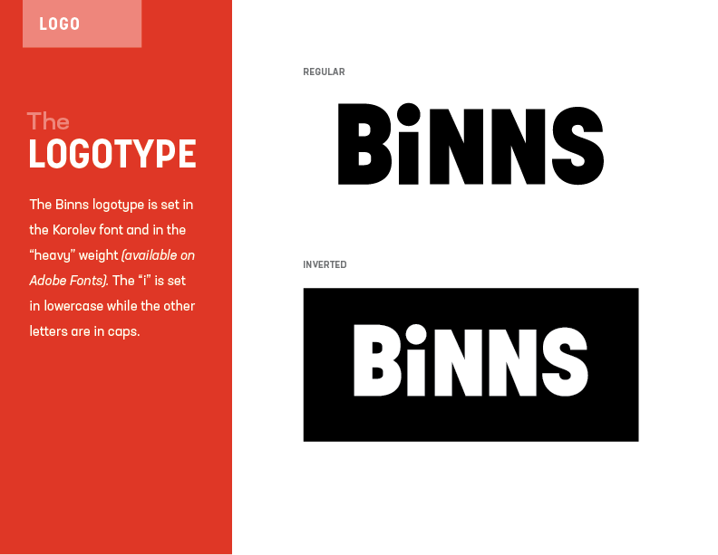
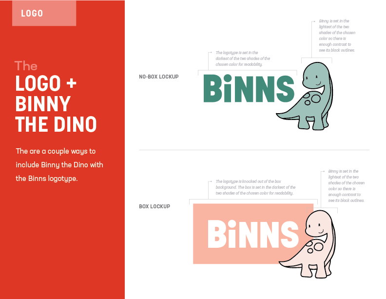
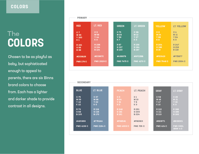
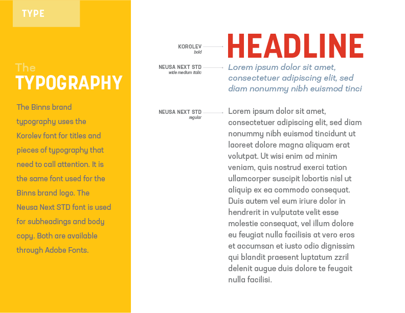
The owners of Binns, a baby formula container brand, approached me wanting a logo and a beginner’s style guide to get them started in their new business. The clients knew they wanted an approachable brand that still had just a touch of sophistication to it trying to avoid something too adolescent. After all, the baby formula containers are for the parents, not the baby. The owners fell in love with the cartoon dinosaur that we lovingly named Binny and knew they wanted him to be their mascot.

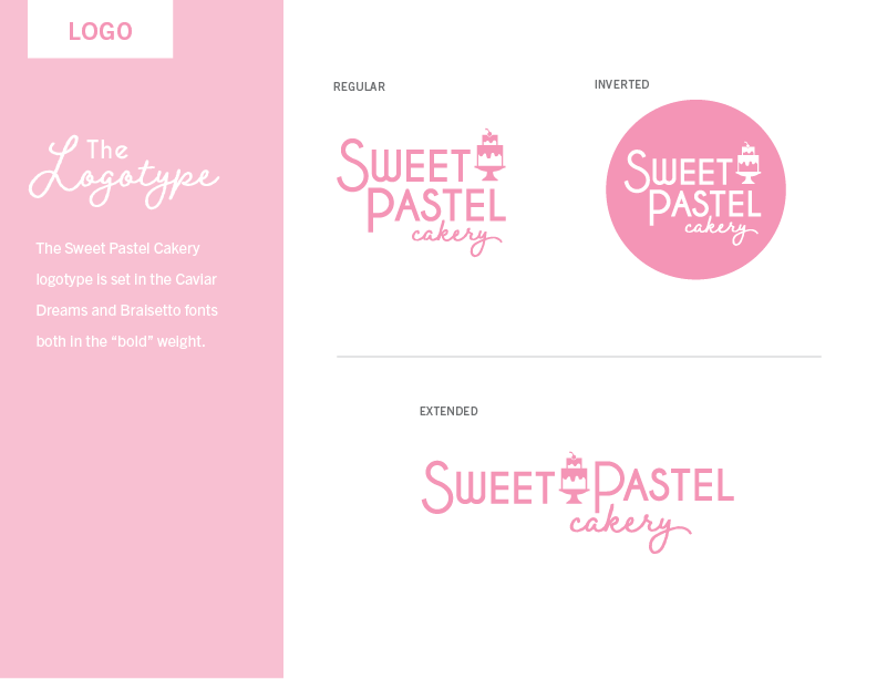
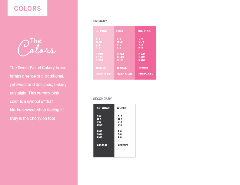
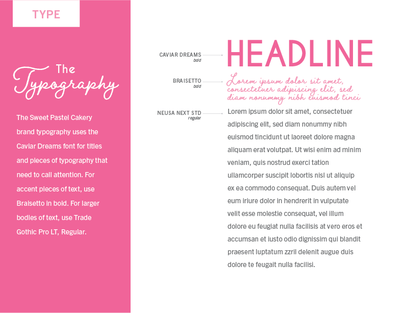
Sweet Pastel Cakery Logo + Style Guide
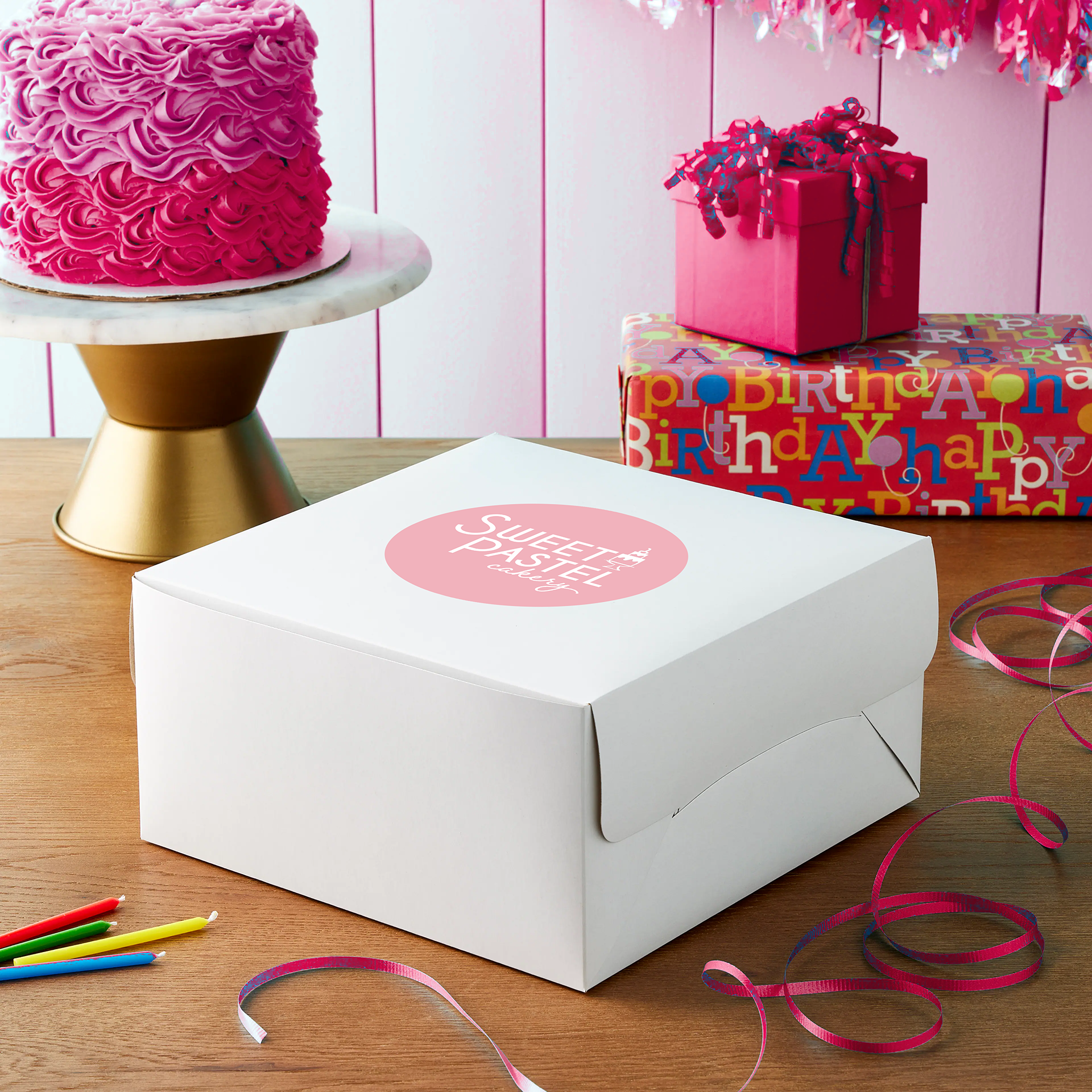
The owner of Sweet Pastel Cakery, a local custom cake designer, needed a new logo and style guide to help elevate her small business. She wanted something nostalgically sweet but also modern.

Jimmer Fredette Documentary photo editing & marketing Pieces
For this project, I created marketing materials for The Lonely Master documentary about former BYU basketball star Jimmer Fredette. I began by using photo manipulation in Photoshop to transform an existing image of Jimmer in his Suns jersey into a more generic version, suitable for the documentary's theme. I then designed various promotional assets for social media and web ads to effectively market the film.
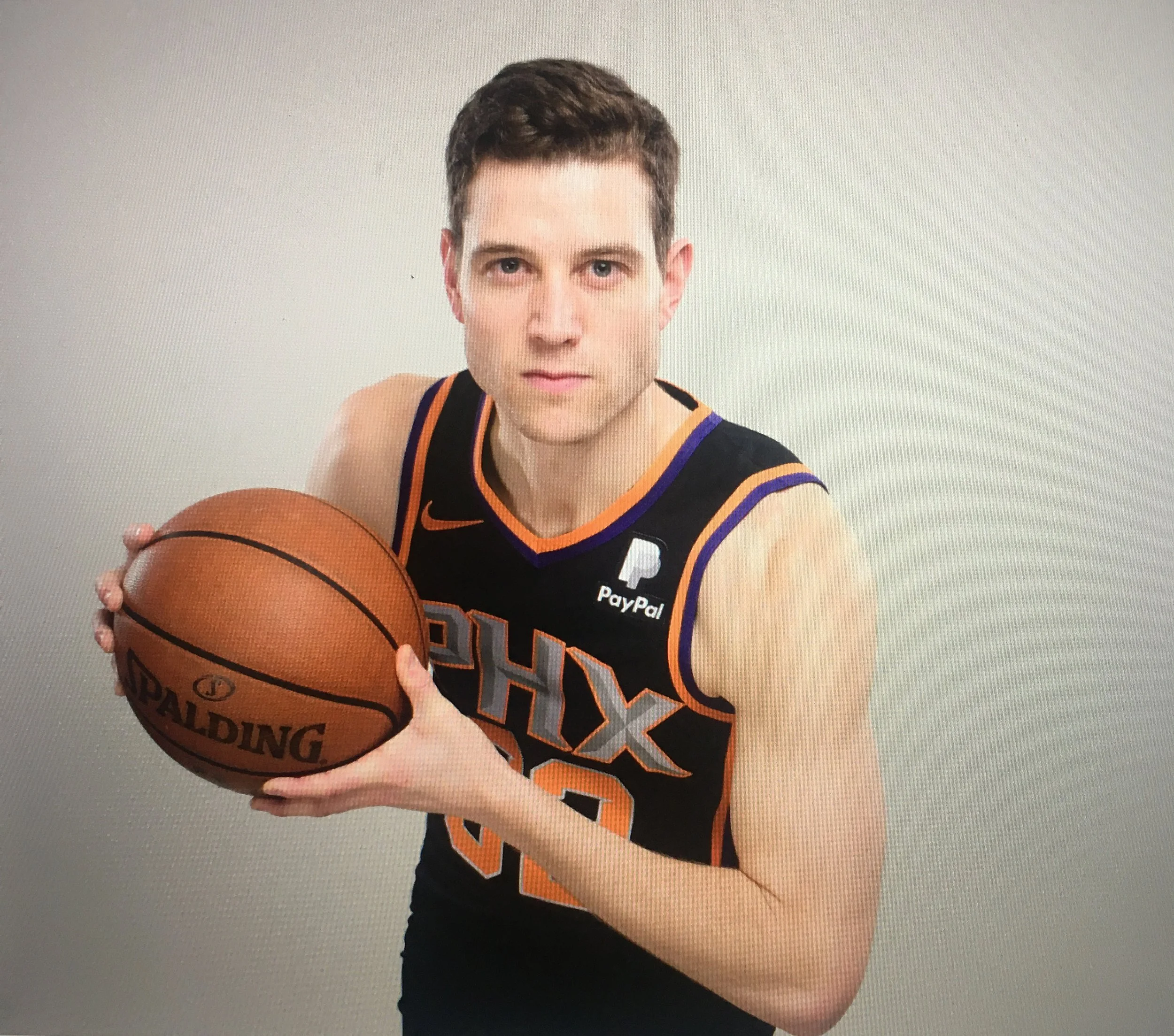
Original photo provided

Edited photo designed into a social media ad

Landscape web ad made with a screenshot from the documentary

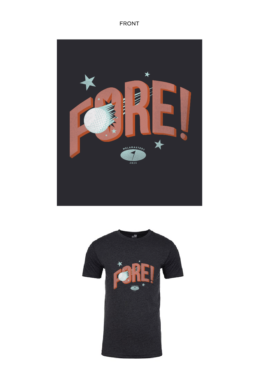
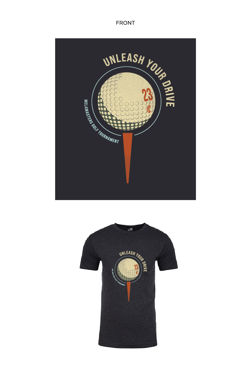
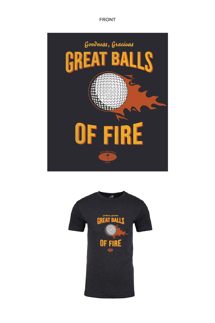
Melamasters Golf Tournament T-shirts